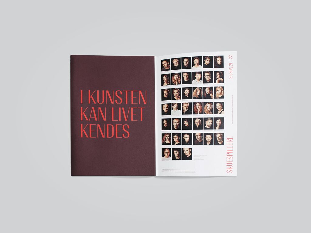
Typeface

Söhne Collection

Zurück Download

The Söhne collection is a sans-serif font family that was developed in memory of Akzidenz-Grotesk that appeared in 1898 – back then a milestone in font design and a model for numerous later designs such as Helvetica. It was inspired by Unimark’s legendary wayfinding system for the New York City Subway, which was traditionally set in Standard Medium, an American release of Akzidenz-Grotesk, and since then in Helvetica. “Framed through the reality of Helvetica”, the style of the Söhne collection captures the analogue materiality of Standard Medium and retains the charm of its original style. Noticeably revised, the collection is clearly suitable for our digital age, comprising four families with a total of 64 fonts. Starting with the regular styles, the collection travels through the famous history of its role model in that it draws inspiration from all its disparate styles over a century of development and presents itself as a complete, contemporary typeface family for modern designers.

Begründung der Jury

Söhne is an outstanding contemporary typeface that is the outcome of a meticulous and exciting development. It is quite a challenge to choose as a starting point the New York City Subway wayfinding system, which has been guiding millions of people safely every day. This new font family goes a step further and cleverly sets itself apart in that it achieves an appearance that is ideal for today’s digital era.

Red Dot: Best of the Best

Durch Starten des Videos erklären Sie sich damit einverstanden, dass Daten wie z.B. Ihre IP-Adresse an Vimeo übermittelt werden. vimeo.com/privacy

Andere interessierte auch