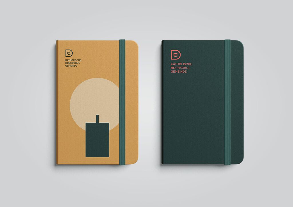
The Korean Association of National Team Members was established in 2011 by current and former Korean athletes. The organisation supports youth education through sports activities and hosts about 60 sports events. The new corporate design adopts the national flag of South Korea: the blue and red circle in the middle of the logo symbolises the harmony between Yin and Yang while the four trigrams represent air, earth, water and fire. Additional graphic elements in different colours are used to create a vibrant visual identity which has a motivating effect on a broad target group.
Credits
Client:
The Korean Association of National Team Members, Seoul, South Korea
Design:
Design Institute of Handong Global University, Pohang, South Korea
Supervision:
Lee Jinkoo
Design Team:
Kim Jieun, Nguyen Cam Chi, Lee Songjoo, Sung Seenae