


“Best Brands & Communication Design – Red Dot Winners Selection 2025”

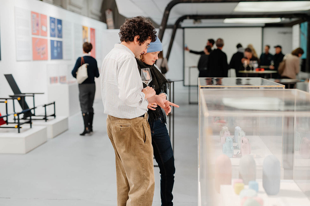
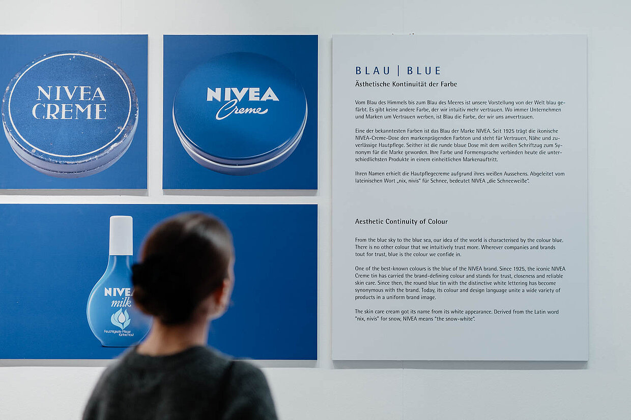
From 28 November 2025 to 7 February 2026, designforum Wien will be hosting the Red Dot exhibition “Colours of Our Time – Identity and Difference in Design”, which explores how colour influences our perception, provides orientation and shapes brands over decades. The focus is on the brand colours of leading industrial and consumer goods brands, including Manner and Nivea, Hilti and DEWALT, Gardena and Fiskars.
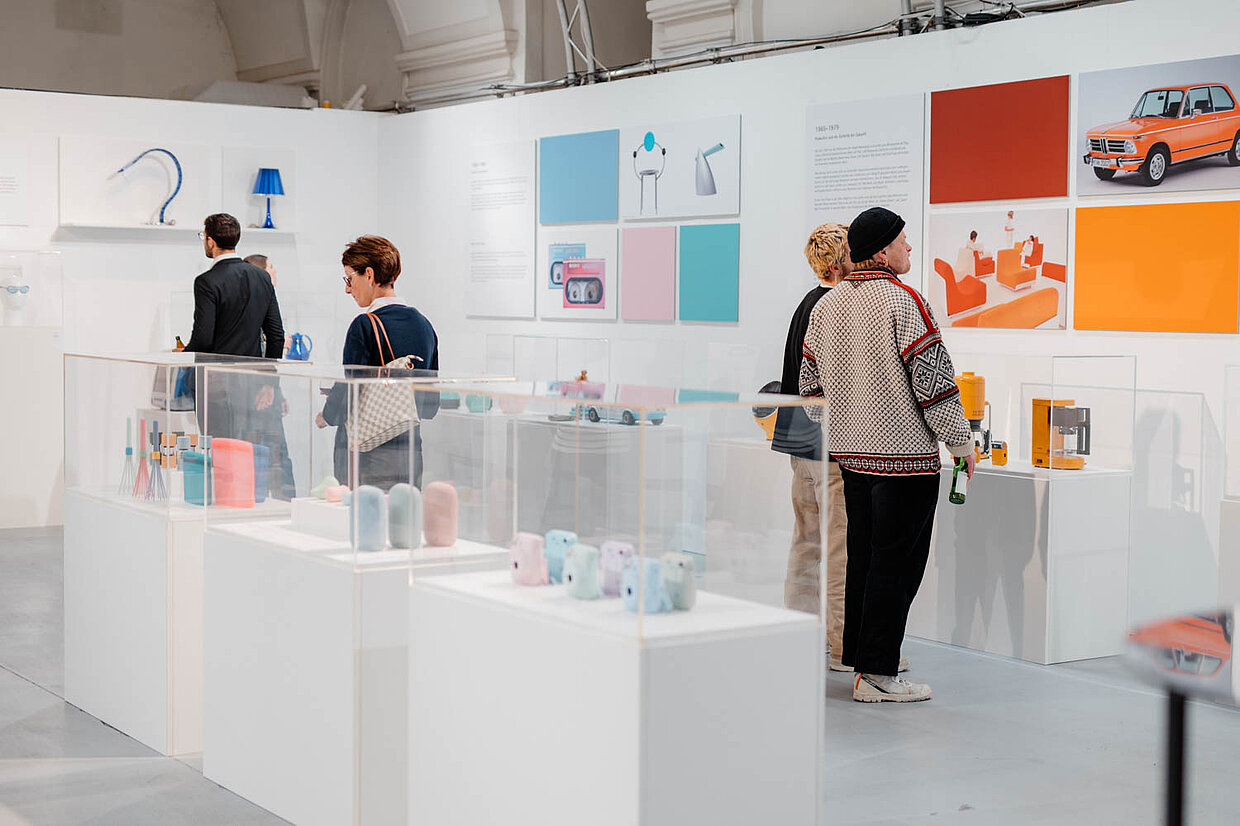
The exhibition will feature numerous products that have won in the Red Dot Design Award. They illustrate how consistent colour design not only creates recognisability, but also improves user guidance and shapes the character of a brand in the long term. The presentation combines historical developments with current examples that impressively demonstrate how colour has become a central component of design.
Hilti has made colour a clear component of its brand management. The bold red, which has been used since the 1970s, ensures recognisability on construction sites worldwide. The combination with black marks operating areas and increases safety. Here, colour is not understood as decoration, but as an integral part of ergonomics.
DEWALT uses the strong long-distance effect of its brand yellow to make tools immediately visible even in cluttered working environments. In combination with the functional colour black, the design provides orientation and improves handling. The colour scheme has a non-verbal effect and is also a systematic tool within the design.

Fiskars' iconic scissors show how a product detail can shape a brand beyond its function. The orange handle, originally a random decision made in the spirit of pop culture, has evolved into one of the strongest colour symbols in everyday design. Today, Fiskars orange stands for Scandinavian precision and quality craftsmanship worldwide.
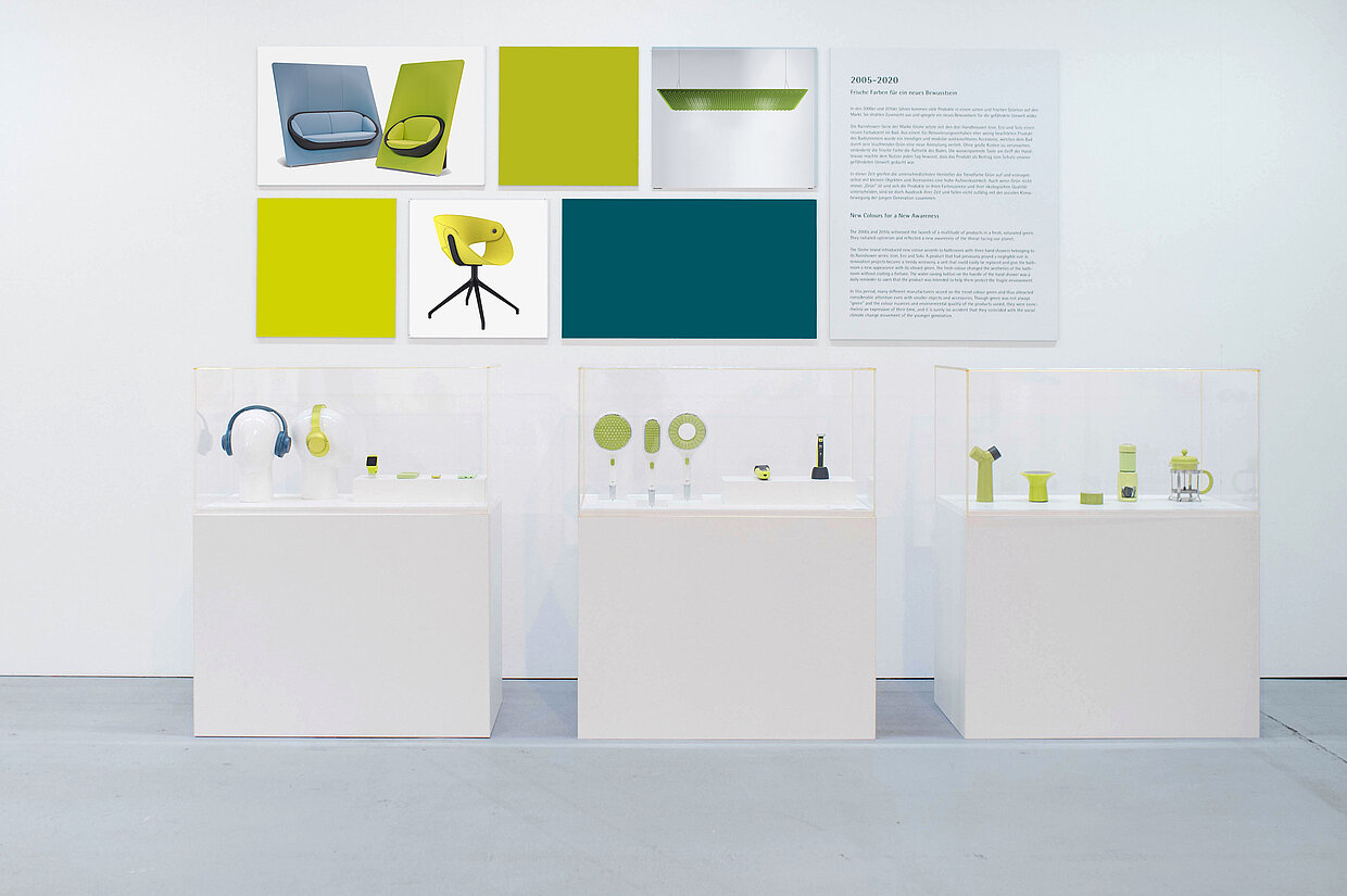
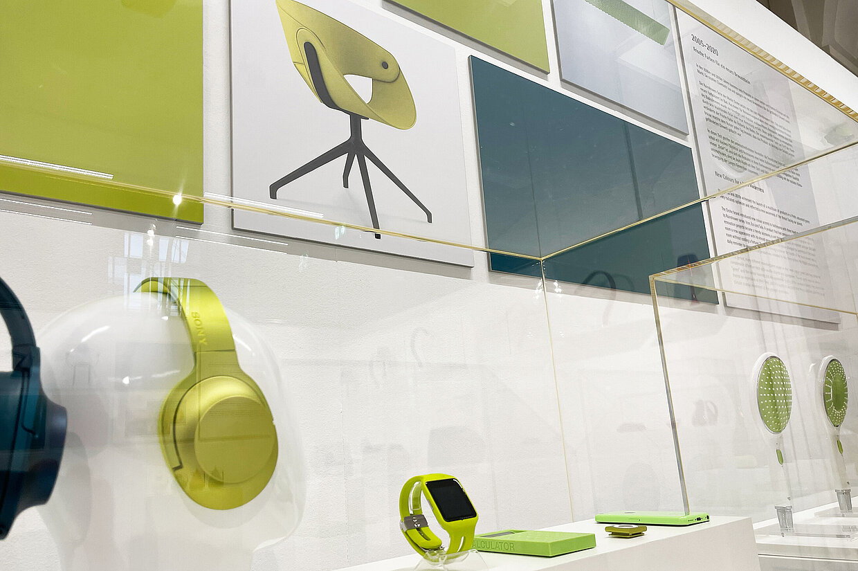
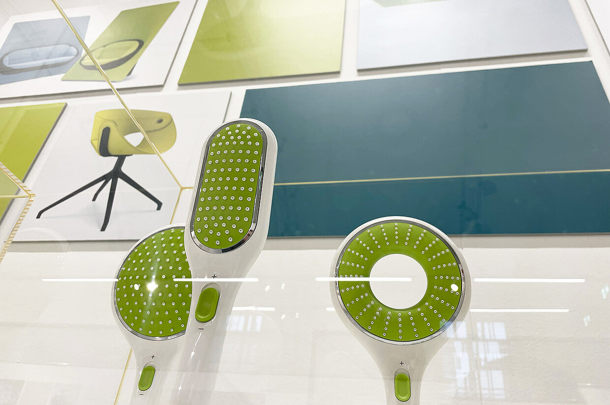
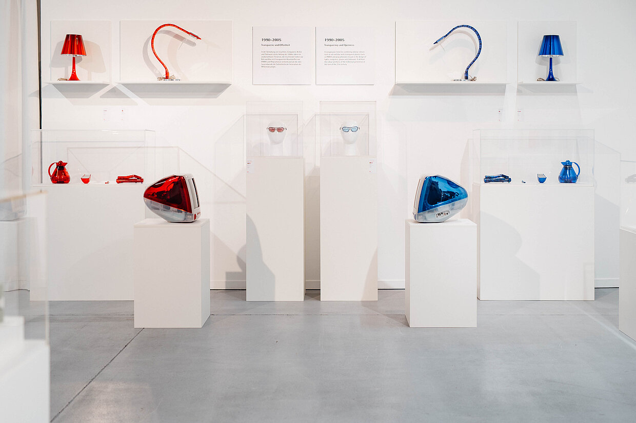
Colour aesthetics are always an expression of their time. The 1960s and 1970s were characterised by bright, warm tones that corresponded with technological optimism and pop culture. In the 1990s, transparent plastics and intense accent colours supported an aesthetic characterised by digital lightness and a new technical self-image. The 2000s and 2010s brought forth bold green tones that accompanied the growing awareness of sustainability and resource conservation.
The latest colour aesthetics show a remarkable tendency towards restraint. Pastel shades, softly graded intermediate colours and reduced saturation have conquered many product areas in recent years . They represent a new sensibility that reflects themes such as diversity, identity and mental calm.
This colour palette is not loud, but deliberate. It creates space for interpretation, conveys accessibility and supports a design that works less through clear signals and more through subtle moods. Although the current colour trends tie in with historical models such as mid-century modern, they pursue a different intention: they open up aesthetic possibilities in which users can find themselves regardless of social roles.
This new restraint is particularly evident in headphones, cameras, office furniture and household electronics. Products appear less status-oriented and more focused on everyday usability and comfort. The colour scheme of the 2020s thus reflects not only new social issues, but also a changed understanding of design: less striking, more accompanying.
All these developments make it clear that colour is not a casual element, but an instrument that fulfils specific functions. It provides orientation, shapes identity and creates trust. It connects generations of products and makes entire brand worlds appear consistent.
The examples from Hilti, DEWALT, Gardena and Fiskars, as well as the examination of different decades, show how closely colour design is linked to social developments – and why colour is one of the most effective tools in design.
Duration: 28 November 2025 – 7 February 2026
designforum Wien
MQ, Museumsplatz 1/Hof 7, 1070 Vienna, Austria
designforum.at

