Red Dot Gala: Product Design 2025 Start Livestream: 8 July, 5:45 pm (CEST)
00 days
00 hours
00 minutes
Food Packaging

Finnish Haiku

뒤로 다운로드

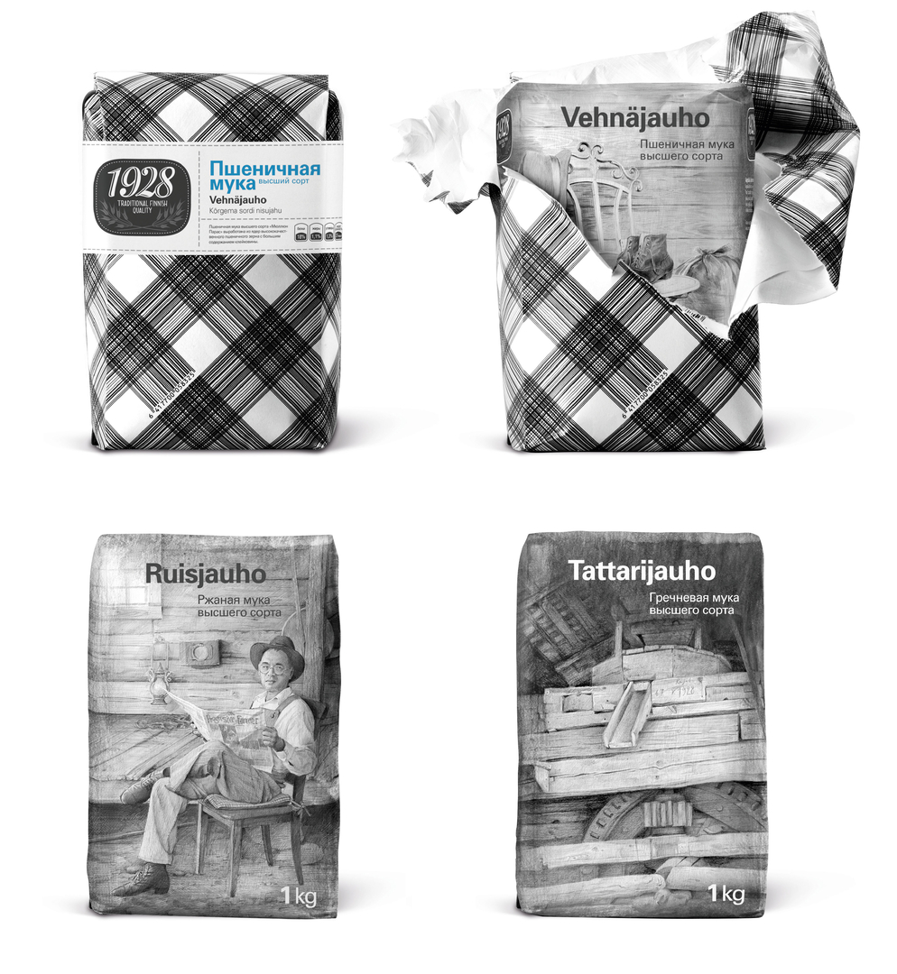
The design of the packaging for this Finnish flour brand realises the manufacturer’s philosophy that a brand should have “its own soul in addition to personal identity”. The aim was to convey the exclusivity of this flour made from select premium ingredients, and to address consumers on an emotional level. The design is based on haiku, a poem that is centred around a natural image clearly or subtly juxtaposed against human life. However, instead of using words like a poem to convey meaning, the packaging uses filigree pencil drawings. These classical pencil drawings show real scenes of rural life from the beginning of the 20th century. The typical softness of such drawings is made more pronounced through a modern-looking no-frills black-and-white pattern of the external packing created by crossed barcode lines. The intention behind this is to convey the idea that a modern-day product is still based on long-standing traditions.

심사평

Incorporating a surprisingly consistent design concept, this packaging manages to tell a story. It skilfully reflects the tradition of the product through a design that is progressive and very unusual in this product sector, and thus communicates the product’s exquisite quality at first sight. This is achieved through attention-grabbing illustrations that impart not only an artful appearance, but are also beautifully crafted.

Red Dot: Best of the Best

Others interested too