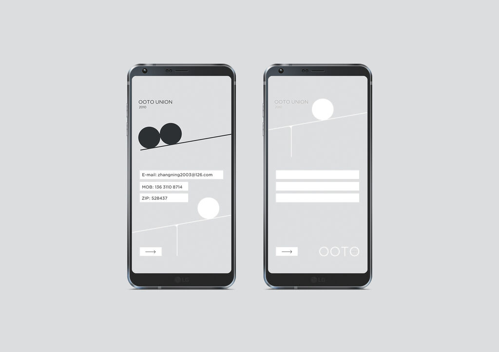
Client: Kia Corporation, Seoul, South Korea
Corporate Identity
YTN
South Korea’s first 24-hour news channel YTN has been known for being a fast and fair information medium since 1993. The new corporate identity is based on the values of fairness, truth and communication. Using the motto “Meet”, the design concept focuses on the communication of insider information to the TV audience. The logo depicts the meeting of two circles and symbolises communication between people. It can be positioned vertically and horizontally as required. The two circles revolving around each other stand for the way in which YTN collects new information over a 24-hour period and delivers it to its viewers. The combination of blue with black and white is a striking colour scheme full of contrast.
参与人士
-
Client:YTN, Seoul
-
Design:Design Park Communications, Seoul; YTN, Seoul
-
Art Direction:Young Chae, Design Park
-
Design Team:Chung Jinsuh, Design Park Suh Jungho, YTN
-
Strategic Planning:Jongwon Jeong, Jisun Shin, Design Park
-
Project Management:Hyejin Lim, Design Park
-
Direction:Sung Woong Kang, YTN
-
Sign Concept:Sujung Jang, Arb Partner, Seoul