International top class: these seven works won the Red Dot: Grand Prix
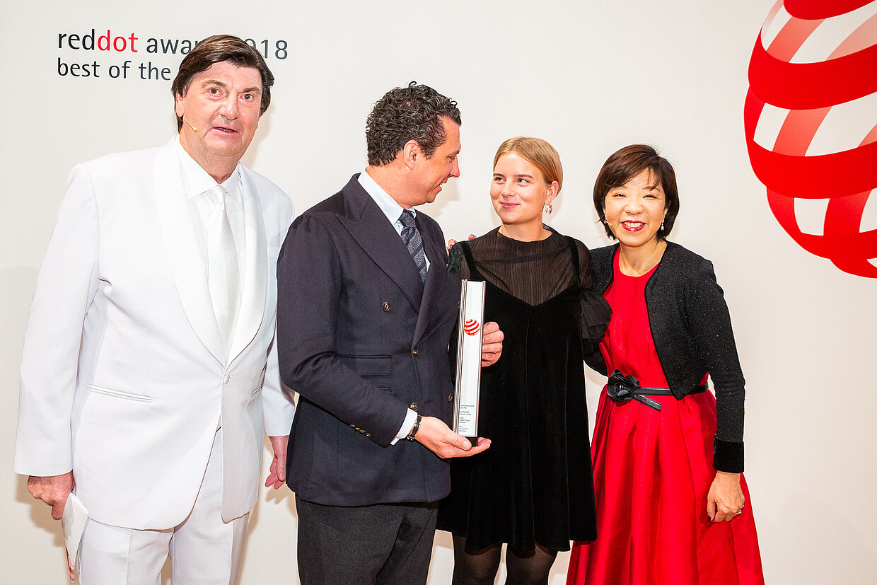
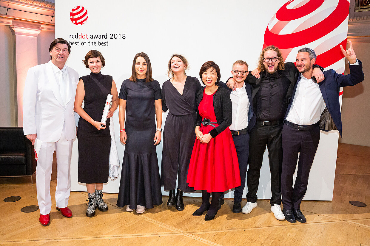
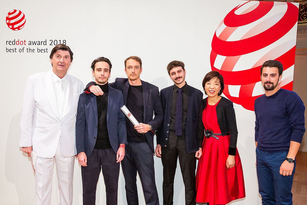
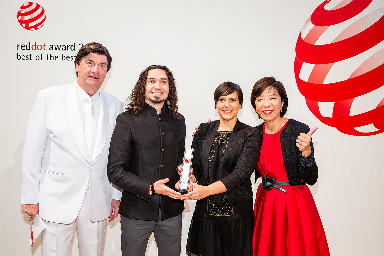
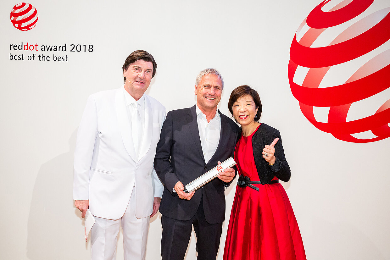
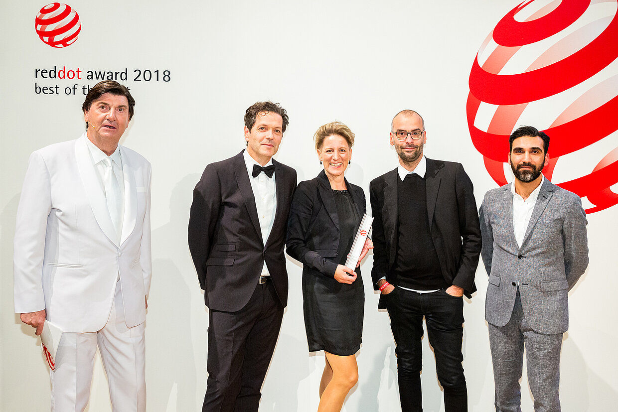
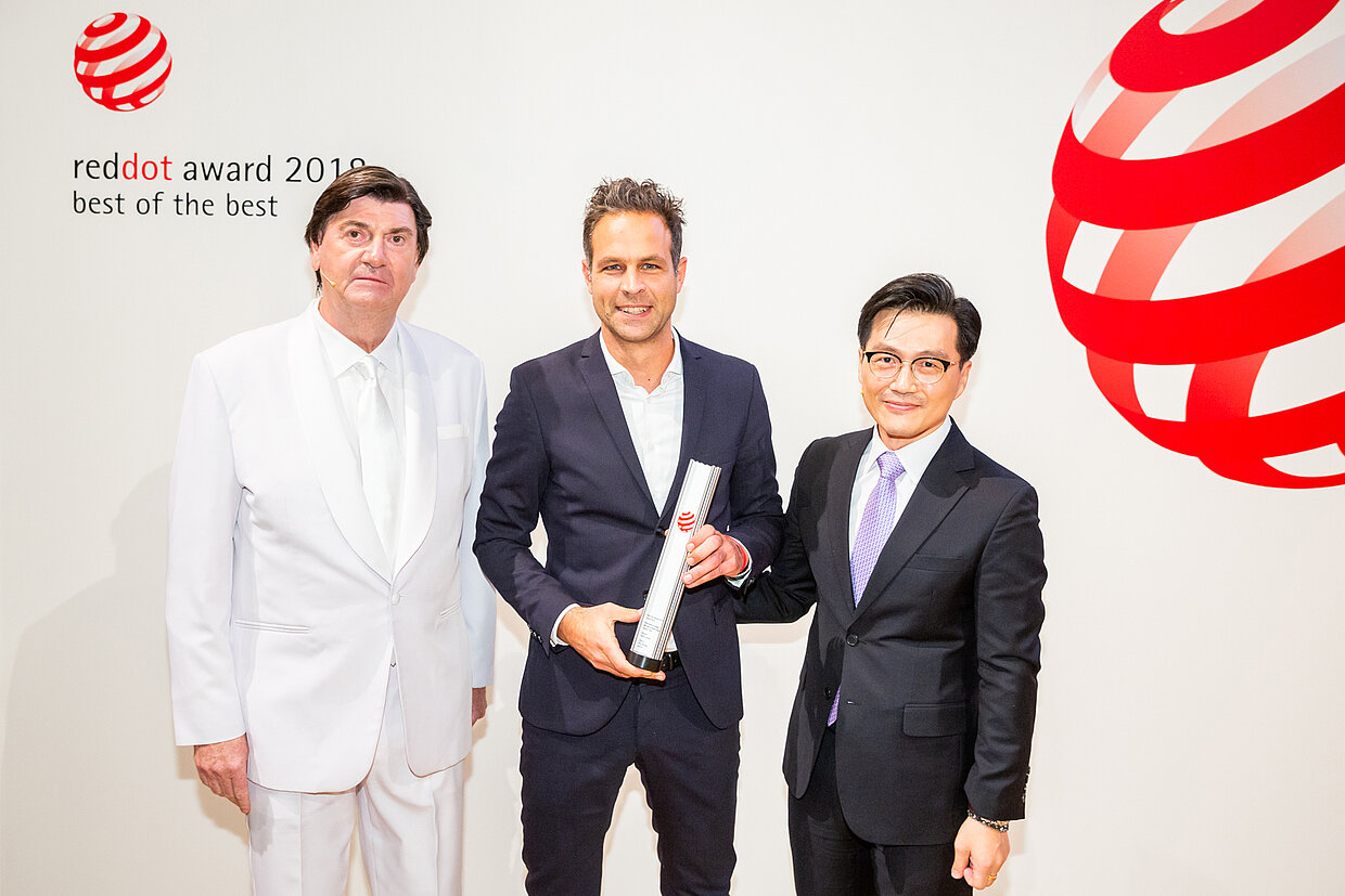
On 26 October 2018, the winners of the highest distinction of the Red Dot Award: Communication Design were honoured. During the award ceremony in the Konzerthaus Berlin in Germany, the competition’s leaders, who were kept secret until the very last moment, were announced. The jury awarded the Red Dot: Grand Prix only to seven works, the best in each category. This is a total of only 0.08% of all entries.
Playful corporate design
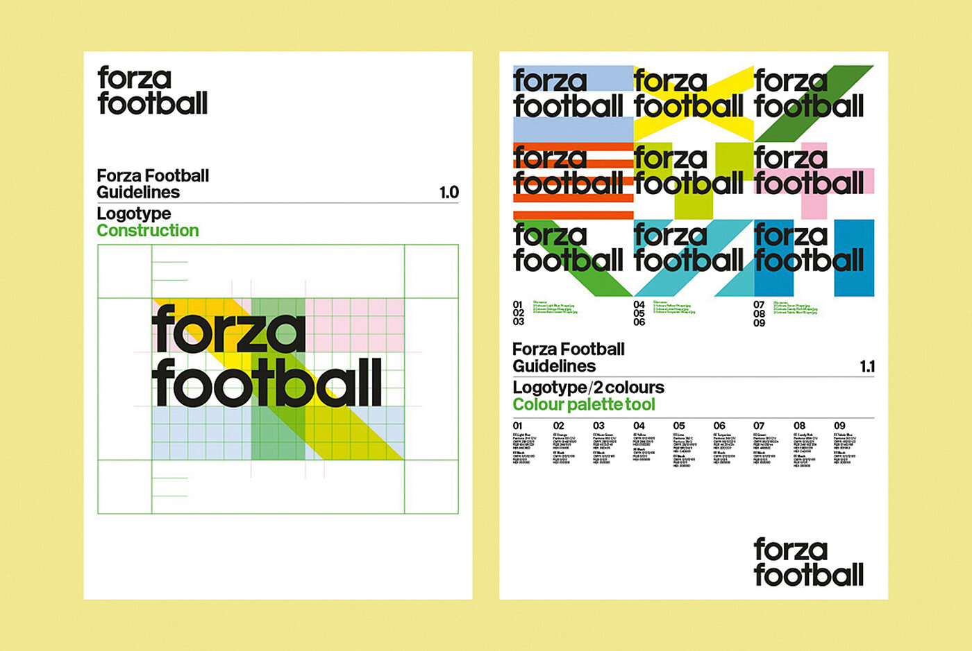
Among others, the corporate design “Forza Football”, created by Kazakoff Design from Stockholm convinced with its exceptional design quality and creativity. Forza Football offers a live score app that provides football fans all over the world with updates. For the visual illustration of the company, the designers adopted a both flexible and playful approach. Inspired by the uniforms of football players and country flags, the design studio created a powerful and fresh corporate design, which illustrates all members of a team: in the company and in the world of football.
Online film with humour and a message
The online film “Everyone is equal. No one is more equal.” by thjnk Zurich, was a big hit with the experts thanks to its design quality. The agency created the clip for Pro Infirmis, a Swiss specialist organisation for people with disabilities, advocating for equal chances, self-determination and autonomy. The film features protagonists with disabilities in everyday situations, e.g. when a vending machine keeps spitting out the same coin over and over again. In a humorous manner, the film manages to convey that people are all equal and are faced with the same challenges in everyday life.
Brand design with a recognition value
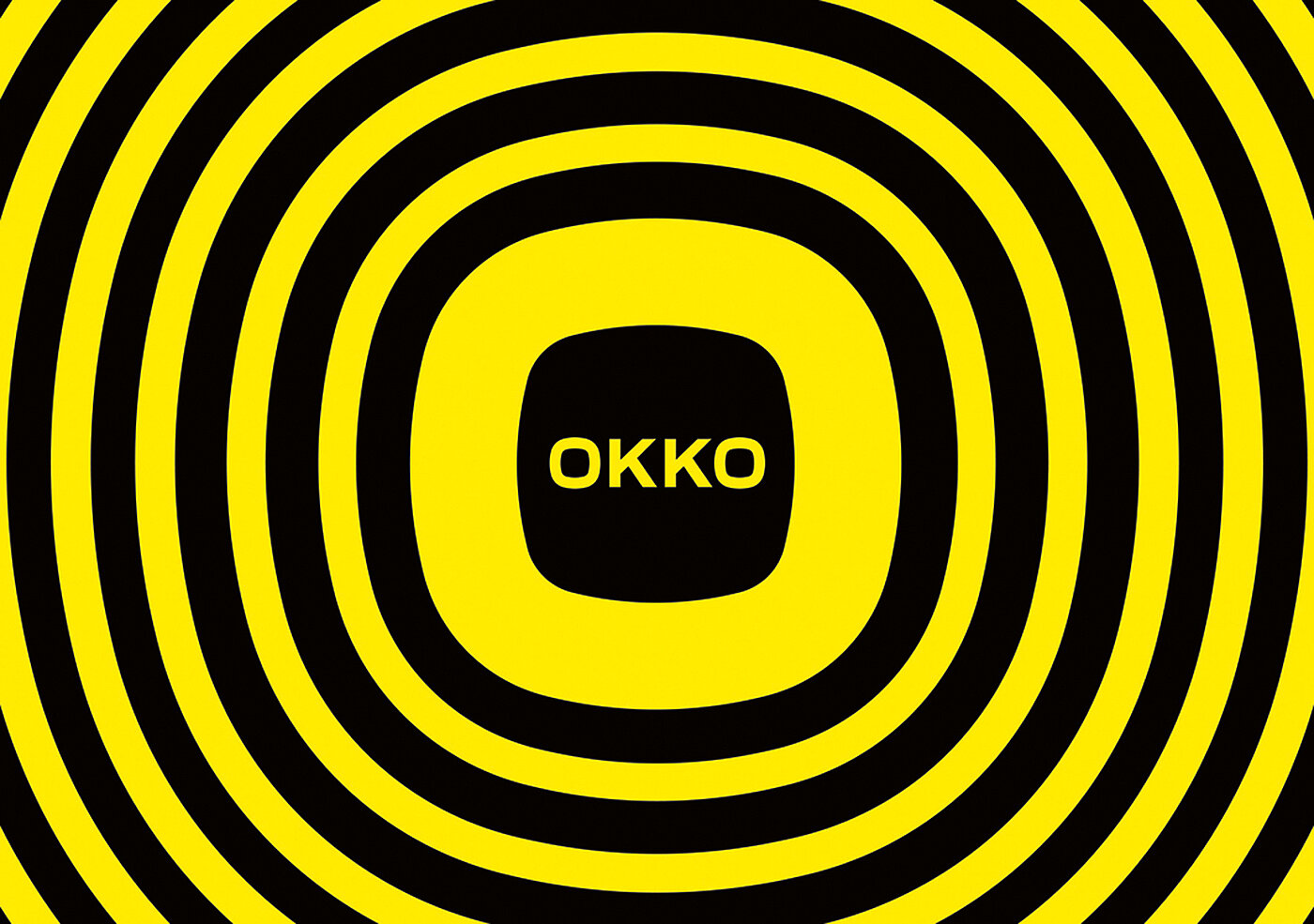
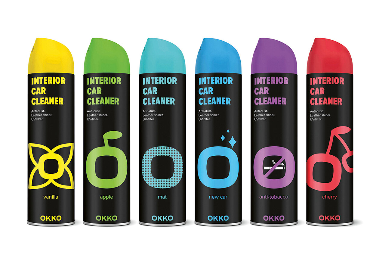
Banda Agency from Kiew is not only the Red Dot: Agency of the Year 2018, but also a winner of the Red Dot: Grand Prix. The Ukrainian creative think tank received it for the brand design “OKKO” by the Ukrainian chain of service stations of the same name. True to the motto “OKKO. Always a good idea“, it also provides products to clean cars, food and drinks. The central element of the versatilely applicable design is the exclamation “O!”, which is often used by people when a good idea comes to their mind. Translated into a unique visual language, the work, featuring a high recognition value, communicates the company’s dynamics. This is further supported by the distinctive rings, which are reminiscent of waves which expand outwardly after throwing a stone into water. The logo’s black colour symbolises petrol and oil, and marks, in combination with vibrant colours, the various products.
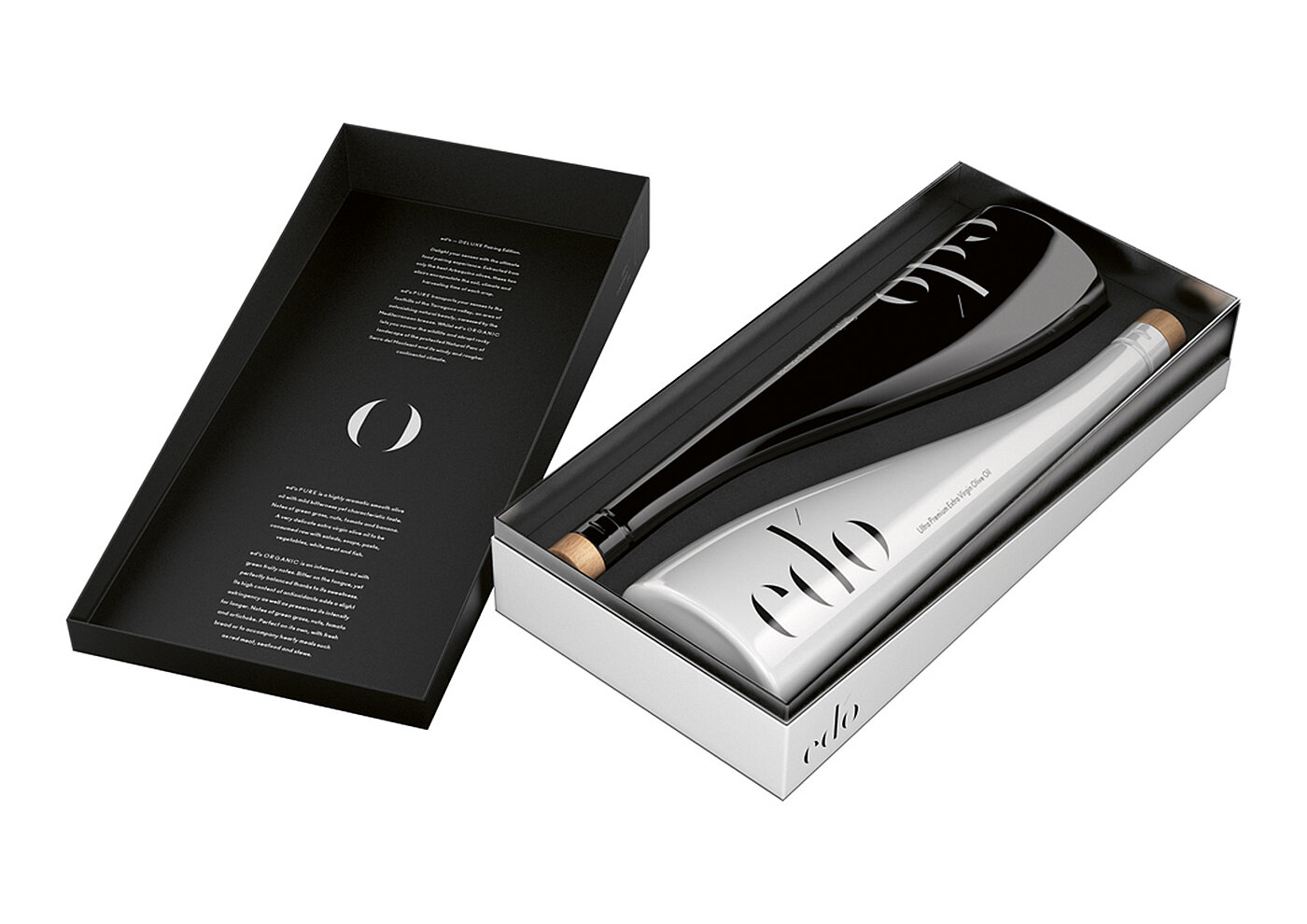
Outstandingly packed
The expert panel awarded another Red Dot: Grand Prix to the packaging design “ed’o Olive Oil – DELUXE Pairing Edition”, created by Taller Design from Gothenburg and Mediactiu from Barcelona. They staged a limited edition of high-quality olive oil for Spanish gourmet food trader Selective Export. Two oils are filled in glass bottles, which rest well in the hand and preserve the nutritional properties. Their wave-shaped silhouette is an allegory of the Mediterranean Sea, where the olives ripe and develop their flavour. While the white bottle contains with “ed’o PURE” a fresher olive oil, the black bottle is filled with “ed’o ORGANIC” which has a stronger character. Together, they are reminiscent of a yin-yang arrangement, which aims to symbolise that the oils ideally complement any recipe. In addition, the logotype of the name underlines the elegance and quality of the products.
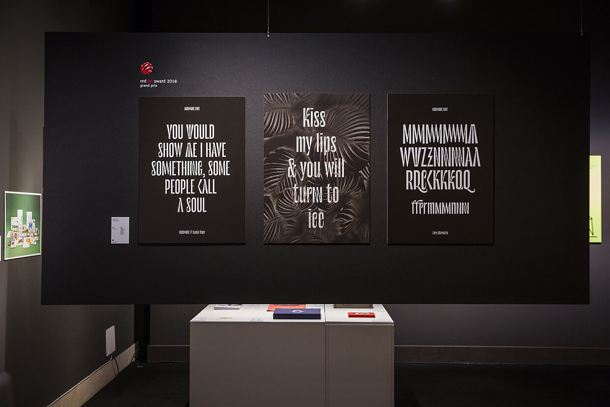
Skilfully playing with letters
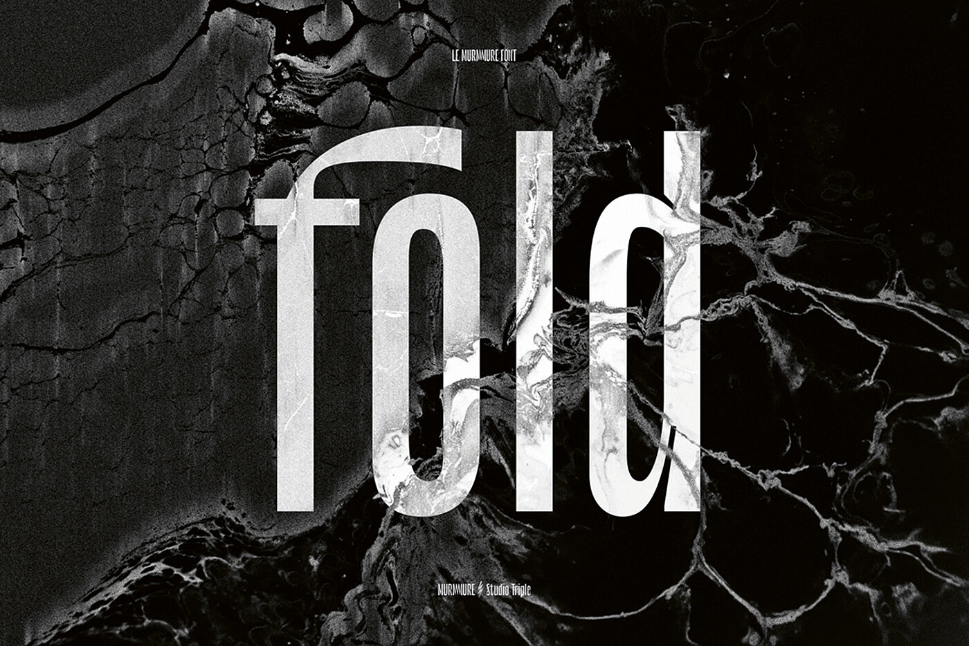
The typeface “Le Murmure” by and for Parisian agency Murmure emerged as the best piece of work in the “Typography” category. In order to renew its brand image, the French creative studio developed a distinctive, yet elegant font. It features surprising stylistic variations such as a duplicated “M” and “N”. The typeface plays skilfully with a mismatch between characters, thus representing the studio’s voice. “Le Murmure” breaks with the idea of reading friendliness and literally demands a close look. Calligraphy and artistic techniques inspired details, so that the typeface emphasises the agency’s joy of experimenting and creativity.
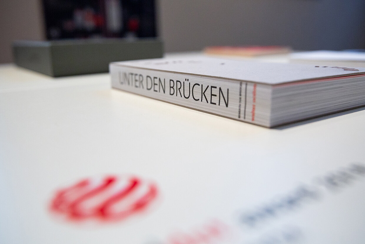
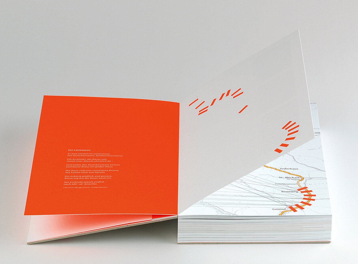
Design which builds bridges
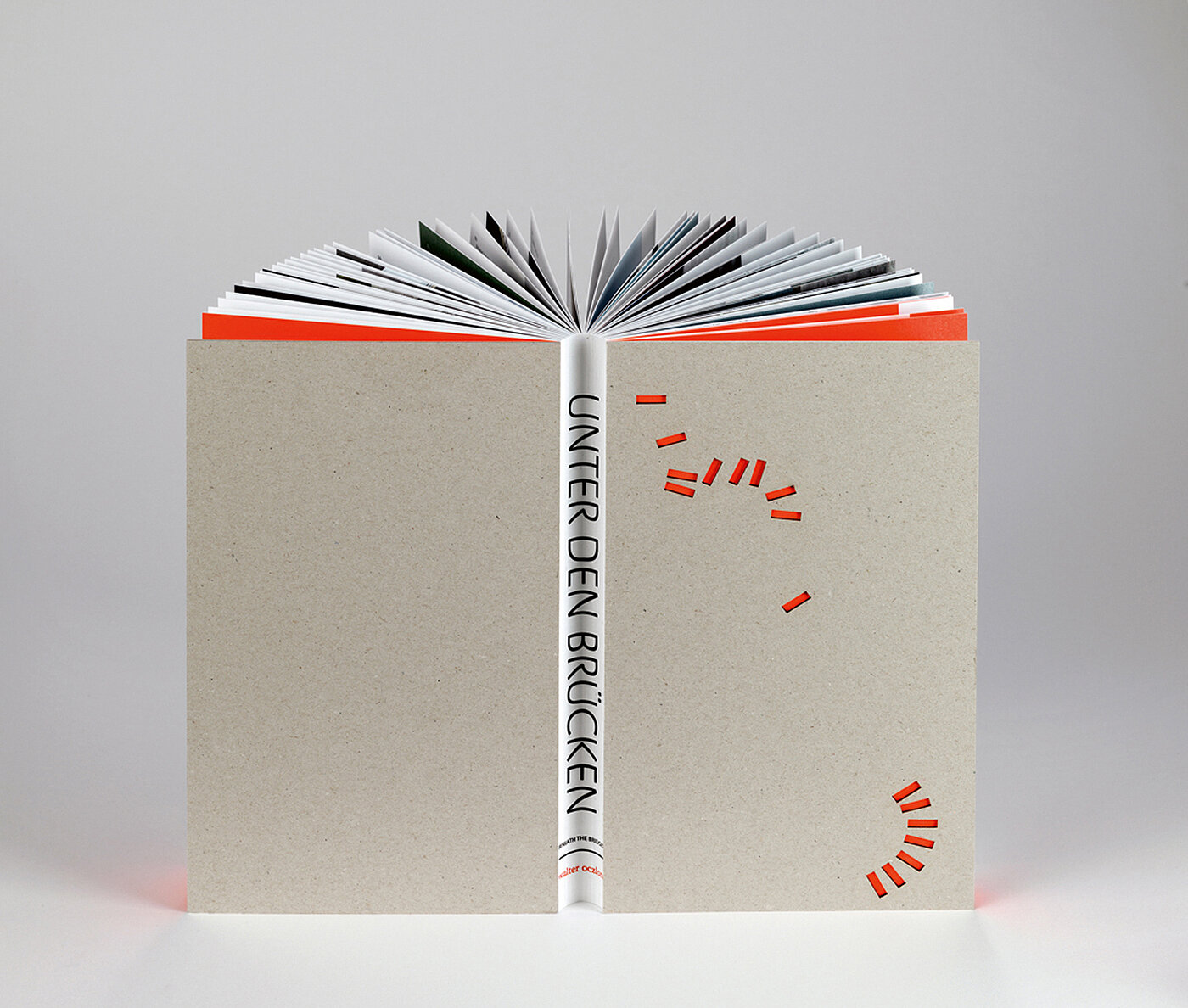
The book “Unter den Brücken” (“Beneath the Bridges”) by the Austrian Atelier Oczlon also stood out from among the entries. Its design succeeds in implementing the topic in a visually outstanding manner: The A10 Tauern motorway is one of the most important north-south connections across the Alps. It traverses Austria on a length of 200 km and leads across numerous bridges that are barely noticed. The publication puts the bridges in the focus. Photographs shot from unusual angles stage the constructions among others like graphical elements within a landscape scenery. Both the grey, plain cardboard cover and the punches in it, forming orange rectangles, signify bridge abutments. Form and content conflate into a highly sophisticated whole in terms of design.
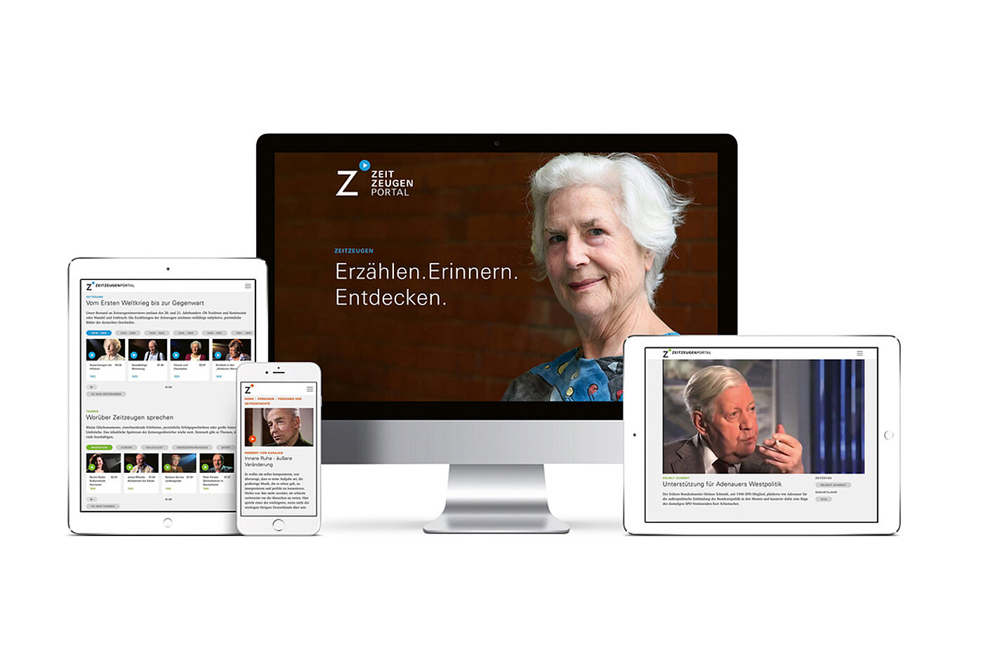
Interactive contemporary witness reports
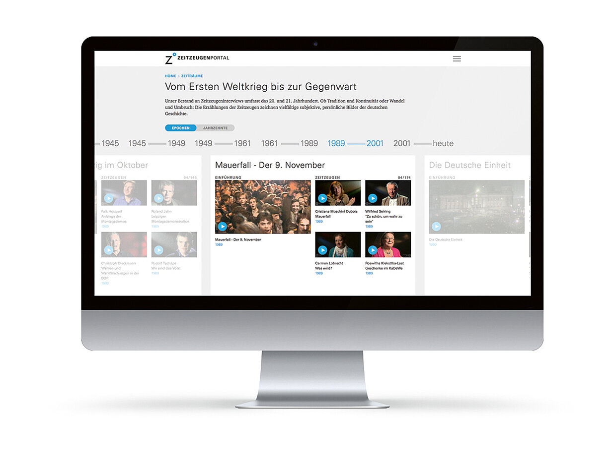
The online platform “zeitzeugen-portal.de Erzählen. Erinnern. Entdecken.” (“Contemporary Witness Portal”) also got the sought-after award. The Red Dot: Grand Prix went to Markwald Neusitzer Identity from Frankfurt and Düsseldorf as well as to the Bonn-based Haus der Geschichte der Bundesrepublik Deutschland Foundation. The website presents video interviews conducted with contemporary witnesses of German history, with the witnesses seeming to be looking straight at the website user. The portal invites visitors to discover, research and analyse individual narratives. Its clear design and intuitive user guidance lend the website a high aesthetic appeal. The project is constantly expanded and represents a great example of engaging online education.
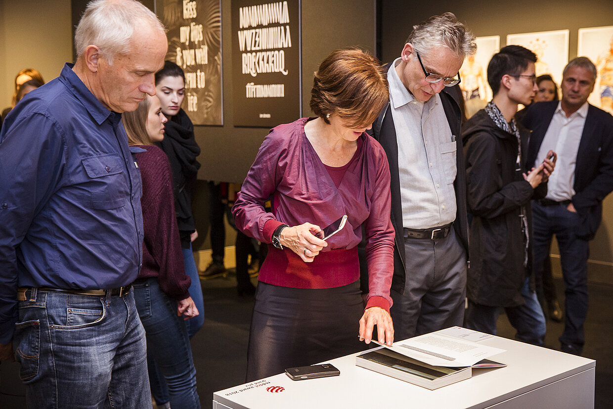
Experience Red Dot: Grands Prix live
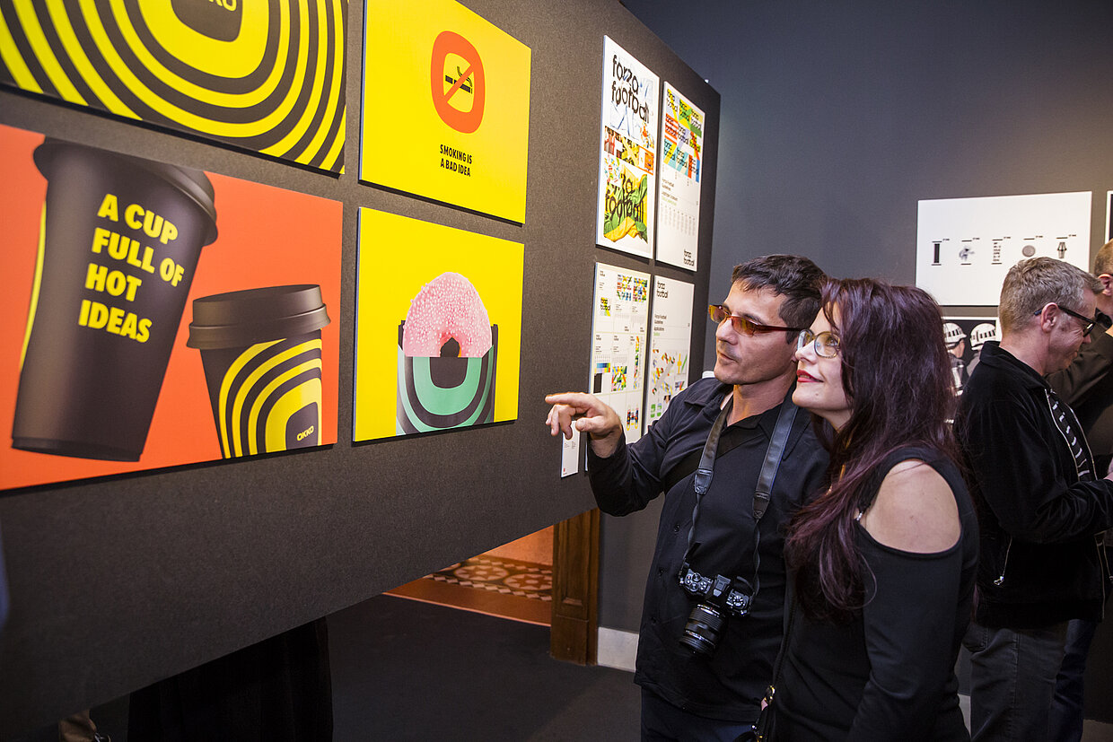
All those who want to experience the outstanding and award-winning design quality of the awarded projects themselves, can do so at the Museum for Communication Berlin until 13 January 2019. The studio exhibition “Best Communication Design – Red Dot Winners Selection 2018” shows an exclusive selection of the works that were successful in the latest Red Dot Award: Communication Design, including the seven projects which were succeeded in winning the Red Dot: Grand Prix, the competition’s highest single distinction.