Loading...
AGAPE
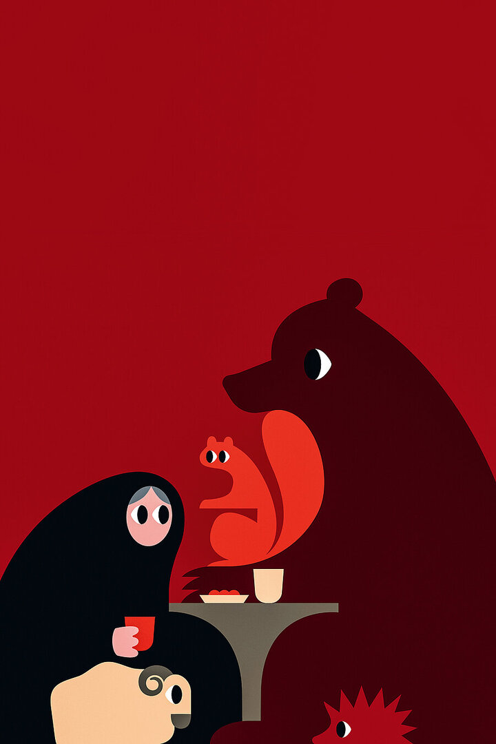
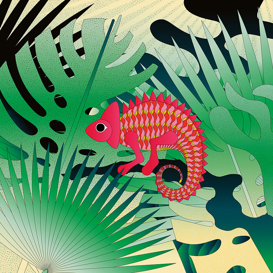
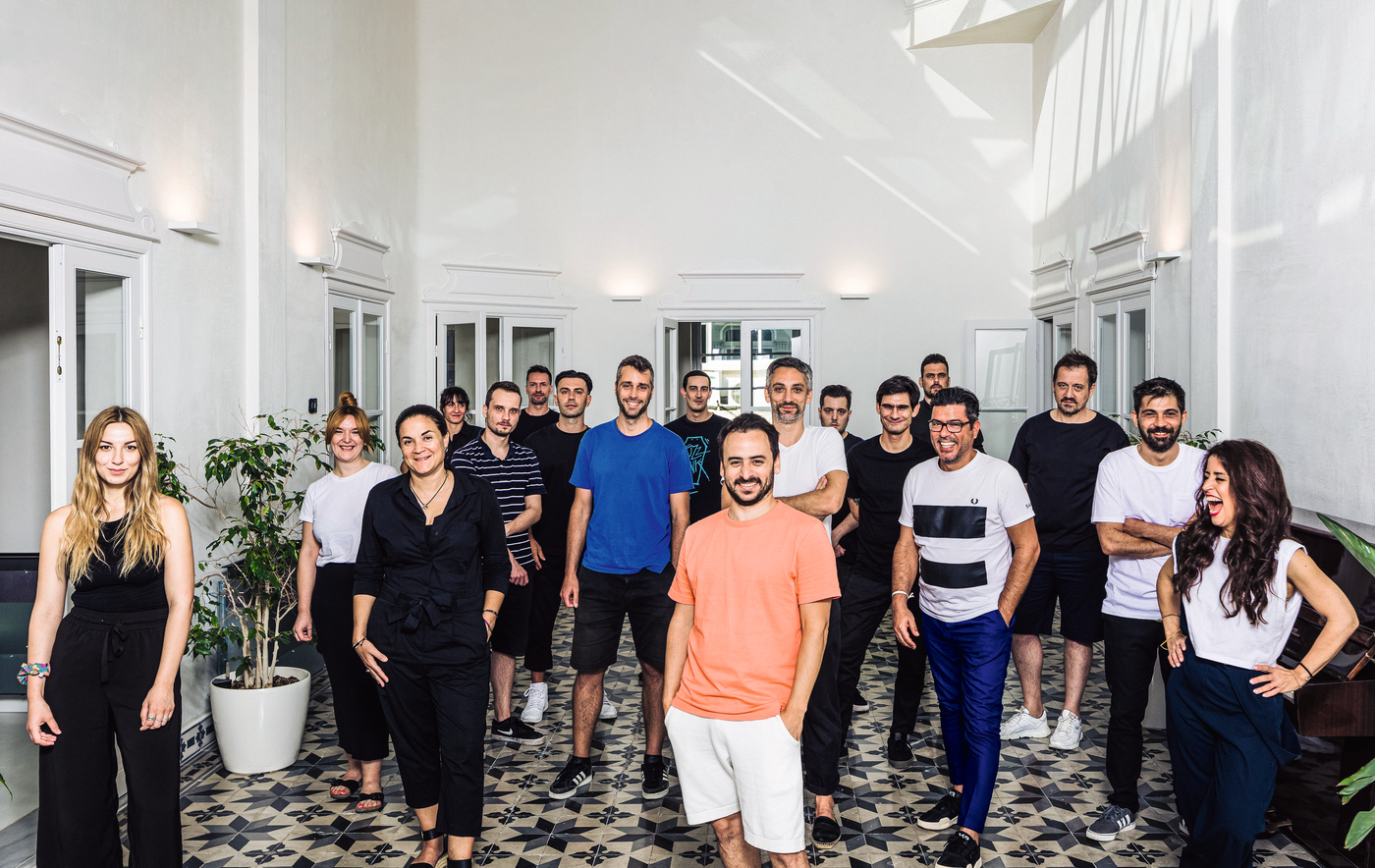
Beetroot’s communicative solutions are as strong in character as they are well-thought-out: for each project, a 25-strong team intensively explores the core of the brand, product or service to create a distinctive identity. Not infrequently, the power of illustration ensures individuality, across all media and for a wide range of clients. The agency's creative roots – true to its name – are interdisciplinary and never cease to surprise.
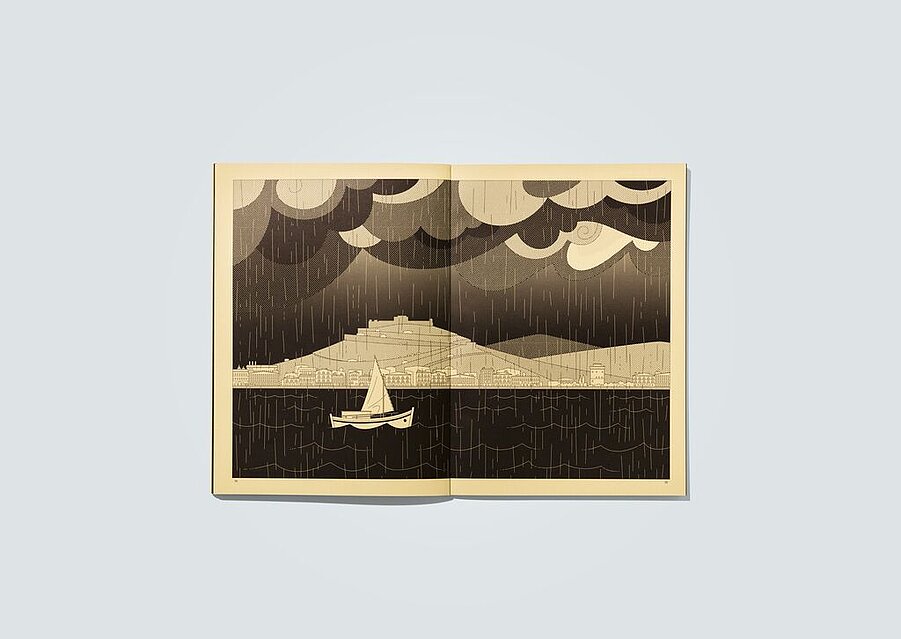
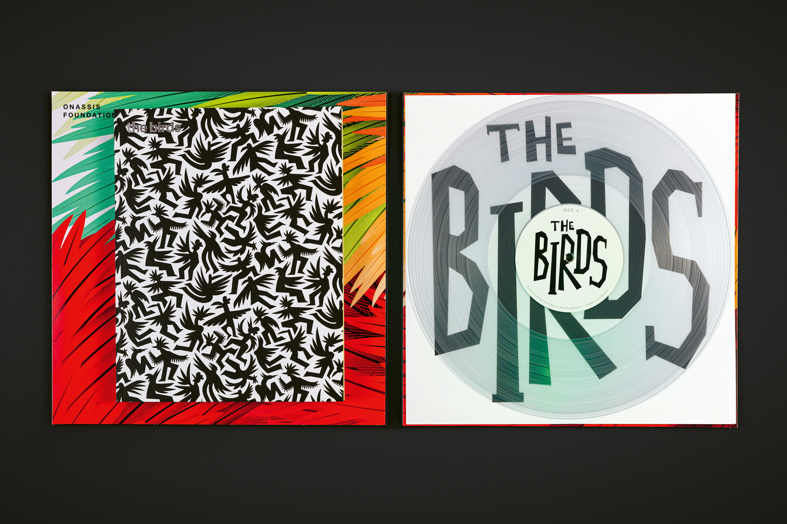
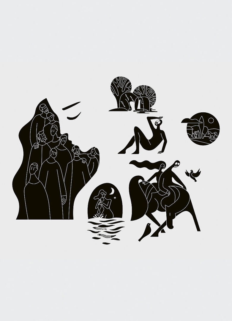
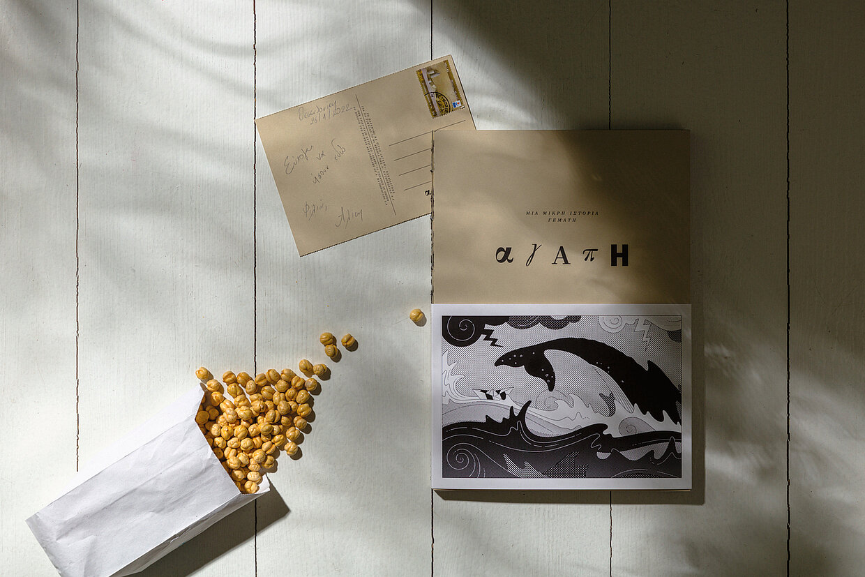
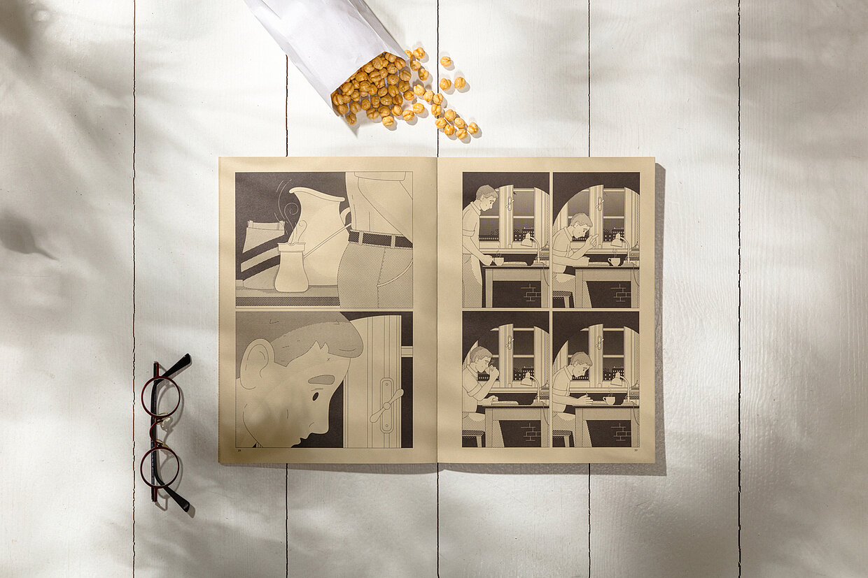
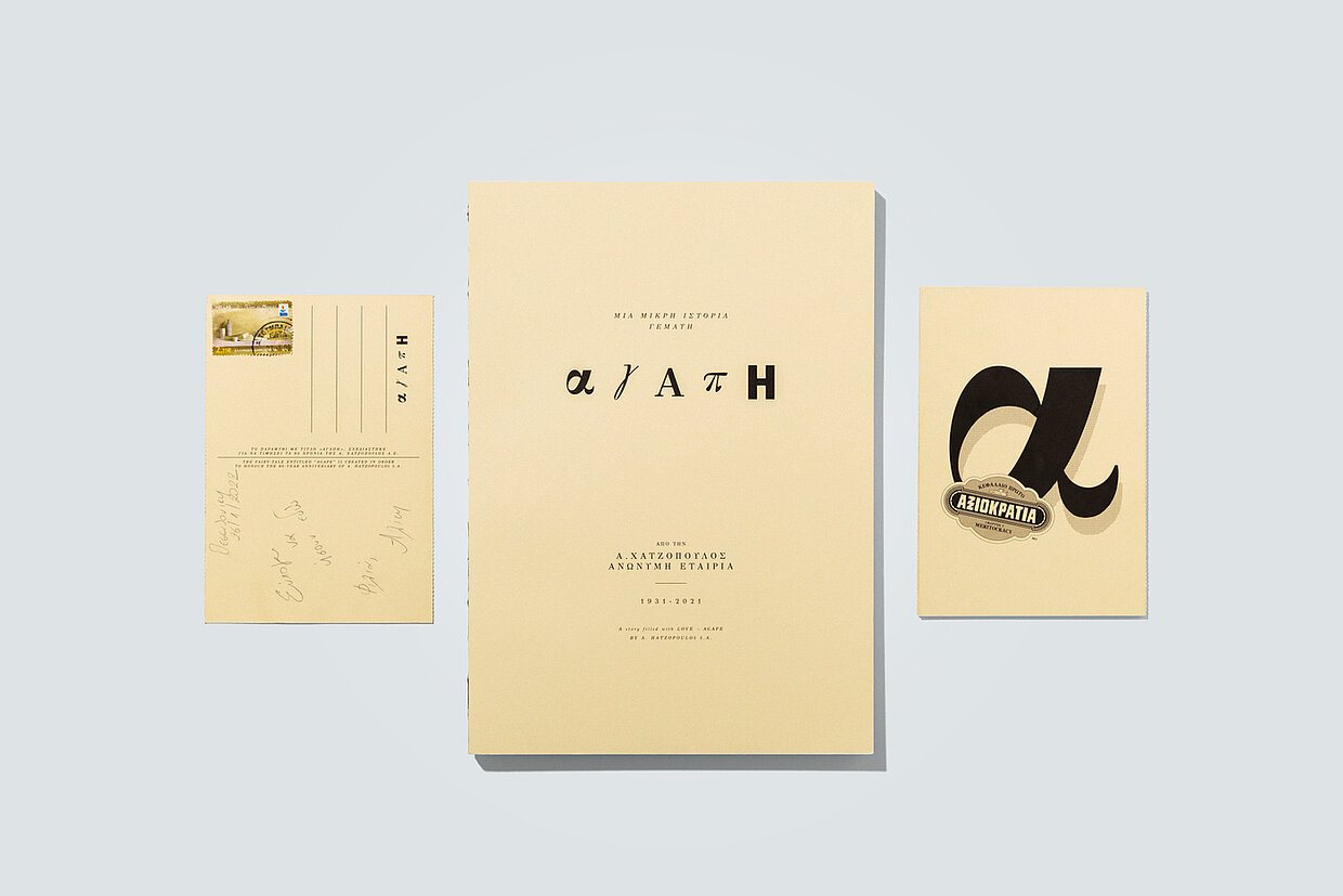
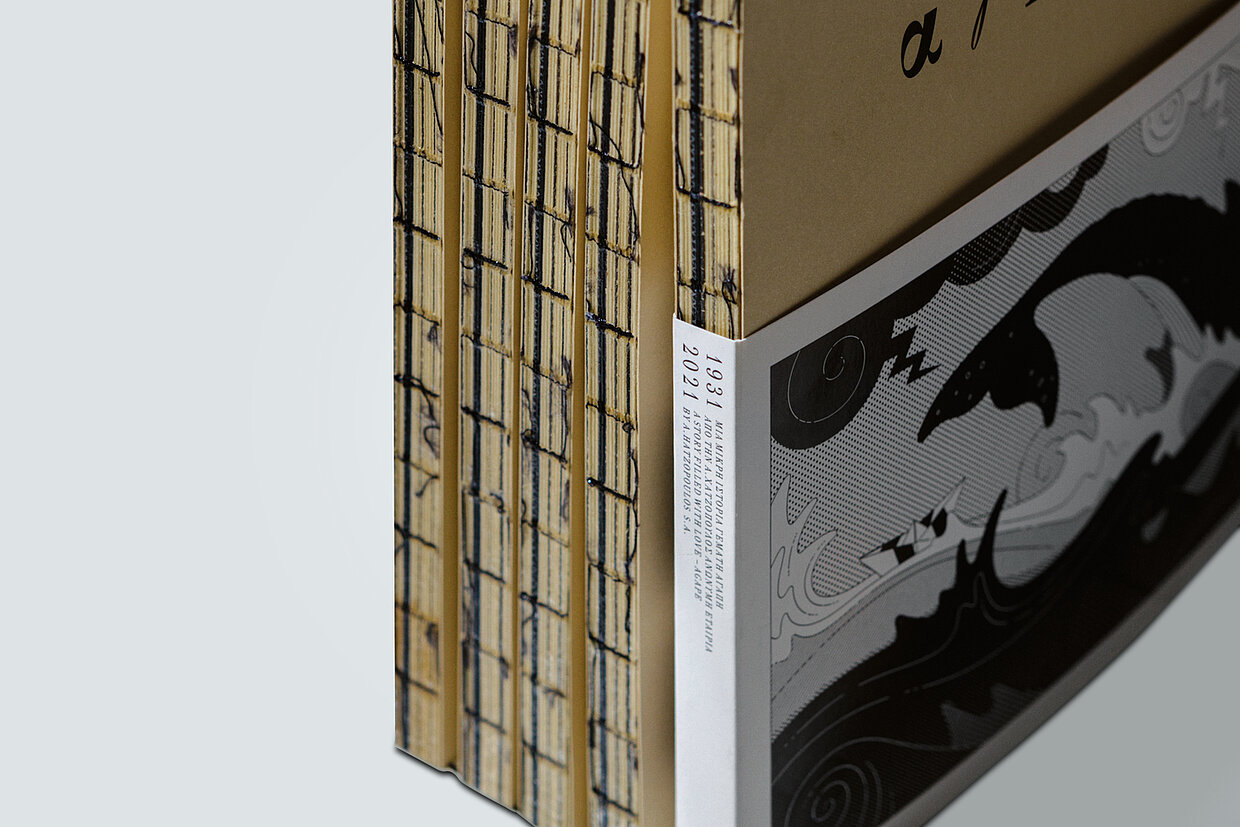
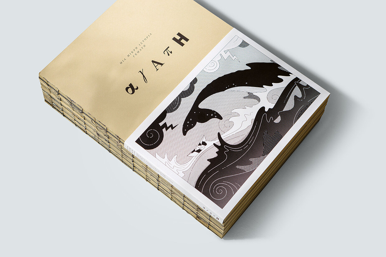
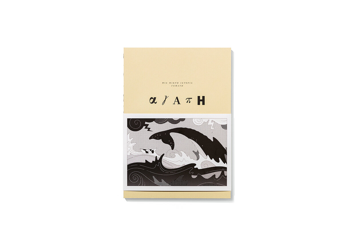
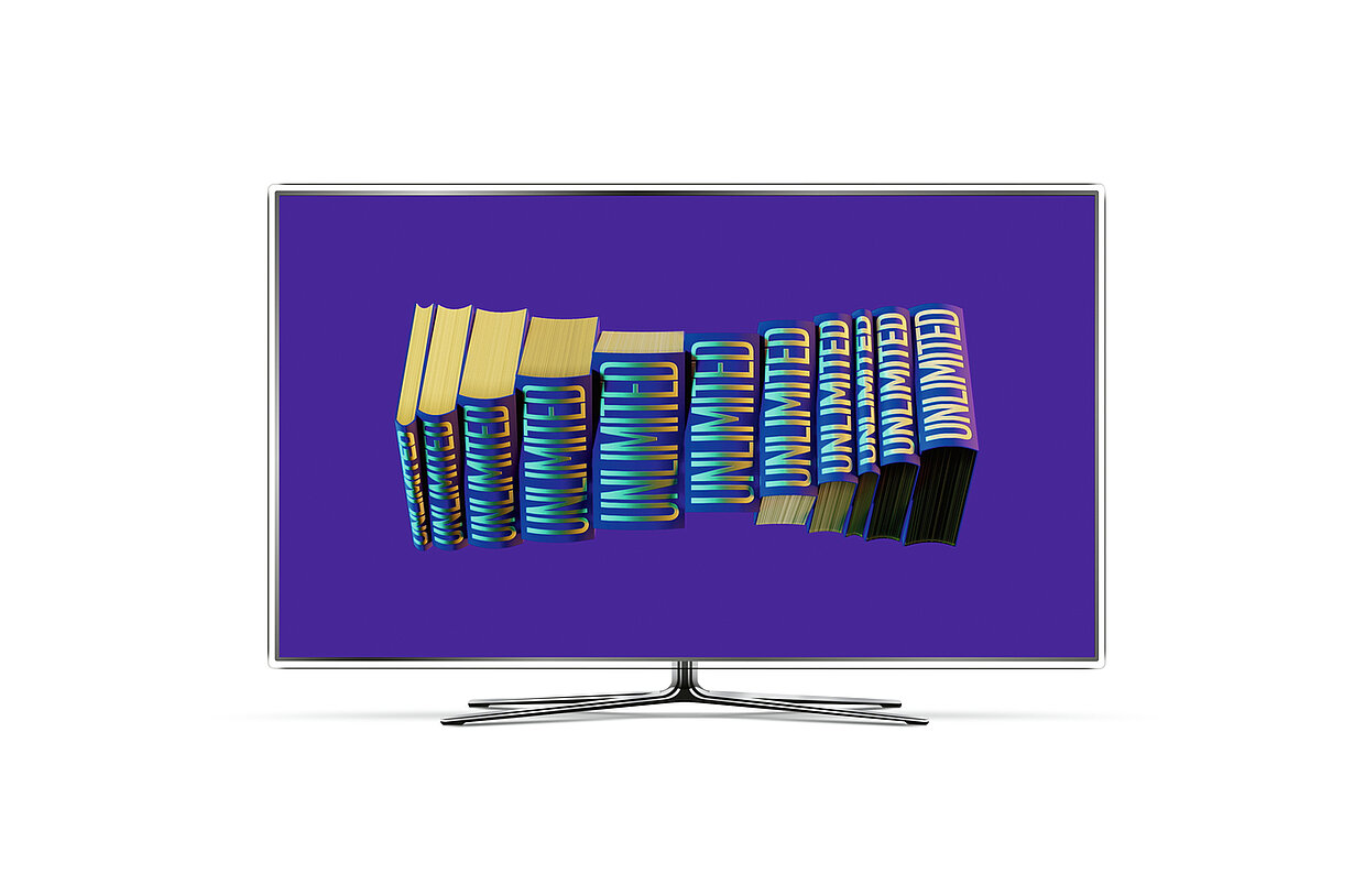
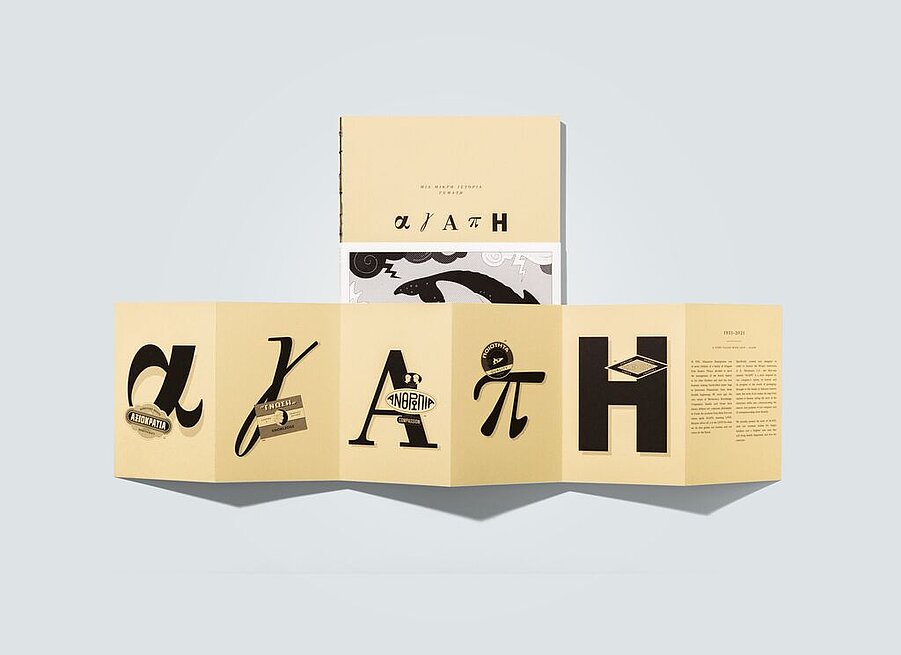
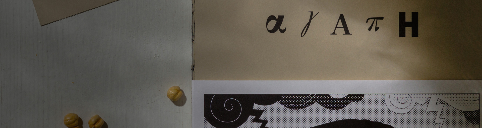
The publication for a client company’s 90th anniversary also surprised with its special concept: Beetroot had created a graphic novel that tells a fictional story, yet one that draws on the experiences of the company’s founder. Realised in monochrome and with reduced lines, this hommage moreover haptically quotes a common appearance of packaging from the past.
Red Dot: Many of your works are illustrative. What can illustration do that photography cannot?
Beetroot: Illustration plays a pivotal part in communication design. It is a unique branding tool that can make the brand/campaign distinctive, engaging and recognisable. Compared to photography, it is less restrictive. There are literally no limits to creativity with illustration, as it is not necessarily committed to realistic representation. Moreover, illustration is less descriptive, and therefore more suggestive and evocative – a great tool to eliminate excessive or unnecessary design elements.
What role did the paper, the feel and the print finishing play in the AGAPE project?
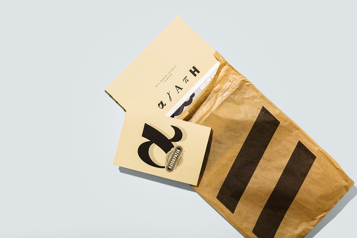
A very central and important role. The design of the book follows, borrows from and reintroduces the culture and style of old-school packaging and typography within very tightly defined design parameters. Furthermore, the cover of the book features visible stitching that allows each centrefold to be fully opened without creasing the pages. Additionally, the book is “packaged” in a plain brown paper bag adorned with a simple, parallel-line symbol that is used throughout the book both as a substitute for the company logo and as a cohesive visual line spanning from chapter to chapter.
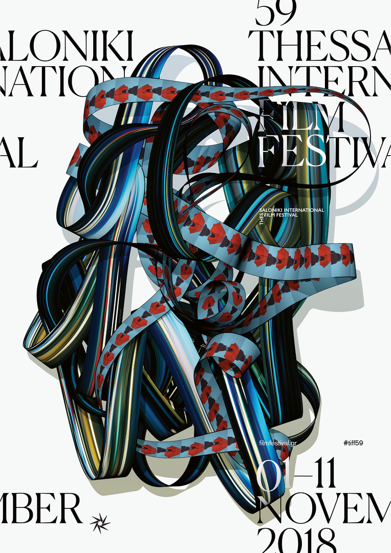
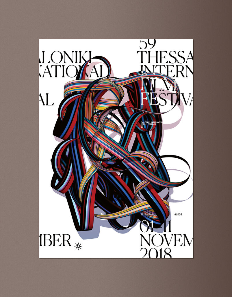
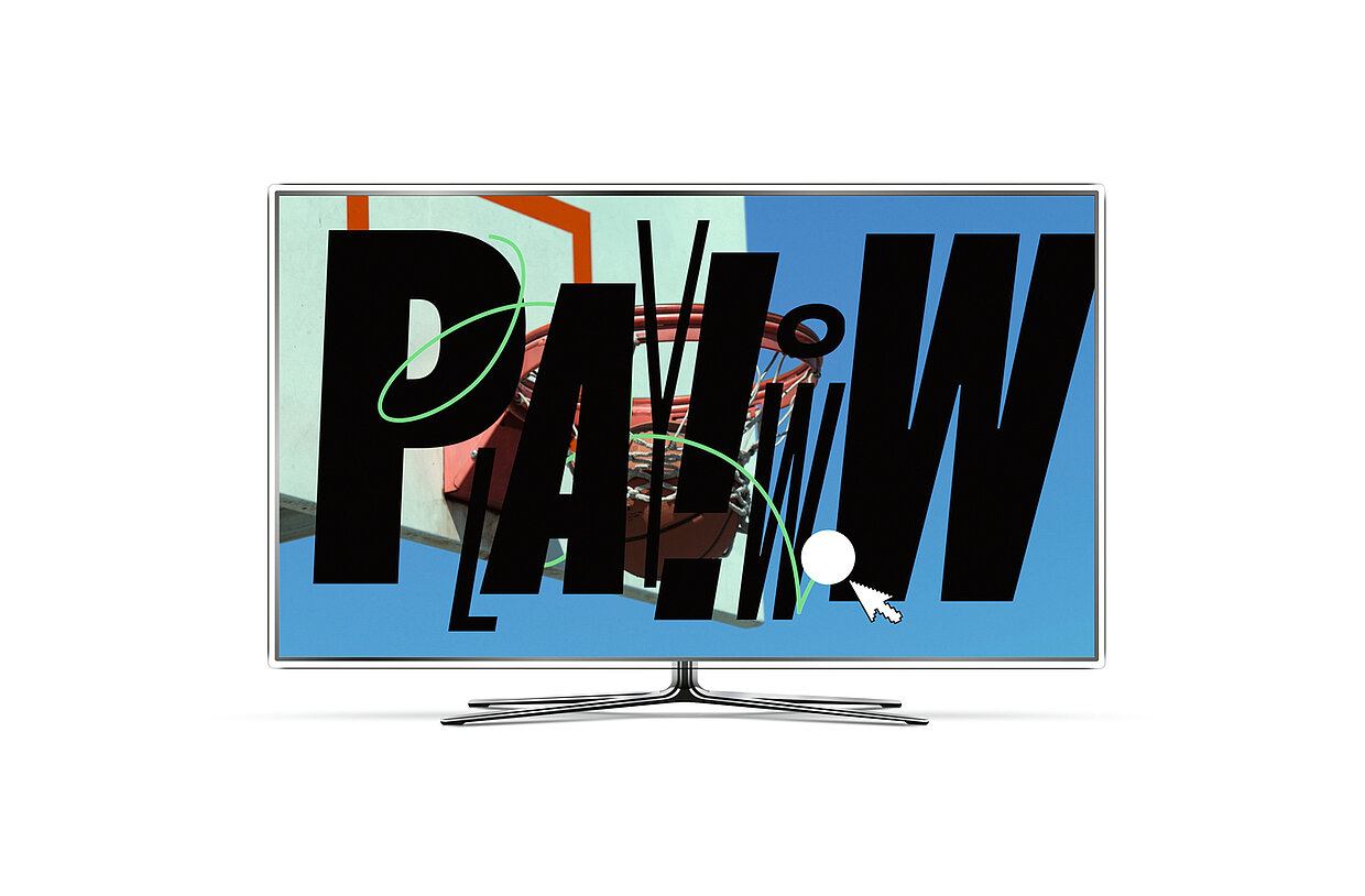
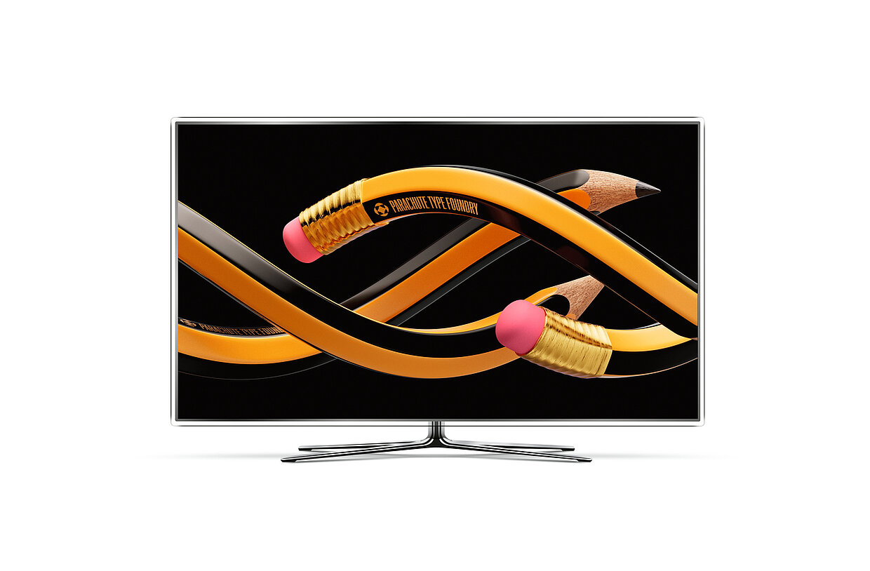
To promote the new, flexible DIN Max typeface family by their fellow creatives at Parachute, Beetroot produced a fast-paced film clip that conveys the strengths of the font in just under a minute. Splendidly colourful and with surprising visual wit, it impressively showcases the many styles, weights and variations of the typeface.
Red Dot: For the new DIN Max typeface family by Parachute, you realised a promotional video that focuses on the flexibility of the font. How difficult was it to condense this message to less than a minute of film?
Beetroot: It definitely was a challenge. But it inspired us to come up with the idea of a fast-paced video, as a mini clip reel, that immediately “reels in” the audience. With this approach, we managed to visualise a wide range of DIN MAX applications and highlight the enormous potential of the typeface. We have also shown how the typeface lends itself to use in various industries, which further expands the range of potential customers.
What is it generally like to design for designers?
Working for other creatives is almost as hard as working for yourself. Still, it is always refreshing and liberating to work for clients who have faced the same challenges and understand them the way you do. The actual challenge is to bridge the difference between two individual design philosophies. Working for Parachute gave our team extra motivation to satisfy fellow designers. We enjoyed both their confidence in our design language and the creative freedom they gave us.
Typography is …
… arguably one of the most important tools of visual communication design. For us designers, typography is much more than just a medium to convey information – it is an entire field of creation.
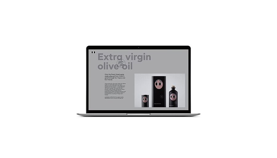
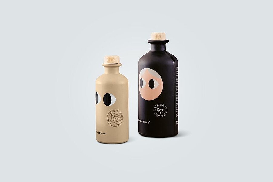
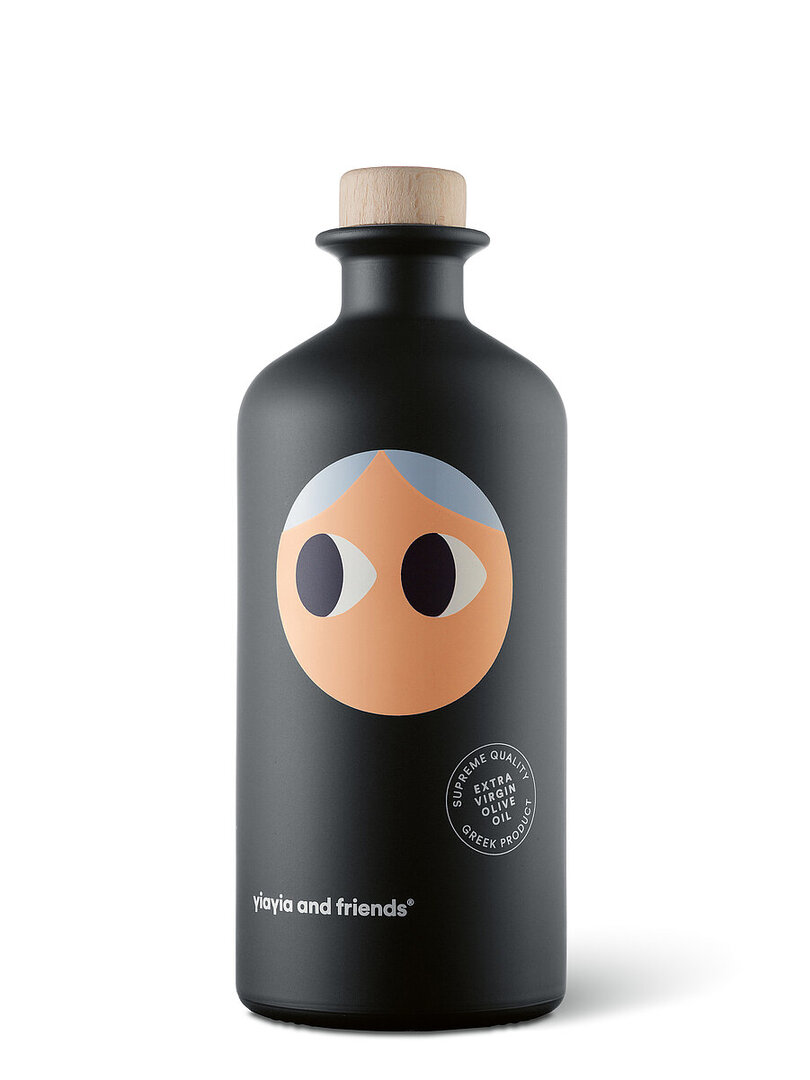
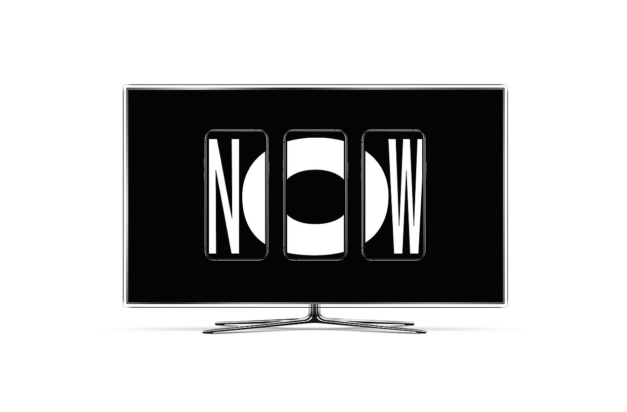
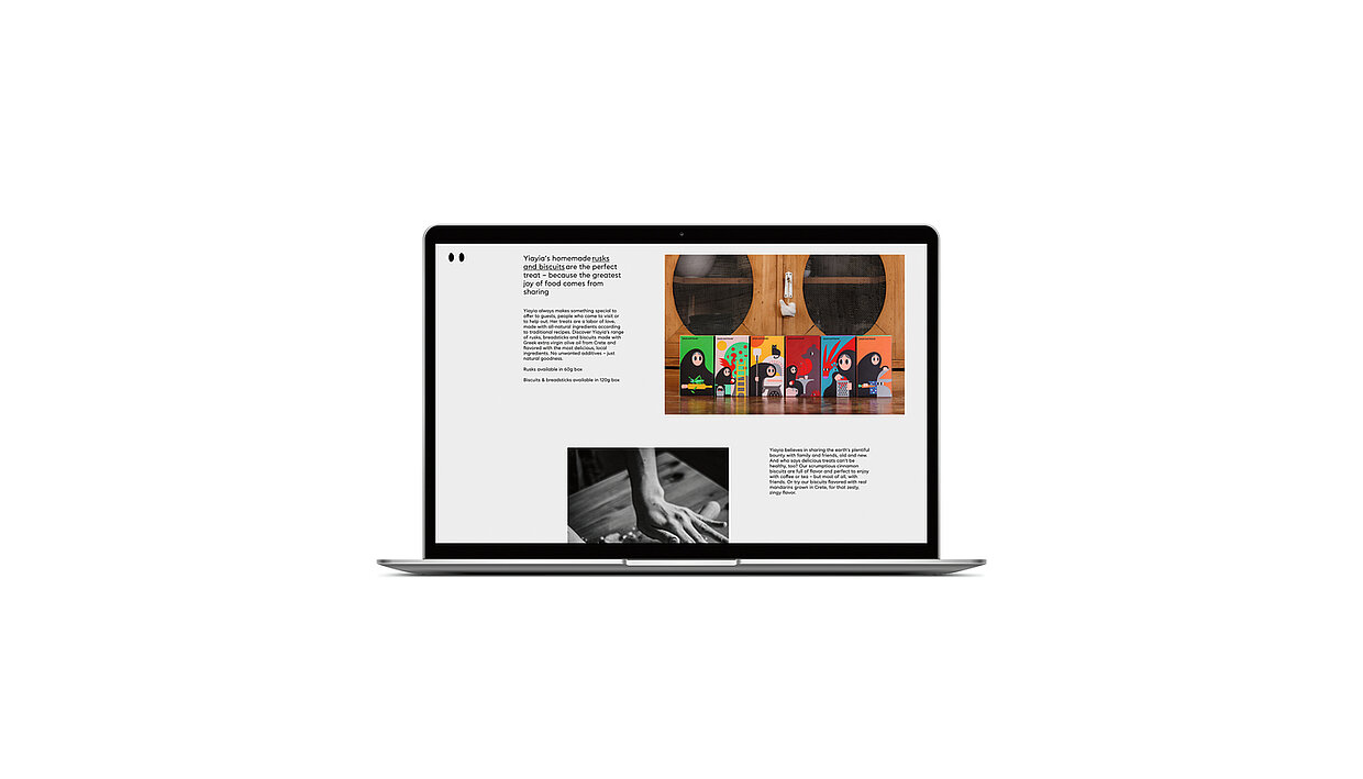
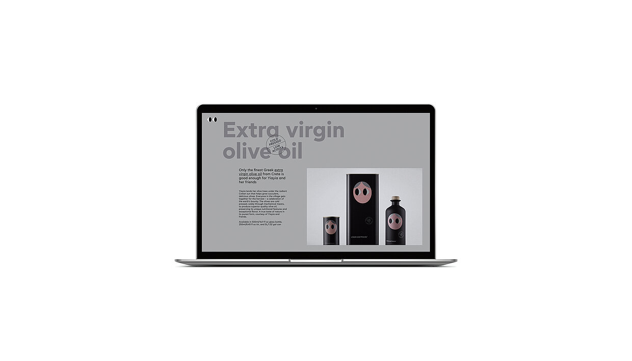
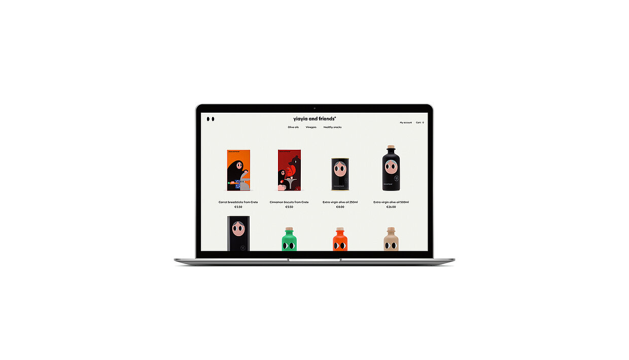
Yiayia and friends was conceived as a multifaceted food, design and education project for a wide audience that, in an engaging and playful manner, is about cultivating, preparing but also about sharing food. The website created for this purpose is also intended to serve Yiayia and friends as a retail e-commerce channel – a balancing act that the creative minds at Beetroot have mastered with strong storytelling and an individual visual vocabulary.
Red Dot: The website “yiayia and friends” relies on strong storytelling. How important is it today to convey information through gripping stories?
Beetroot: In today’s digital age, brands need to tell compelling and truthful stories to reach and connect with their audiences. Online audiences are more discriminating and perceptive, and they respond positively to more authentic and emotionally engaging content. We believe so strongly in the value of storytelling that, throughout the yiayia and friends e-shop, the narrative is the dominant element of the site, above and before any commercial aspects. On yiayiaandfriends.com, it actually takes some effort to locate the products, contrary to current marketing trends and guidelines – we feel that, in the long run, it is more important to learn about the story of the brand first.
Is it one of the greatest challenges for designers today to master technical knowhow and creative craft in equal measure?
Yes, it is. In our multidisciplinary team, this philosophy is deeply ingrained – and it is not limited to designers. All our team members, even those who are not actively involved in the creative processes, figuratively get their hands dirty, constantly learning new skills and experimenting in different areas.