Award-winning companions for the new year: these calendars were enchanting in the Red Dot Award 2018
Around 6,000 years ago, Nile has regularly bursted its banks every 365 days. This meant fertile soil for farmers in old Egypt. Today, we no longer need a river to organise the year, as calendars ease our live. Digital or analogue, big or small, for the pocket, the table or the wall – in their multi-facetted forms and with their different designs, they satisfy the users’ needs. Being indispensable helpers, calendars serve for organisation, remind us of important dates and ideally also convince us in an aesthetic way. Shortly before the year draws to an end, we have a look at calendars which won a prize in the Red Dot Award: Communication Design 2018. One of them can become a constant companion in the next year.
When a calendar becomes art
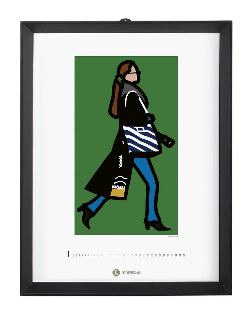
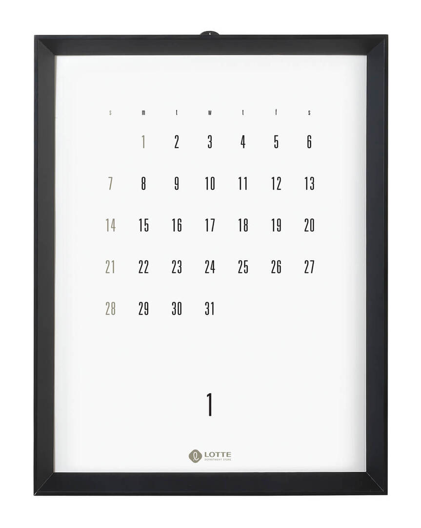
This calender for the year 2018 was created for the customers of Lotte Department Stores in South Korea. It is based on Julian Opie’s motif series “Walking people” which assigns to pop art, a genre that is very popular in Korea. What makes this calendar so special is its format, as it is displayed in a frame. This way, the Red Dot awarded calendar “2018 LOTTE Department Store” fulfils its traditional function and is furthermore experineced as a complete work of art by the beholder. Each of the 13 works can be hung up separately from the calendar, which was designed by Cat Communications from Seoul.
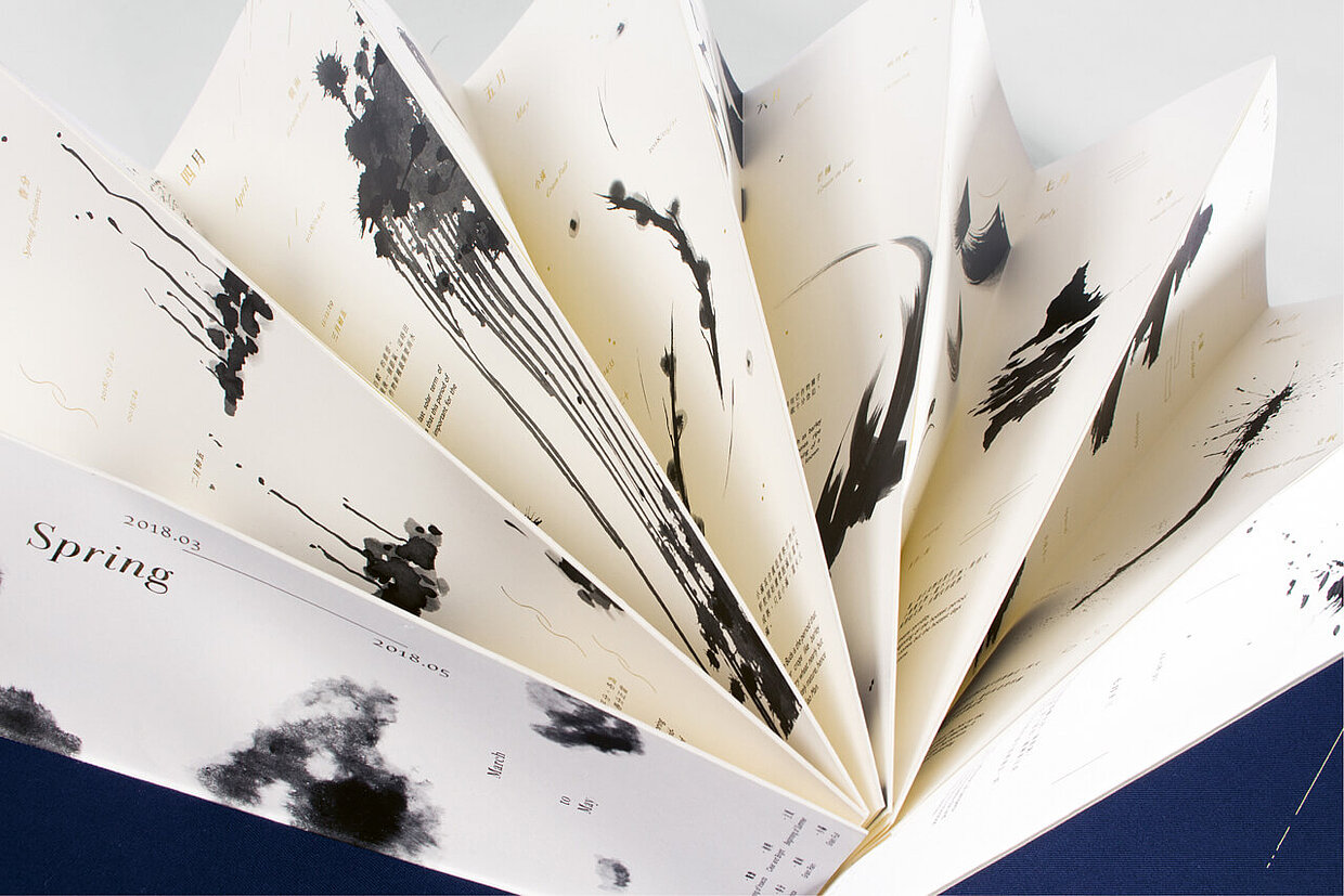
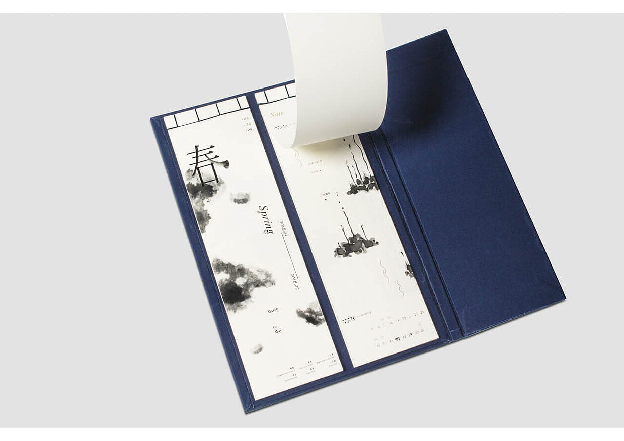
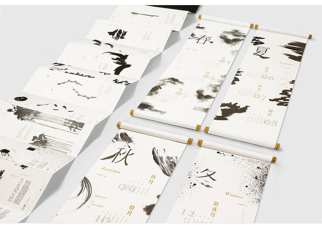
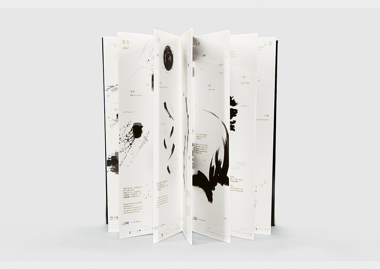
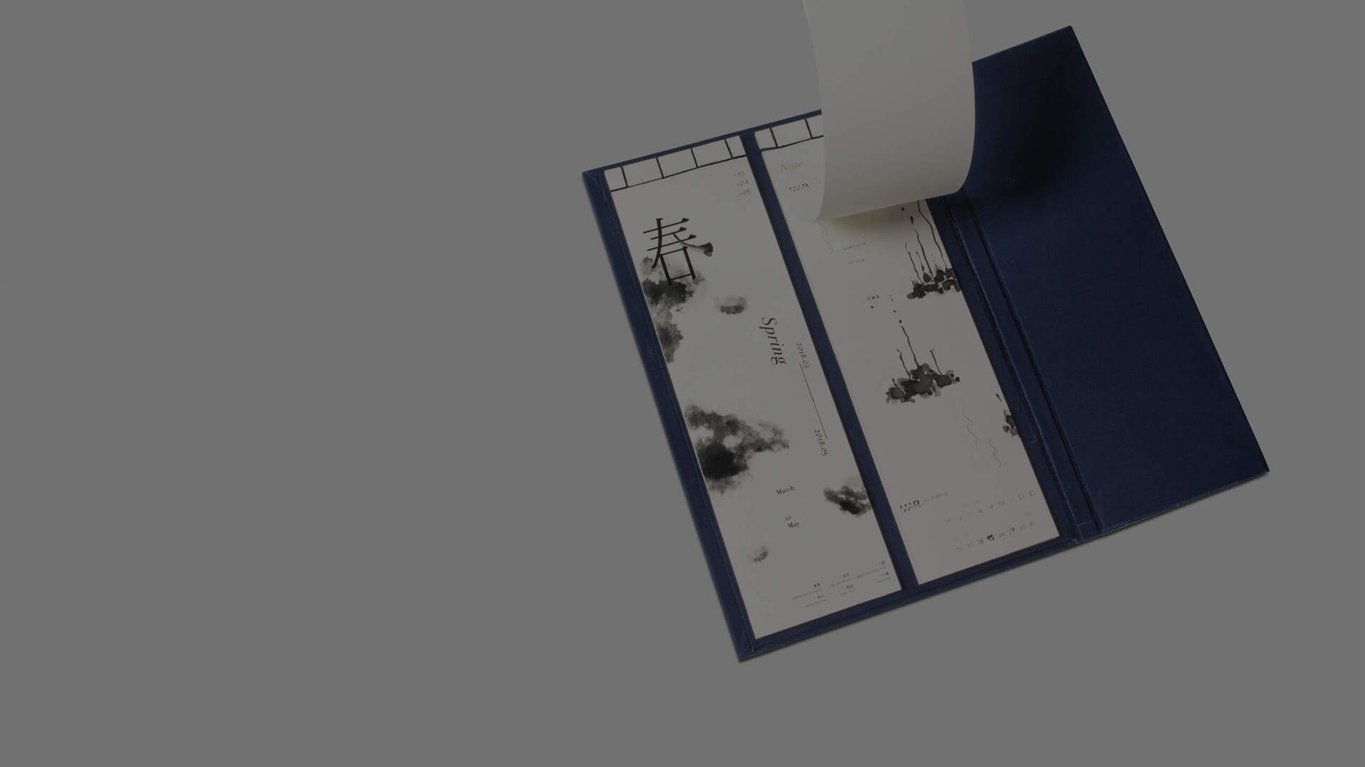
The numerous forms and styles of ink and brush strokes have played an important role in Chinese tradition over thousands of years. The calendar “The Changing Season” uses this variety to depict the four seasons. Just like these change in the course of the year, ink painting is constantly changing and evolving over the years. While the user flips through the pages of each month, his or her attention is drawn to the cultural uniqueness of Chinese ink as well as to the characteristics of each time of the year. Spring for example is symbolised as the season of reincarnation. Within the Red Dot: Junior Award, the calendar, which was designed at Taiwanese Shu-Te University, was awarded with the Red Dot.
Cultural exchange
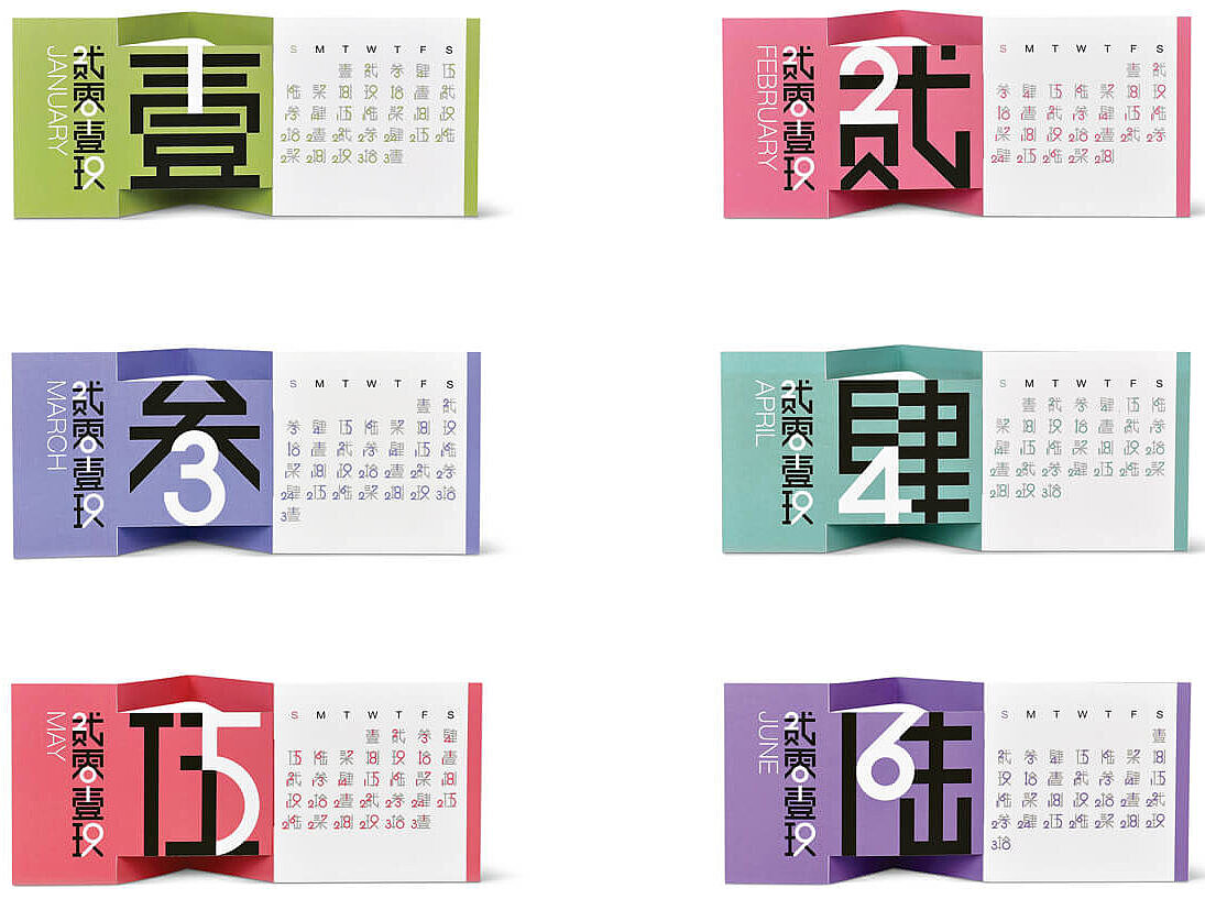
The title of the calendar “The Blendar 2019” originates from the words “blend” and “calendar” which characterise this Red Dot awarded work from Shanghai Jiao Tong University. While the term “calendar” stands for the function, “blend” represents the principle of the typographical design. On the calendar sheets, Chinese number characters and Arabic numbers blend together, thus allowing the user to read the calendar even if they do not know Chinese at all. Complementing the intertwining graphical elements, the harmonious colour scheme illustrates the idea of contributing to a fruitful exchange between China and the Western world – a good New Year’s resolution.
Discover award-winning design online
Whether calendar or communication design from another field – Designers from 45 countries have set high standards in the Red Dot Award: Communication Design 2018, which will be leading the way and inspiring for the future. The online exhibition presents all of the prize-winning works with pictures and explanatory texts.