
Cheng Shiu University
Winners profile
The creative engine of Yu-Yun Hong, who studies visual communication at Cheng Shiu University, is not only her passion for design: she wants her work to evoke positive emotions, solve problems and create value. “While I strive for innovation, I always keep in mind the purpose of design and its practical requirements.” This is also the philosophy of her fellow students Hsiang-Fei Lin and Yi-Syuan Su – together they developed the RES:NU project.
Red Dot: With RES:NU you have developed packaging for long-lasting infant milk. What initially sparked this idea?
Cheng Shiu University: Design is not just about aesthetics – it has the power to make a tangible difference in people’s lives. The initial inspiration for RES:NU came from witnessing the challenges faced by inhabitants of war-torn regions, and from the need to provide substantial help and improve their lives through design.
What target group did you have in mind?
The target group includes infants in war shelters, healthcare workers and families with babies. The safety and well-being of infants in war shelters is of utmost importance as they are in a vulnerable state. Our aim was to develop long-life milk that would provide convenient and safe feeding in such extreme environments.
Our design is intended to relieve the burden on health workers in refugee shelters and efficiently assist them in caring for infants. Families with babies in war shelters are often under significant stress, so breastfeeding may simply not be possible for these mothers.
The implementation is reduced to the essentials. In your eyes, is simplification the main task for designers?
Although design simplification is essential, it is not the sole task of a designer. RES:NU was conceived for emergency scenarios, and in its design we avoided unnecessary complexity in order to ensure clear communication. The degree of simplification depends on various factors, including project requirements and target audiences. We believe that a designer’s primary task is to outline clear values and communicate accurate information effectively through visualisation.
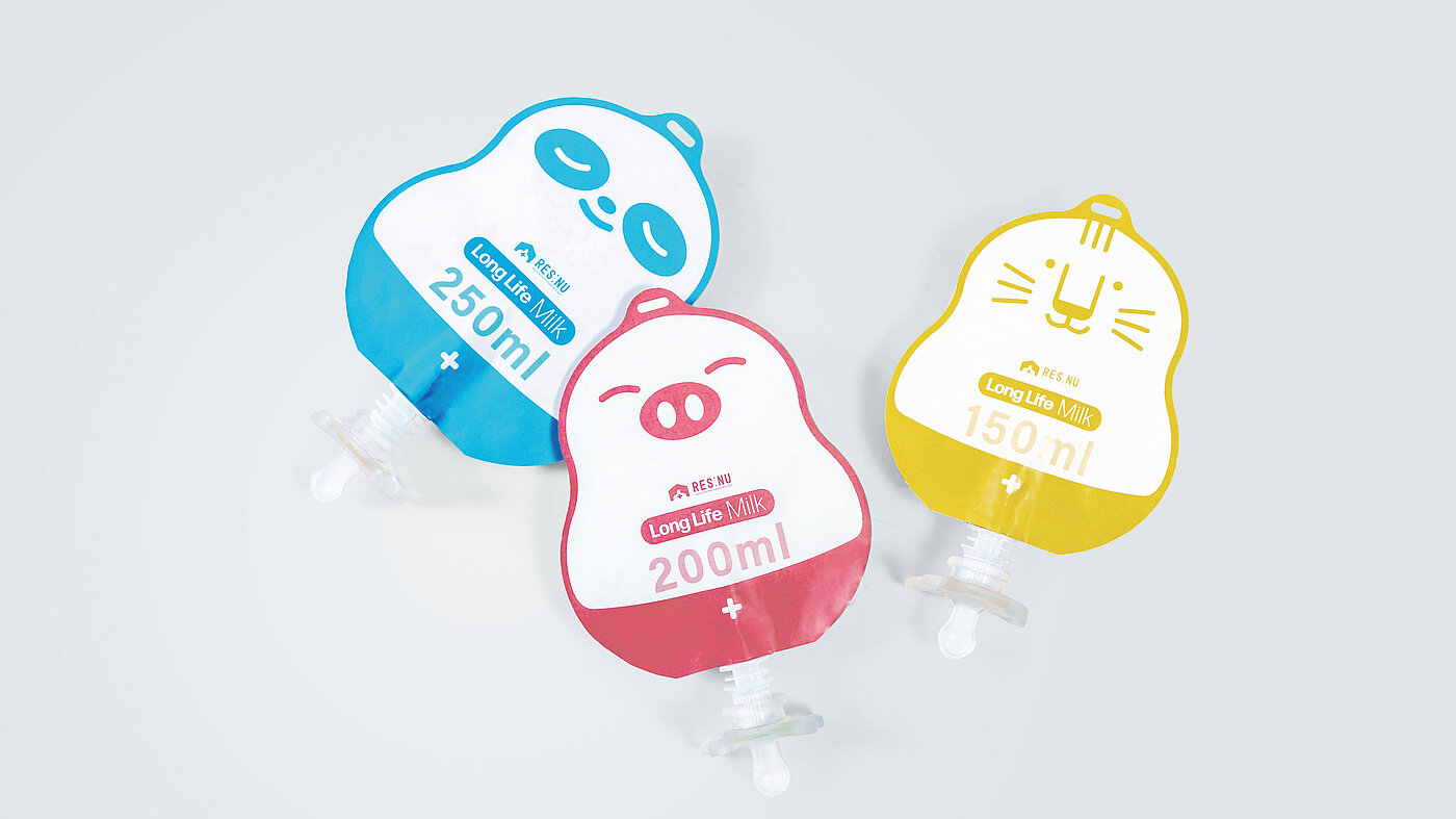
With charming illustrations, you not only lend the product recognisability – the pictures also serve as orientation ...
That’s right. When designing the packaging for RES:NU, we wanted to achieve two important goals. One is to have a positive impact on infants. Babies at this age are developing their visual skills, so bright colours help them understand the world, increase emotional stability and thus make feeding a positive experience. Secondly, quick identification is important for health workers. The different quantities are clearly marked on the packaging so that one can easily distinguish between the products, thus saving time and improving efficiency.