
Redbook Technology Limited
Winners profile
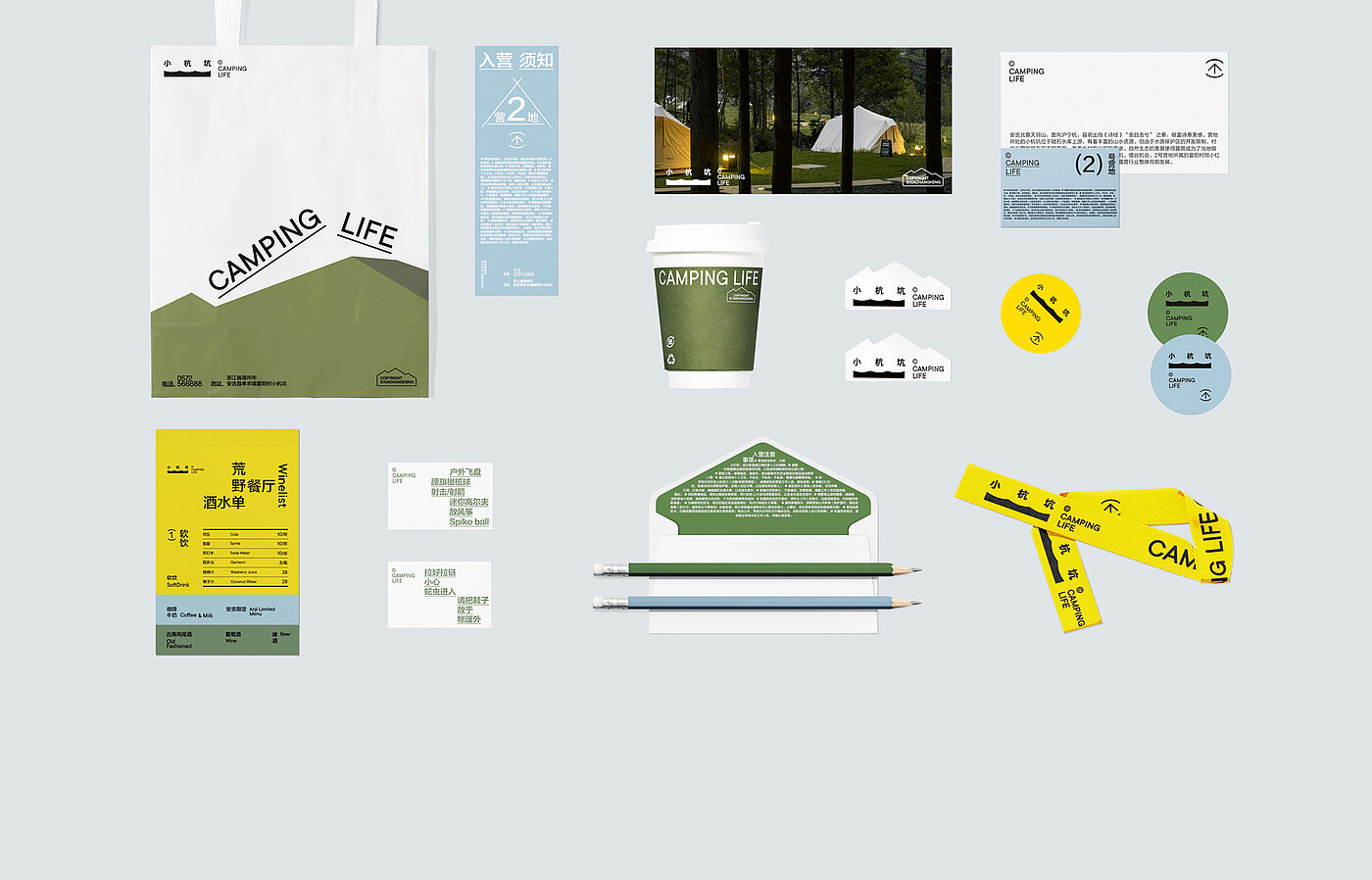
REDesign approaches its work with an interdisciplinary team: 81 experts from the fields of graphics, 3D motion, illustration, brand management and content strategy deliver contemporary solutions and strive to think outside the box. With Xiaohangkeng, they have invented a camping project and made it accessible with a well-thought-out corporate design.
Red Dot: The camping brand Xiaohangkeng is part of a community service project. What is its objective?
Xiaohongshu, REDesign: In this case, business is a means, not an end. Our goal is to harness the power of the economy to involve more people in the process of social change. On the one hand, we are committed to ecological sustainability, and we integrate the concept of a circular economy into holiday practices. On the other hand, we want to connect urban and rural areas through this offer and help to attract visitors.
What was the biggest challenge in realising the corporate design?
We had to develop a unique visual language that would stand out from the many camping brands out there. In addition, the project’s target group consists primarily of young people. Thus, the brand also needs to feel natural and youthful in order to evoke associations and resonate with the target group.
Which detail did you spend the longest time on?
We invested a lot of time in developing the logo to best represent the brand’s characteristics. We experimented with different font styles and made subtle adjustments to the font proportions and layout to create a rhythm, akin to composing a piece of music. In the final version, the three characters of “Xiaohangkeng” were arranged isometrically.
Did you encounter any difficulties in the realisation?
We were fortunate that the early stages of the project went relatively smoothly. However, when designing the signage system, it proved difficult to produce the elements from acrylic material. The challenge lay in the precision of the design on the one hand and in the complexity of the production process on the other. Our task was to transform the two-dimensional visual language into a three-dimensional entity. This involved replicating details such as the rippling arch and ensuring precise angles. Although it may seem simple, a high degree of precision in production was necessary.
The typography is also topographically set. Do these fine details make for a good corporate design?
In our view, these subtle treatments contribute to the quality of the project, but there is more to it than that. Currently, the market environment is highly competitive and design styles tend to converge, so a unique and differentiated visual brand language is particularly important. This requires us to extract unique design approaches from a brand’s vast gene pool to reinforce and highlight the brand’s identity.v