
Wearable communication design: posters “Book Club 01 – CENTER 2 CENTER”
On 26 October, the winners of the Red Dot Award: Communication Design 2018 will be honoured at the award ceremony in Berlin, Germany. On that day, the recipients of the highest individual prize, the Red Dot: Grand Prix, will first be announced. Every year, only a few works stand out from all entries. In 2017, DAEKI & JUN Design Studio from Seoul was among the five proud laureates to receive this special award. The designers won over the Red Dot Jury with the promotional posters “Book Club 01 – CENTER 2 CENTER”.
Surprising creative potential
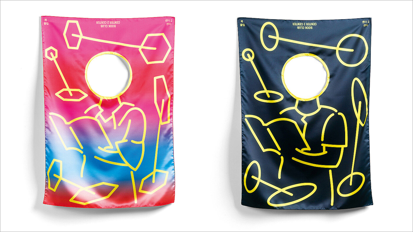
“Nowadays, where much is talked about the death of printed products, this work is proof that there is still a lot of creative potential in this area”, said the jury. The design of the posters also included creating the logo for CENTER 2 CENTER, an independent publishing project specialising in culture and arts. Therefore, the logo refers to the architectural term “centre to centre”, a concept for measuring the distance from the centre of one component to that of another. Thus, the main visual motif of the poster comprises two graphical elements being linked by a line, symbolising that the project links the centre of books with readers and other elements to bring them together.
New kind of posters
The posters “Book Club 01 – CENTER 2 CENTER” allow for two modes of display: they can be put up on the wall and also be worn. The jury was enthused by this innovative approach: “The fact that the medium of the poster is not used in the traditional way but instead is printed on fabric so that it can be worn like clothing is entirely novel and an outstanding idea.” This special feature was achieved by textile-printing the posters on fabric. After the printing work, the human head section, coloured in yellow, was cut out and finished by sewing. As a result, the artwork also allows people to wear it, in a way that makes it look as if they are reading a book. In addition, the title lettering in the upper part was printed upside down so that it can be read correctly on the back when the poster is worn.
The Red Dot Jury honoured this exceptional piece of work with a Red Dot: Grand Prix in 2017, as it “attracts attention, surprises with refined humour and makes the wearer become part of the message expressed: a reader who perceives the products of the client.” When asked which three adjectives describe their posters best, the designers Daeki Shim and Hyojun Shim said that it is “witty, aesthetic, sensitive”.

DAEKI & JUN Design Studio
Daeki Shim and Hyojun Shim are graphic designers and co-founders of DAEKI & JUN Design Studio in Seoul. Daeki Shim studied at Central Saint Martins, University of the Arts London and at University College London. Hyojun Shim studied at Central Saint Martins, University of the Arts London, at Goldsmiths and at University College London. Along with running their studio, they have been teaching at several universities in South Korea. They have won about 80 international awards in design competitions and their works have been exhibited, among others, at the Central House of Artists in Russia, “Die Neue Sammlung – The Design Museum” in Germany, Cube Design Museum in the Netherlands and the Ginza Graphic Gallery in Japan.


