![[Translate to English:]](/fileadmin/_processed_/5/b/csm_91-01956-2022BC.0837263_CO_2_7d5236bd1c.jpg "[Translate to English:]")
Timur Tukhvatullin — A problem is a muse.
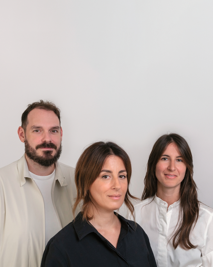
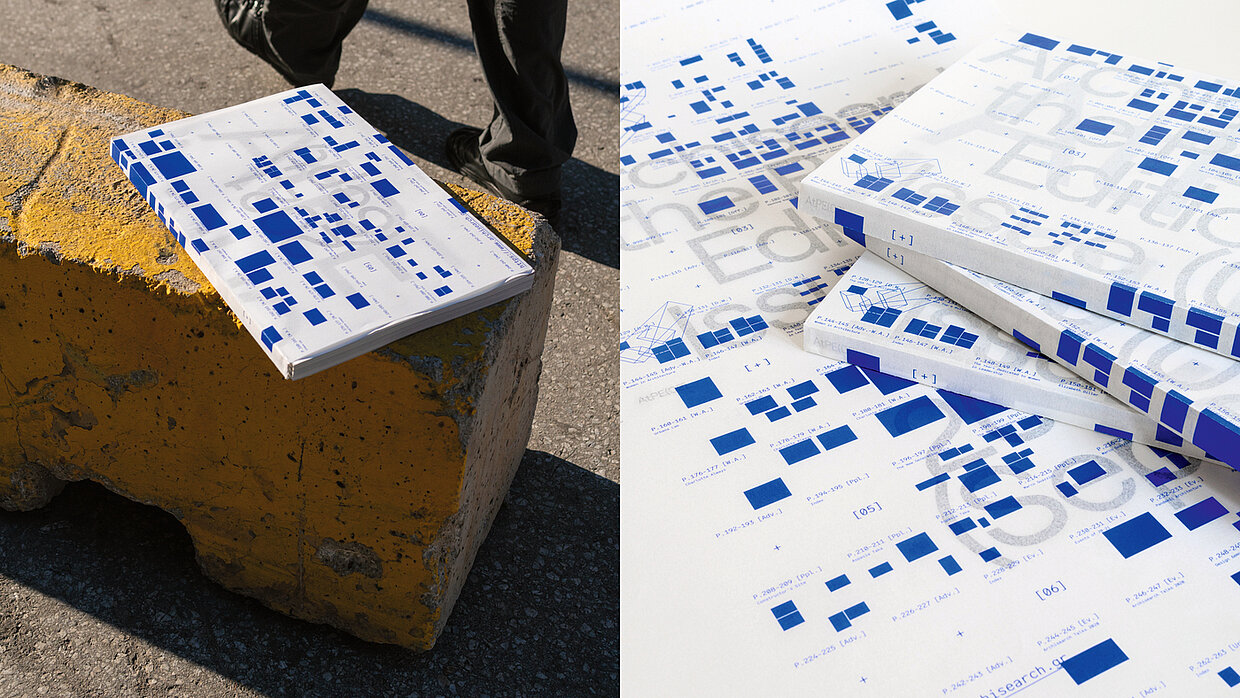
Right from the start, Elli Christaki, Stergios Galikas and Evelina Garantzioti saw more in their Post-Spectacular Office than just a studio for “anything”. This is where numerous creative disciplines come together with enthusiastic curiosity. “We are always on the lookout for people and things we admire, for art that shocks us and for cultural movements.” With the transformation of the extensive content of the Archisearch online platform by The Design Ambassador, the trio lives up to its passion for architecture as well as its love of materiality. “The sensitive treatment of the format, the carefully considered typography and choice of materials, as well as fine details such as the matching colour of the thread binding for each edition make Archisearch an object that is simply a pleasure to hold in one’s hands”, the jury said.
Red Dot: With Archisearch, you take online content back into the analogue. What was the decisive factor for this?
Post-Spectacular Office: The online version of Archisearch has a daily content feed, showcasing a multitude of architectural projects from around the world. After all, this is the nature of such a medium. The need for a firmer filtering of the content, targeted topics and the presentation of more theoretical approaches led to the creation of its printed version.
Has the longing for analogue, haptic media grown again?
Sure, the world is turning to analogue-haptic media again, but not in the sense that it will displace the dominance of digital. It is definitely a trend, but also has deeper reasons related, in our opinion, to the human need for a sensory relationship with things that goes beyond one-dimensional vision. Another reason may be the need for slower information intake and mental processing.
What is special about the medium of the magazine? Or is there anything that puts limits to your creativity?
Starting with the second question, having a maximum number of pages per issue always is a limitation. On the other hand, this is the driving force while curating and designing publications. At the same time, a crucial characteristic of magazines is trying to capture the present and this is always a key point that motivates us as designers - we are called upon to seize the moment.
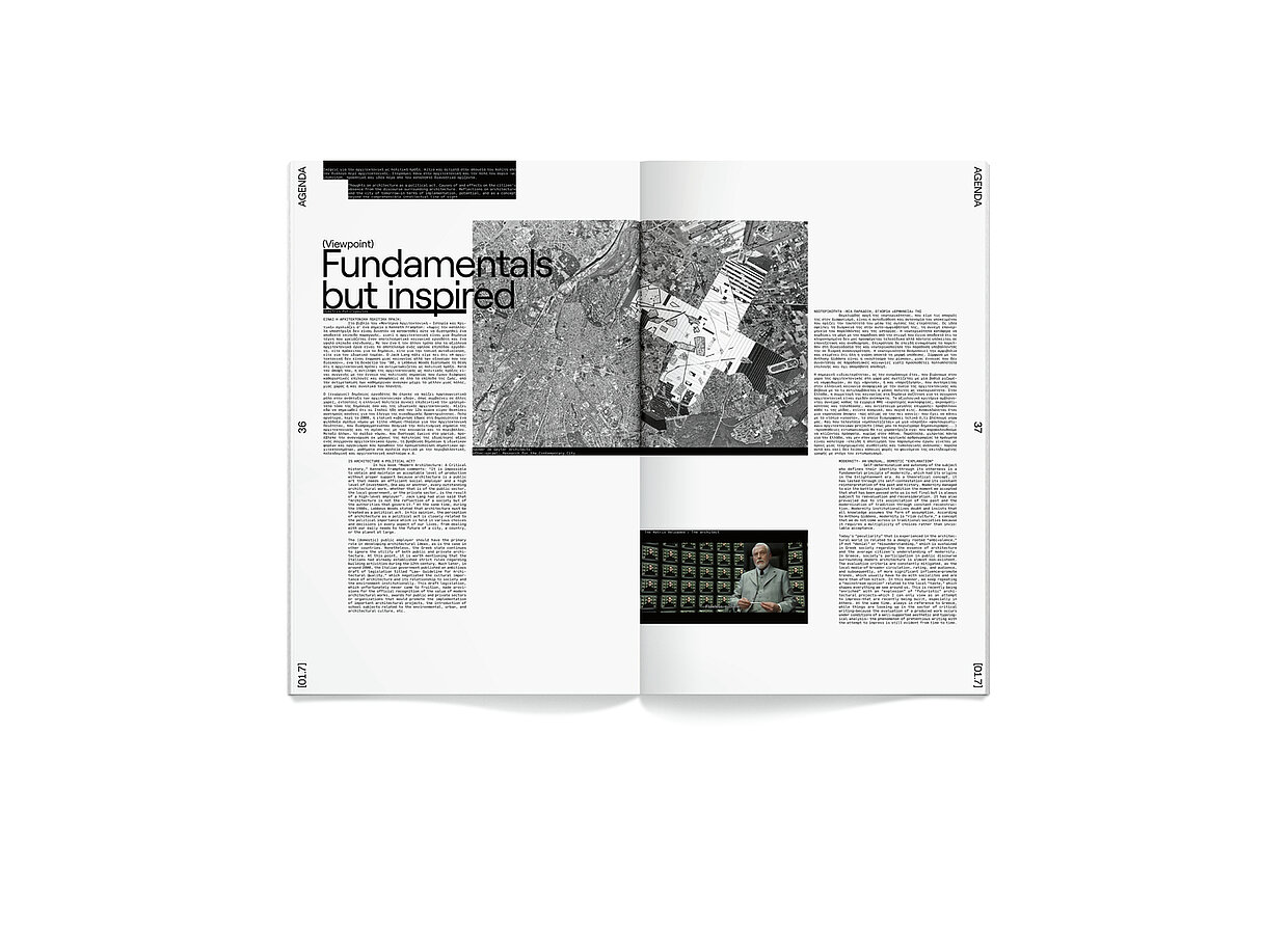
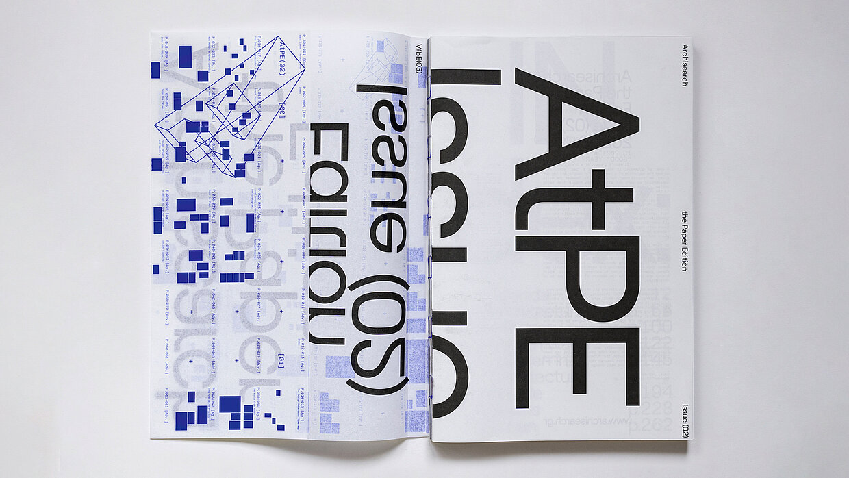
Archisearch is overwhelming above all because of its large format …
That is a nod to the architect's everyday life. An everyday issue during practice is the large scale of printed drawings that an architect has to deal with. But also, we aimed to point out the sense an architect has when something is drawn on paper or digitally and then scaled up in real life.
The use of typography in this project is also striking. Do you see typography as one of the most important tools in design?
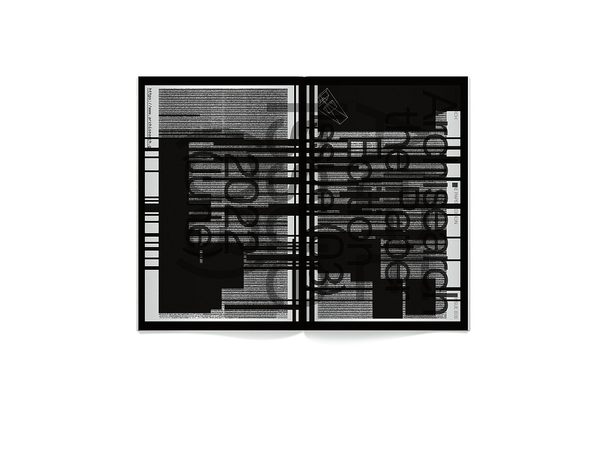
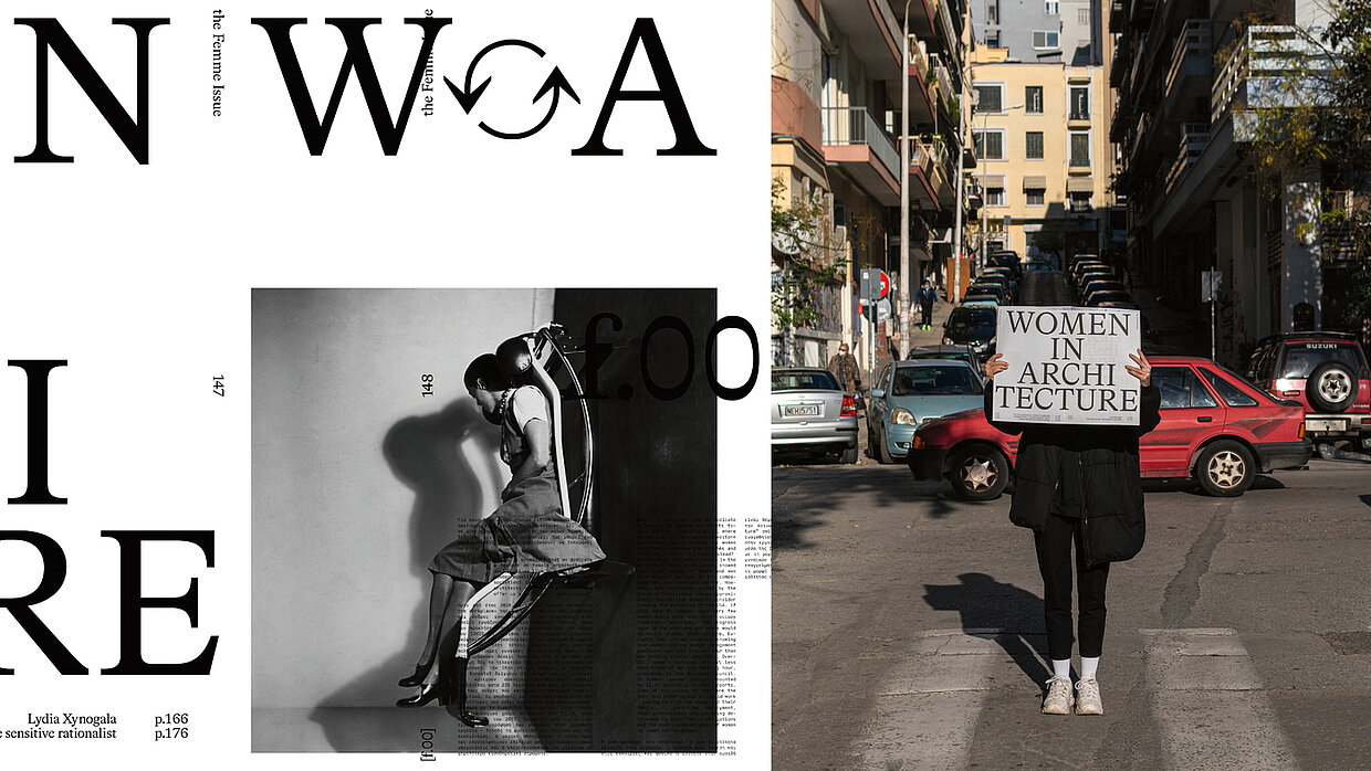
Ideally, we would love to design only with letters. As shapes with cultural meanings, they are able, we think, to carry a narrative by themselves. In Archisearch, we have two typographic systems. A basic one, which runs through the entire issue and creates a textual topography referencing the shapes of a city, and a second system, that of the titles, which creates the necessary tensions in the change of chapters, defining the pace of reading.
![[Translate to English:]](/fileadmin/_processed_/a/0/csm_91-02748-2022BC.0837213_CO_e5966d4754.jpg "[Translate to English:]")
![[Translate to English:]](/fileadmin/_processed_/d/5/csm_91-02746-2022BC_1f08f6cfdf.jpg "[Translate to English:]")