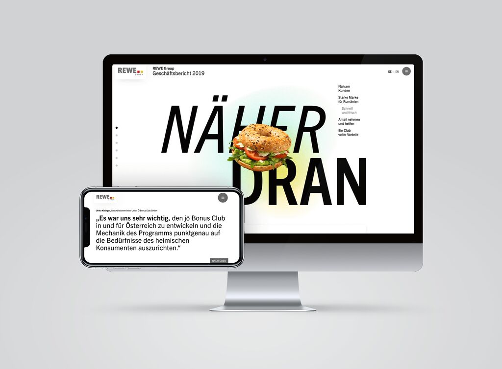
annual reports

AICT Annual Report 2010

Back Download

The design of the annual report for the AICT, the Advanced Institutes of Convergence Technology in Korea, combines the acronym of these institutes with the year of publication into a motif that is reminiscent of the shape of chemical compounds of various elements. This immediately visualises what the science institutes’ research focuses on and illustrates the fact that AICT is an umbrella name for different institutes in various fields of research such as nanotechnology, IT and biology. The reduced and modern design with coloured circles, lines and diagonals visually marks the reference to natural sciences which is also on the inside of the report, and emphasises the high demands placed on environmental sustainability by the advanced research institutes through the selection of recycled paper. The content is thus presented in an unpretentious and clearly arranged layout. Statement by the jury »As mirror of a company, annual reports often reveal more through their appearance, style and focus on a special topic than through text. This work convinces by its reduction. Spaces and unobtrusive colours create an engaging and highly individual visual appearance with-out distracting from the content. Another astounding feature is the combination of two completely different fonts, a sans-serif linear Antiqua typeface of highly technical appeal with just as objective Asian characters.«

Red Dot: Best of the Best

Others interested too