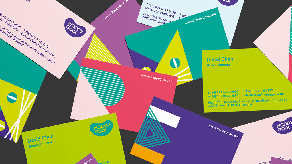
apros

Back Download

apros is a still young vermouth brand from the Black Forest, founded by three friends, an entrepreneur, a restaurateur, and an oenologist and winemaker. Following the brand philosophy of focusing on the essentials, the apros Black Forest Vermouths are made from carefully selected wines that are refined with organic botanicals and local wine distillates. This reduction to the essentials shapes the brand identity just as much as the strong connection to its homeland, which the slogan conveys in only a few words: “Full of character. Just like its origins!” The brand name “apros” goes back to the Latin word for wild boar and is set as a word mark in minuscules in the corporate sansserif typeface “Akkurat”. The lettering is complemented by another central design element, a stylised rhombus, which is intended to visualise various facets of the Black Forest in an abstract form – mountains, valleys, firs, cones, and snow. The hexagon functions as an independent figurative mark, while several of these apros rhombuses together form the apros pattern, which is used primarily for packaging, but also as a decorative element in merchandise applications or parts of the business stationery. The pattern is used in variations of black on white, white on black, on natural cardboard or with the colour of vermouth set as a background. The visual language relies on colour photographs of the drinks and their ingredients on the one hand and aesthetic black-and-white nature shots of the Black Forest on the other, creating its own distinctive visual world. The packaging design is kept puristic and thus puts the focus on the actual product with its warm colours. The entire brand identity interprets the theme of the Black Forest in a contemporary way, avoiding clichés, and in this way stages the products in a manner that is as puristic as it is emotional.

Red Dot

Others interested too