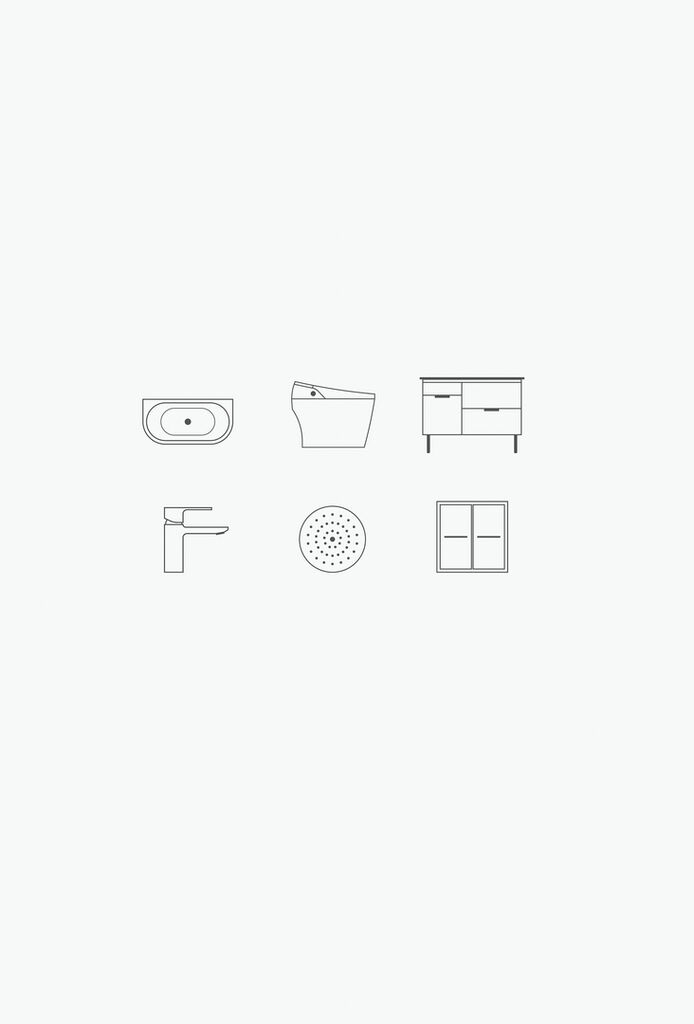
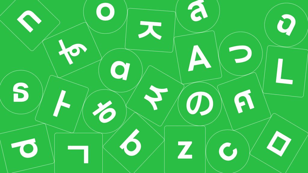
Typeface

Bahlsen – The Bahlsen Family

Back Download

The family-owned company Bahlsen, which has been around for 130 years, has intensively dealt with its own origin and identity to sustainably relaunch the brand. Against the background of creating “good things for others”, the new umbrella brand and the newly developed corporate design aim at conveying the notions of tradition and timelessness. The result is a concise Grotesk typeface that expresses the company’s family aspirations already in the name of the new umbrella brand: The Bahlsen Family. The Bahlsen Grotesk is based on a handwritten typography of the 1920s, with each letter and every single character being redeveloped and individually proportioned. The result is a characteristic typeface that can be used as an independent design element. In addition, the typography was baked as limited-edition biscuits and repackaged in a special tin box sealed by the TET seal of quality. This seal, once developed by Hermann Bahlsen, also forms a bridge to the newly designed umbrella brand.

Statement by the Jury

The design of this new typeface masterfully combines the tradition and identity of the company with the modernity of the present to outstandingly convincing and vivid effect. Baking the new characters as biscuits and creating a congenial packaging for them is an excellent idea that not only hits the very heart of the brand, but as a surplus, also offers a sensual experience.

Red Dot: Best of the Best

Others interested too