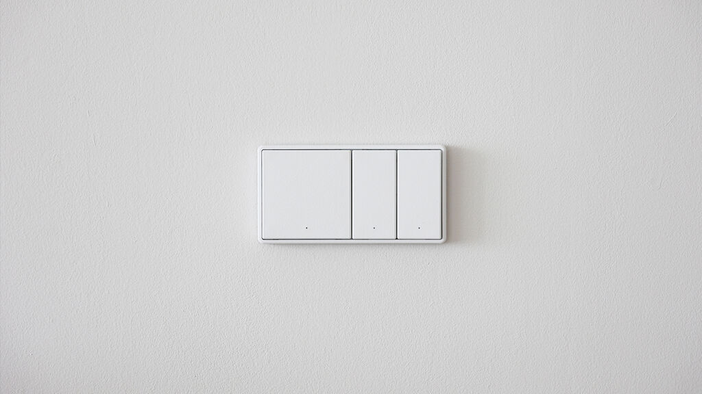
The design of this flagship store employs contrasting colours. The facade is made of geometric blocks in black and white with red accents similar to those in the company name. Red and black dominate the interior. The brand logo in the form of a freestanding red sphere is a head-turning eye-catcher. To soften the commercial nature of the site and introduce a sense of privacy, customers have several meeting areas at their disposal fitted with furniture in a range of styles.
Statement by the Jury
The fascinating use of contrasts gives the Beimu flagship store an aesthetic appearance and a powerful aura.
Credits
Client:
Guangdong Beimu Home Furnishing Co., Ltd., Dongguan, China
Design:
(OD.O) one design office Ltd., Huson, Dongguan, China
Shenzhen Chengyi Design Co., Ltd., Shenzhen, China