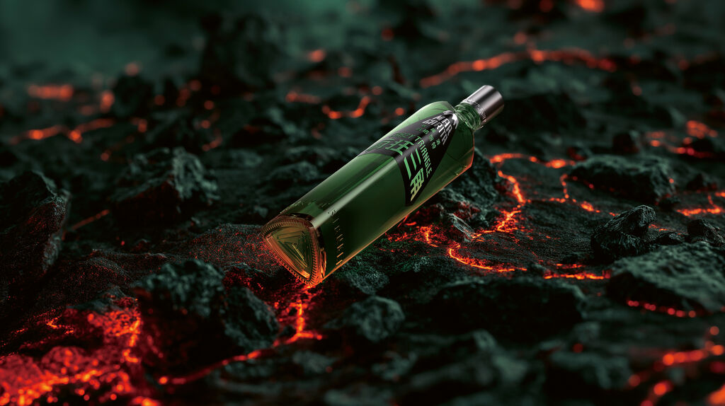
Retail Packaging

Brite

Back Download

Considering that every DIY store offers a wide range of wood varnishes, the aim of this packaging design for Brite was to create a distinctive concept, making it easier for the consumer to choose the right product, and at the same time to highlight the brand’s passion for wood. This was realised by carving the product types out of wood and giving them the main role in the packaging design. Each stock-keeping unit has its own unique and memorable typeface that becomes an expression of the respective product’s identity. This is complemented by a hyper-decorative typography which illustrates the impact that the different types of coating can achieve.

Red Dot

Others interested too