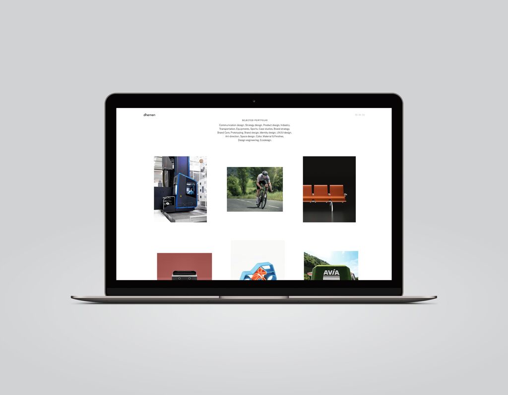
Brand Design

Casey’s

Back Download

Over the last 50 years, Casey’s has grown into one of the largest convenience store and petrol station chains in the US. However, the logo stayed the same, creating a disconnect between the brand and its modern in-store and online experience. The task was to update the visual identity while retaining the company’s heritage, namely its quirky personality and bold red colour, which apply to both parts of the business: petrol station and convenience store. The resulting brand evolves the barn concept, elevates the presence of the weathervane and uses a customised font for cohesion with other visual elements and for legibility in all sizes. 

Red Dot

Others interested too