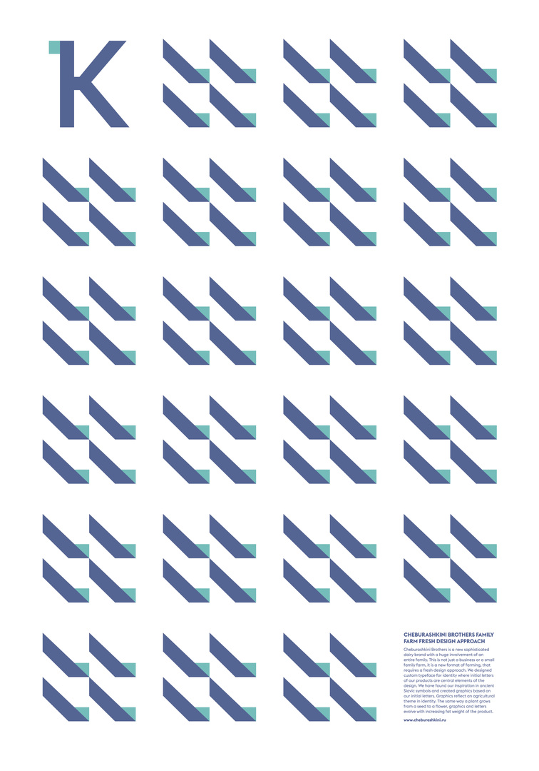
Client: BMW Group MINI, Dubai, United Arab Emirates
Cheburashkini Brothers
Statement by the Jury
What makes this system, developed for dairy products and based on initials and symbols, stand out is, on one hand, its derivation from ancient Slavic symbols for elements of agriculture and, on the other, the resulting ultra-modern and reduced style of the icons. Simple, clear and modular in use, they form the basis for these unusual and fascinating posters, the design of which perfectly captures the freshness of the products they represent.
-
Client:Cheburashkini Brothers, Moscow
-
Design:Ermolaev Bureau, Moscow
-
Creative Direction/Graphic Design:Vlad Ermolaev
-
Project Management:Victoria Ermolaeva