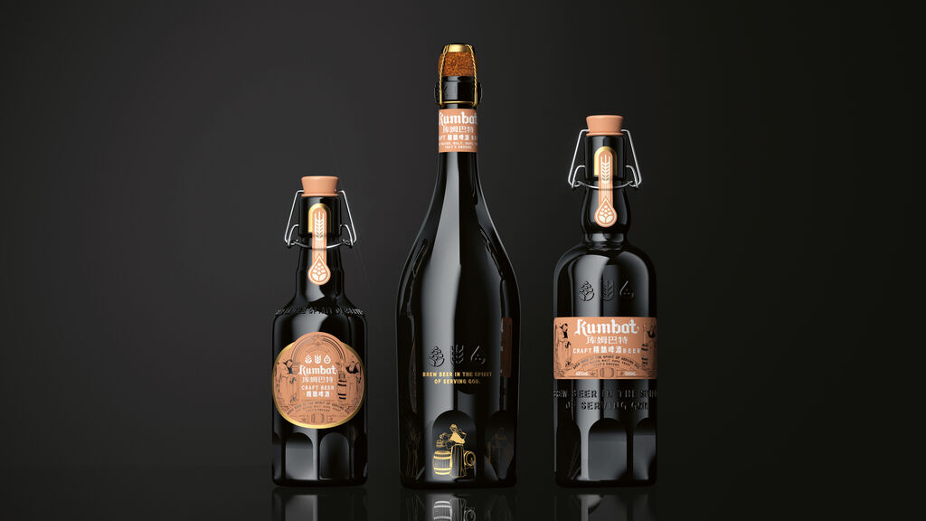
Client: Free Bio Technology Corp., Taipei City
Food Packaging
Cheburashkini Brothers for Kids
The packaging concept for this yogurt range takes into account the cognitive abilities of children from the age of three. Children discover the world through simple forms and are better able to comprehend abstract, simple and geometric shapes and colours. The idea behind the design was that the word “yoghurt” in Cyrillic starts with a specific letter with a diacritic on the top, which can be drawn in different graphic shapes. Thus, it became possible to show different flavours of yoghurt: cherry, prune, pear, peach and others. The colours and abstract shapes are reminiscent of these berries. Children are thereby encouraged to develop their abstract thinking skills.
Credits
-
Client:The Family Farm of Cheburashkini Brothers, Moscow, Russia
-
Design:Ermolaev Bureau, Moscow, Russia
-
Graphic Design:Vlad Ermolaev