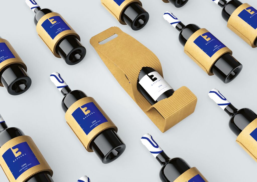
Beverage Packaging

Coolbrew

Back Download

Using one minimalistic symbol, this packaging design for the local Coolbrew coffee brand has set out to establish a new market direction for Russia. The created sign is based on the first two letters of the logo and serves as a brand identity. In the form of an aluminium can, the packaging smoothly combines matte and metallic textures, intended to further emphasise the main symbol and make the can pleasant to the touch. Each coffee type features a carefully chosen colour code: beige for cappuccino, dark-brown for black coffee, green for matcha latte and blue for coffee lemonade.

Red Dot

Others interested too