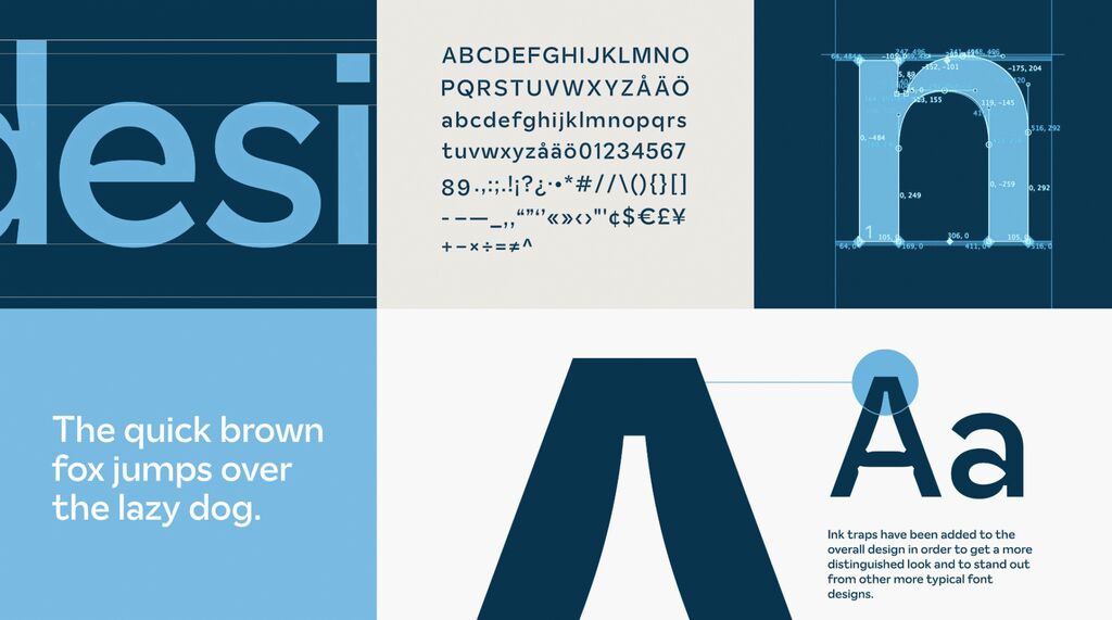
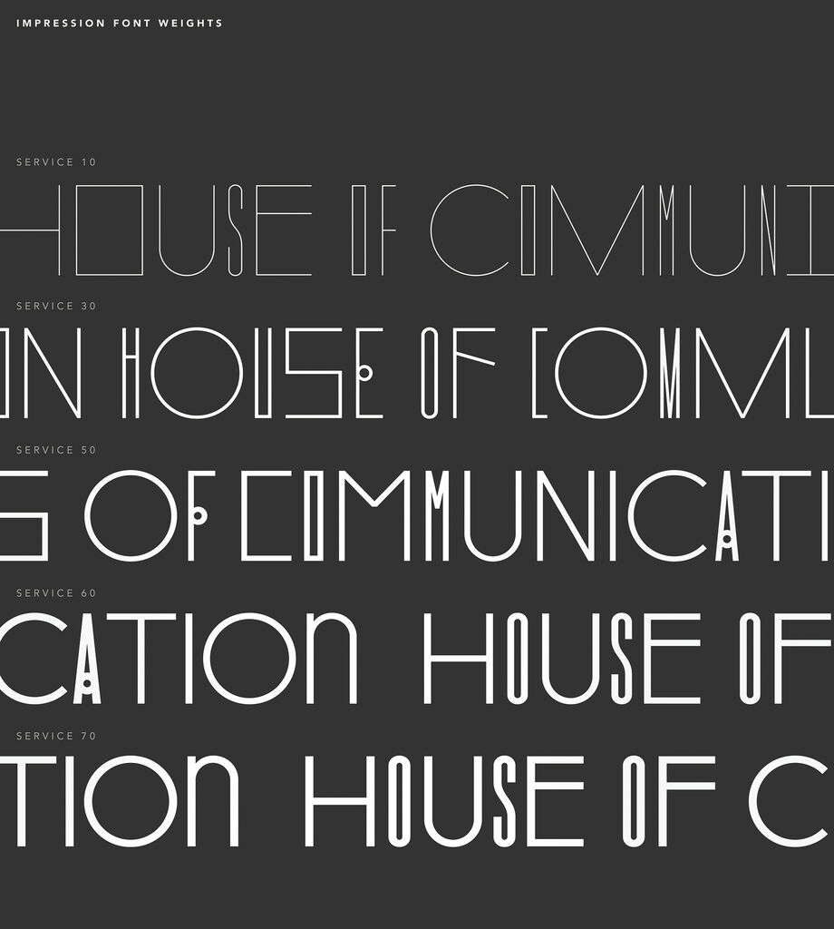
The customised typeface is the core of Datsun’s new visual identity, aiming to individualise the brand to suit the needs of different target audiences and markets. Datsun targets young first-time car buyers, which translates into a youthful, light and cheerful brand style. The sans-serif typeface has a distinctive and inflated look, which gives it a lightly playful and unique character to be recognised globally. Contemporary and friendly, yet professional, the typeface works across different markets and languages, ensuring homogeneous global brand communication.
Credits
Client:
Nissan Motor Co., Ltd., Global Design Center, Kanagawa