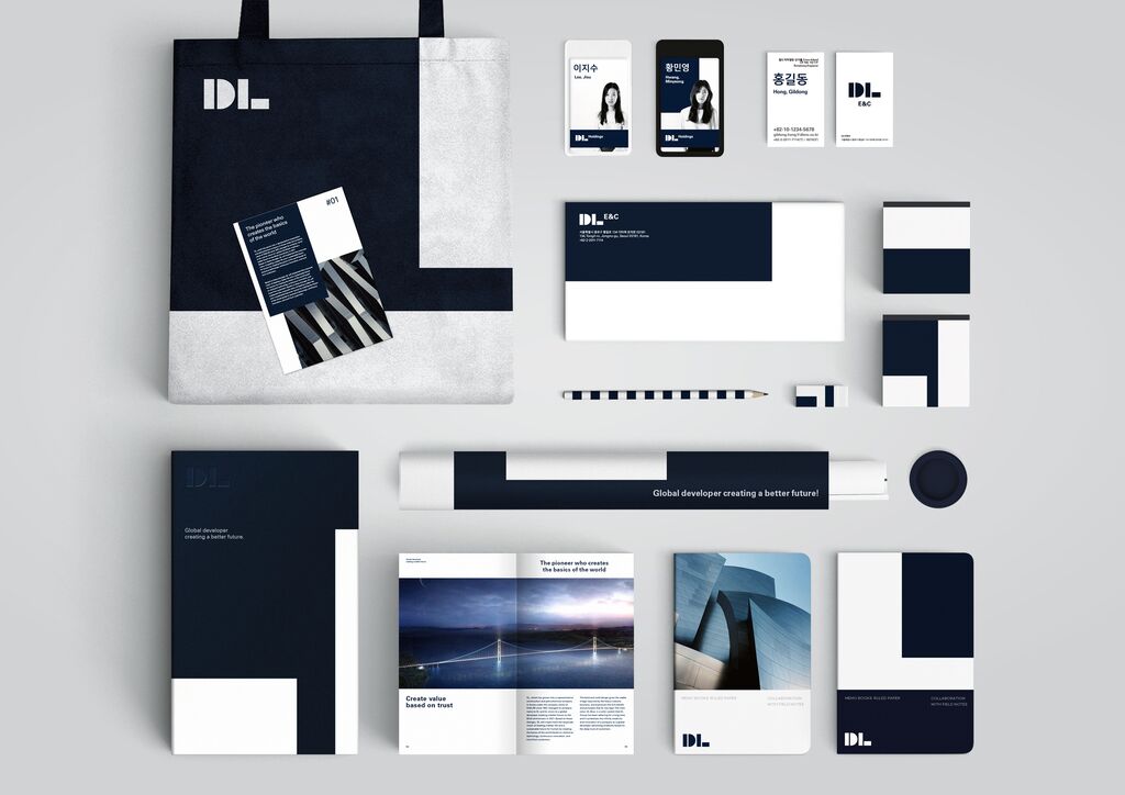
Client: Hamburger Sport-Verein e.V., Hamburg
Statement by the Jury
The relaunch inspires because it changes neither the well-established typography nor the logo of Deutsche Bahn. Instead, by accentuating the red line alone, it implements an instrument that is as powerful as it is playful, humorous and lively, covering all areas of corporate design and communication. The interplay of pictograms, typeface and content works outstandingly well towards effortlessly achieving the goal of image change.