Visual Identity
Expodium

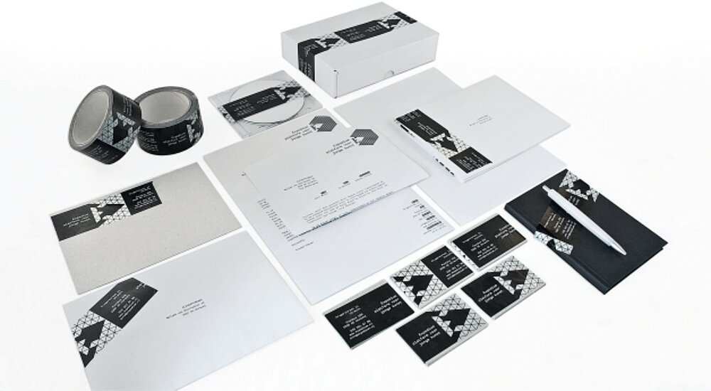
Expodium is a production house that organises events in the public domain as a reaction to urban development in cities. The starting point for designing this visual identity was a honeycombed cube built from an isometric grid, featuring a letter “E” that appears to be cut from the left side of the cube. This logo serves as a typographic grid on all communication media and is complemented by tape used for highlighting, labelling and marking. Based on the idea of highlighter markers, flyers and posters are printed in fluorescent colours.
Credits
-
Client:Expodium, Utrecht
-
Design:CLEVER°FRANKE, Utrecht
