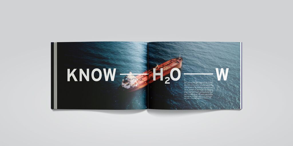
Urologist Dr. Jan Ferrari had a new corporate design developed which communicates urology-related topics in an open-minded and playful way. The logo for the surgery shows male and female genitals in abstract form. It additionally incorporates different organs and topics relating to urology by means of graphic elements. The abstract combination of these graphics aims to attract attention to this taboo subject. This project is supported by appealing and striking colours. They make the visual appearance brave, individual and humorous, but not obtrusive or displeasing. The clear and reduced design explains urological matters in a transparent way.
Credits
Client:
Dr. med. Jan Ferrari
Praxis für Urologie, Kaarst, Germany