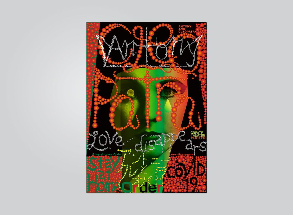
Typeface

Helvetica Now

Back Download

The typeface Helvetica Now represents a major overhaul of Helvetica, one of the best known and most widely used typeface families in the world. The new version was developed to keep this 1957 style classic alive and in tune with today’s changing technical conditions and reading habits. The most important innovation consists of the three optical sizes of Micro, Text and Display. Helvetica Now Micro offers more open letters and adjustments to complex characters and accent marks, all aimed at improving legibility at tiny sizes. Helvetica Now Display has a range of weights, from Hairline to Extrablack, and a tighter spacing. In between is Helvetica Now Text. Previously problematic glyph designs such as the “@ sign” have been reworked and a host of alternate characters been created such as a single-story a, a beardless G and a straight-legged R, which all have the potential to alter the look of the typeface family and together with additional tools signify a giant leap forward for it to live on tomorrow and beyond.

Statement by the Jury

The Helvetica typeface is a true icon, and to revise it to make it fit for contemporary and future use is a highly respectable endeavour. With a myriad of new and alternate letters, sizes and styles, the result has emerged as a convincing realisation that manages the balancing act of lending the well-known classic an immediately recognisable modern touch.

Red Dot: Best of the Best

Others interested too