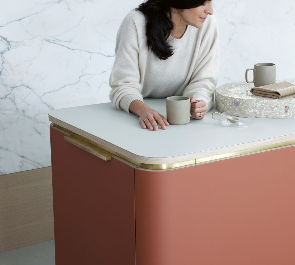
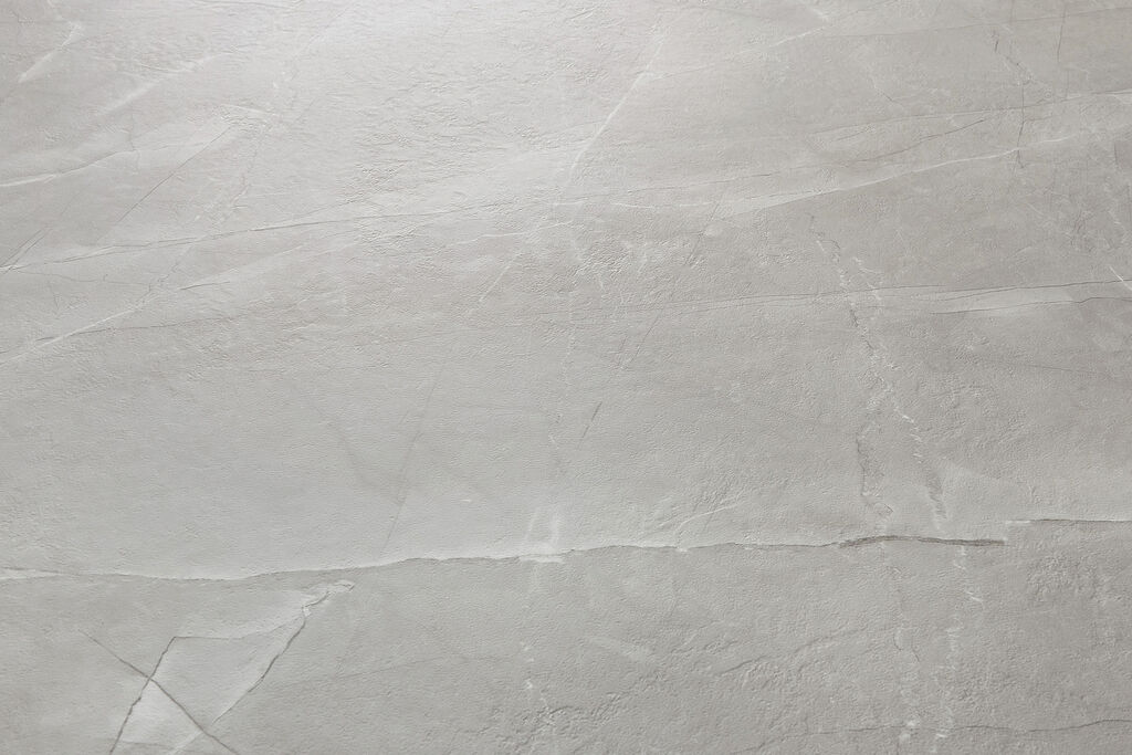
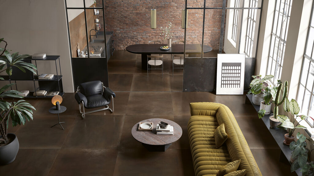
Care Product Packaging

IROIKU

Back Download

When lined up, the flacons used for the unisex skincare and complexion enhancement products of the IROIKU brand look like a colour chart. Consisting of two transparent, square components, the small bottles can be easily stacked and attractively presented in the store. The lower part contains the respective product, while the upper part consists of an elegant pump dispenser with a transparent lid. “The two halves with identical proportions convey exceptional value,” the jury explained. This impression is also supported by the puristic printed lettering, which concisely communicates the most important information: the brand name and the colour tone.

Red Dot

Others interested too