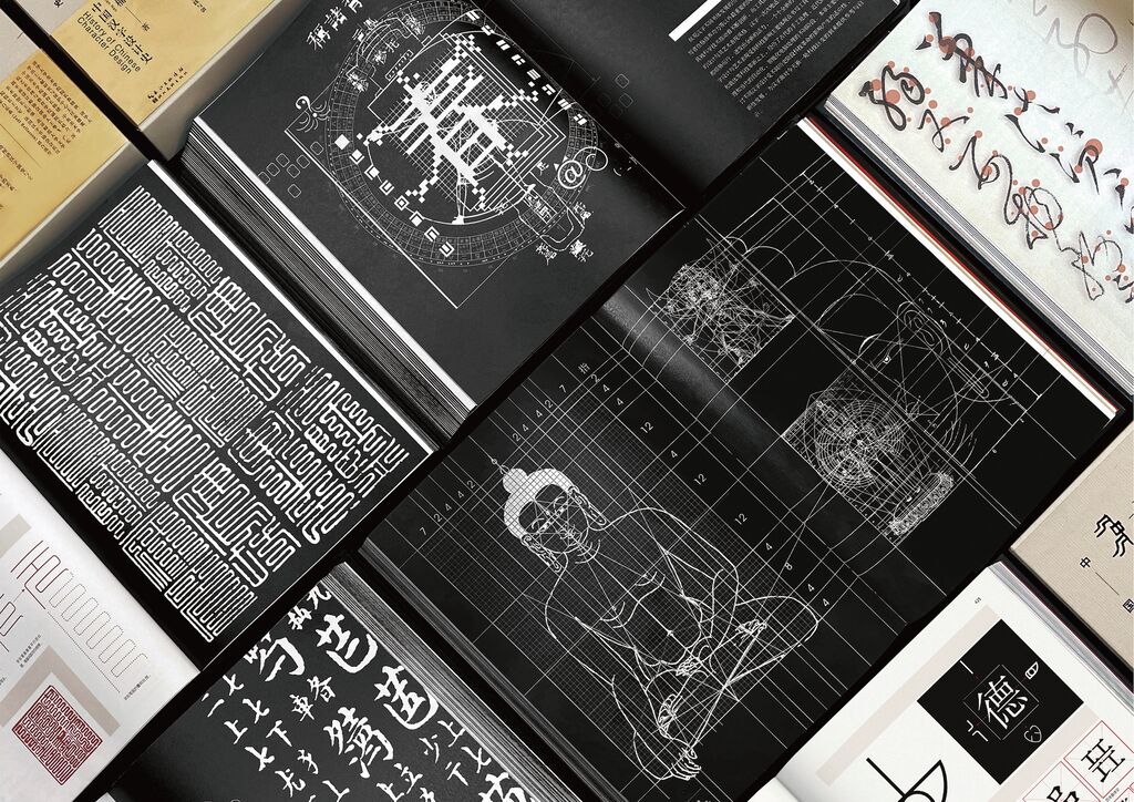
Book

KASPER FLORIO – Atypical Swiss: Visual Analysis

Back Download

This work highlights the Swiss Grid, a significant pillar of graphic design, and its contemporary application. In order to point up the latter, it is referred to the philosophy of Swiss designers Larissa Kasper and Rosario Florio. Based on this, the publication only uses two fonts – Darker Grotesque and Xanh Mono. The placement, size and quantity of the displayed images and graphic elements is well-thought-out. Special features, e.g. the flaps and slanted pages are deliberately designed in such a way that the flow of reading is efficiently controlled and blank space is maximised.

Red Dot

Others interested too