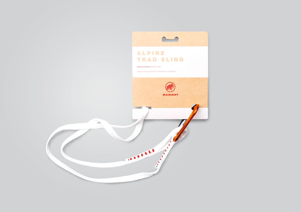
Packaging

Kiyotomo

Back Download

The key visual of this tea packaging combines a window motif with a Chinese character. The latter merges the signs for “sun” and “moon”, and stands for “brightness”. By integrating the logogram into a filigree, flower-shaped form, the packaging design conveys a homely atmosphere, or more precisely the notion of having a decent cup of tea by the window. Debossing, silver stamping and laser cutting is used to visualise light that shines through the tracery. The main colours indigo blue and silver grey exude calmness and serenity, while the colours of the sealing stickers reflect the different shades of the teas.

Red Dot

Others interested too