Typeface

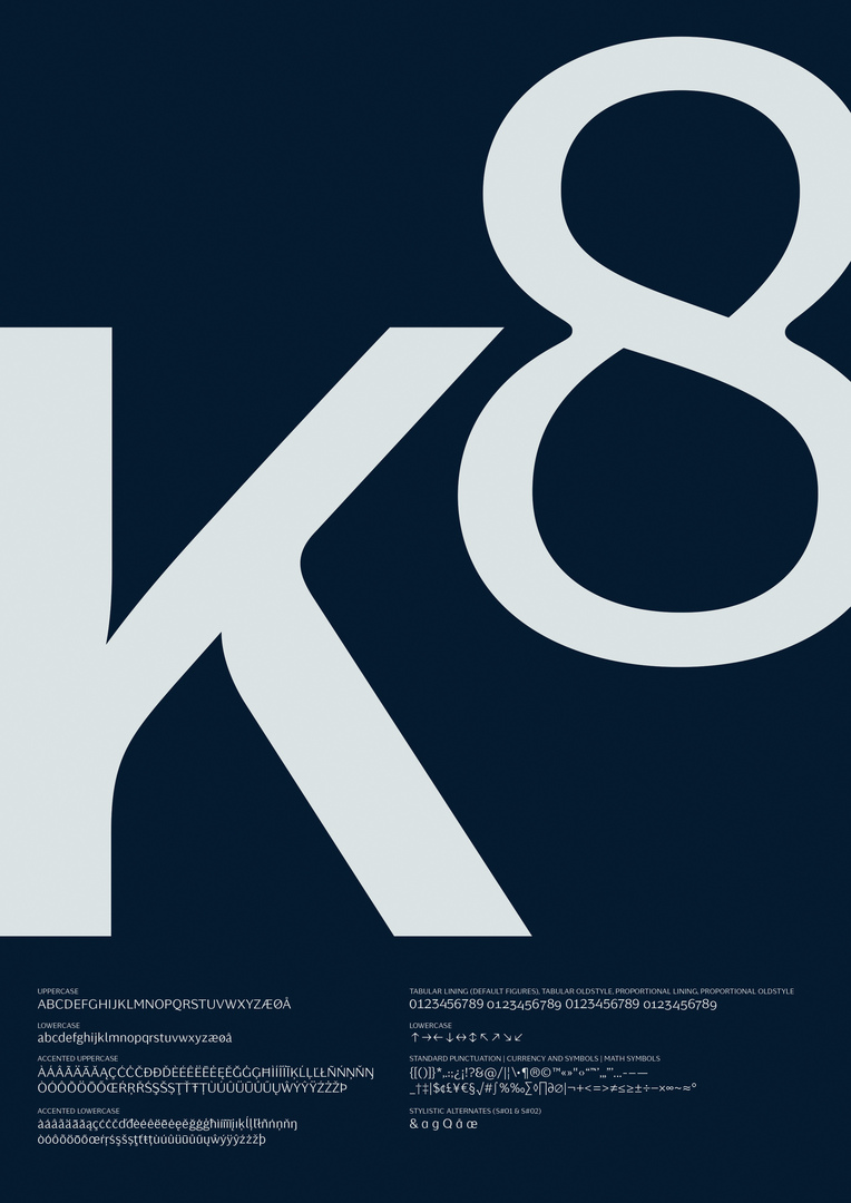
Kontrapunkt Miki

Back Download

Kontrapunkt designs typefaces based on the idea of sharing, an idea that does not only acknowledge the sources of inspiration but also the actual designs that are both relevant and applicable. After its first free typeface released in 2003 and the second in 2011, this year saw the launch of Kontrapunkt Miki, the third and latest member of the family. It was inspired by the discovery that many of the sans-serif typefaces available today are similar in both expression and application. Therefore, Kontrapunkt Miki was created as a typeface with more personality and a wider usage repertoire by making it occupy the place in between the Antiqua and the sans-serif design approach. The result is a clear sans-serif typeface with more con-trast between thick and thin strokes and less geometric forms, which, in contrast to other sans-serif typefaces, ensures great clarity with uppercase letters while also embracing lowercase letters in body text. The typeface thus encapsulates the Danish design tradition with an emphasis on human forms and soft, sculptural edges.

Statement by the Jury

The Kontrapunkt Miki typeface stands out with its purity and good values in terms of its balance, contrast and characteristic regarding the human shapes and thick-thin areas. They are all well conceived within the wide range of font styles. Refreshing, elegant and straightforward all at the same time, this new typeface delights with a very lively approach.

Red Dot: Best of the Best

By starting the video, you agree that data, e.g. your IP address, will be sent to Vimeo. vimeo.com/privacy

Others interested too