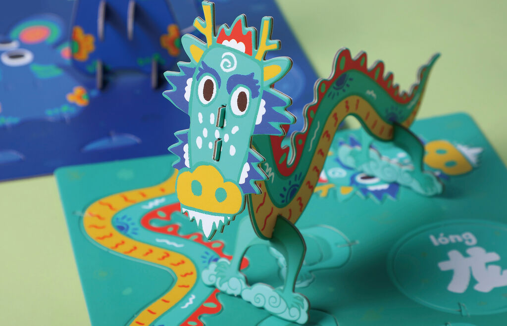
Food Packaging,Label Design

Latini Olive Oil

Back Download

The packaging concept for the Latini brand of olive oil establishes a close connection to its production area of Istria, an Adriatic region of Croatia. That’s why the story of Tone, an ancestor of the company’s founders, is told. In the 1880s, he worked in olive groves in Istria that were then owned by Italians known as “Latini”. The design visualises that Tone once received a chequered shirt for a day’s wage. As this fine garment was a rare sight in the area’s villages, it earned his family the nickname “Latini”. Tone’s descendants came to own their own groves in Istria and today produce olive oil under the name Latini to honour their “colourful” ancestor. The aim was to evoke this story by designing a label resembling a chequered shirt, thereby “dressing up” the bottle as a sort of portrait of the man himself. Text on a card tucked into the label’s “shirt pocket” tells the story of the Latini family behind the product. This connects the family’s distinctive history to its venerable cultivation of a delicious craft olive oil.

Statement by the Jury

In a clever manner, the packaging design for Latini olive oil combines branding with quotations from the fashion world. The label adopts the look of a beautiful chequered shirt whose green hues match those of the olive oil inside the bottle. This textile appearance is continued by the product information hidden in a small pocket. The smart concept thus enhances the product and makes the bottle look highly decorative on the table.

Red Dot: Best of the Best

By starting the video, you agree that data, e.g. your IP address, will be sent to Vimeo. vimeo.com/privacy

Others interested too