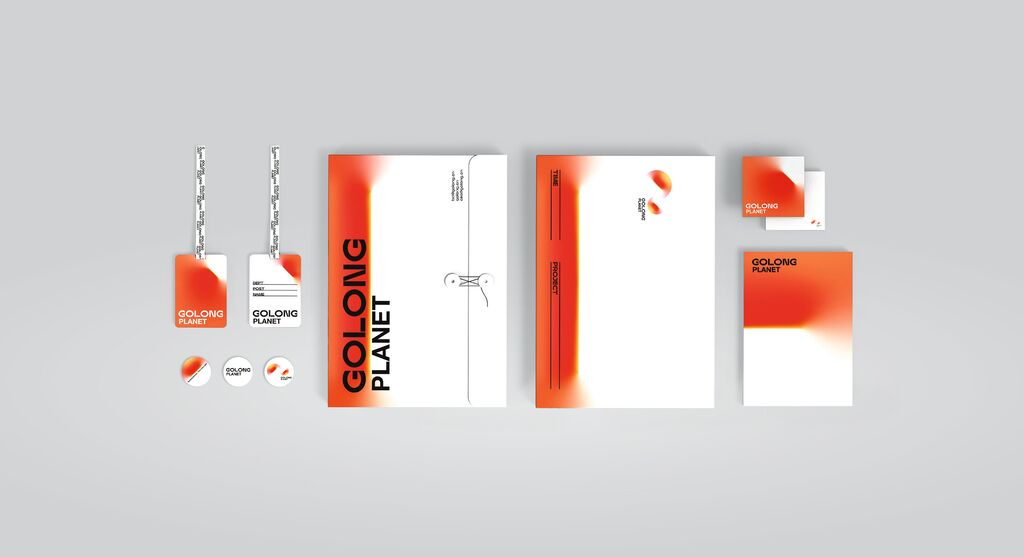
Corporate Design Relaunch

Life of the Children

Back Download

Life of the Children is a private aid organisation that supports children in developing countries. As part of the corporate design relaunch, a geometric graphic language was developed that aims to portray a hug. While the individual circles stand for neglected children, the connecting lines symbolise the NGO, which provides support for children in need. Furthermore, the hollow circle is a visual representation of transparency as the core value of the organisation. The strong contrast of complementary colours emphasises the visual conciseness of the graphic elements, while a bold yellow is chosen as the main colour to convey a positive impression.

Red Dot

Others interested too