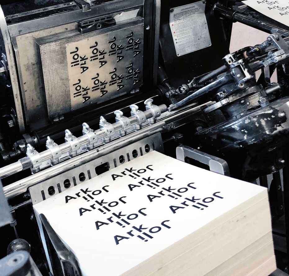
Corporate Design Relaunch

Metafrax Group

Back Download

The Metafrax Group is a methanol producer in Europe, exporting globally to 75 countries. The corporate group comprises over 12 different brands that had no obvious visual connection to one another. The new corporate design aims to unite the entire group under one branding. Symbolising unity and integrity, dots are used as the central element of the logo. The connections between the dots represent the combination of resilience and movement. The corporate colour, deep purple, not only stands for wisdom and science, but also emphasises the dynamic pattern, which is both stable and flexible, conveying the idea of sustainability. The custom-made font represents the integration of technology and industry.

Red Dot

By starting the video, you agree that data, e.g. your IP address, will be sent to Vimeo. vimeo.com/privacy

Others interested too