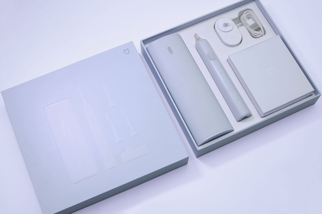
Beverage Packaging,Label Design

Piquentum St. Vital Series 2012/2013/2014

Back Download

The labels for the Piquentum St. Vital series 2012/2013/2014 were designed to point out the importance of understanding nature. Each one is different, but together they immediately convey how various weather conditions create characteristic tastes of wine. The conceptual idea behind the design is to visualise the weather of each vintage year in a simple way: circles, as standard meteorological rain symbols, show the amount of rainfall each month of the year. This results in aesthetically punched labels, which enable consumers to easily compare the different vintage years.

Red Dot

Others interested too