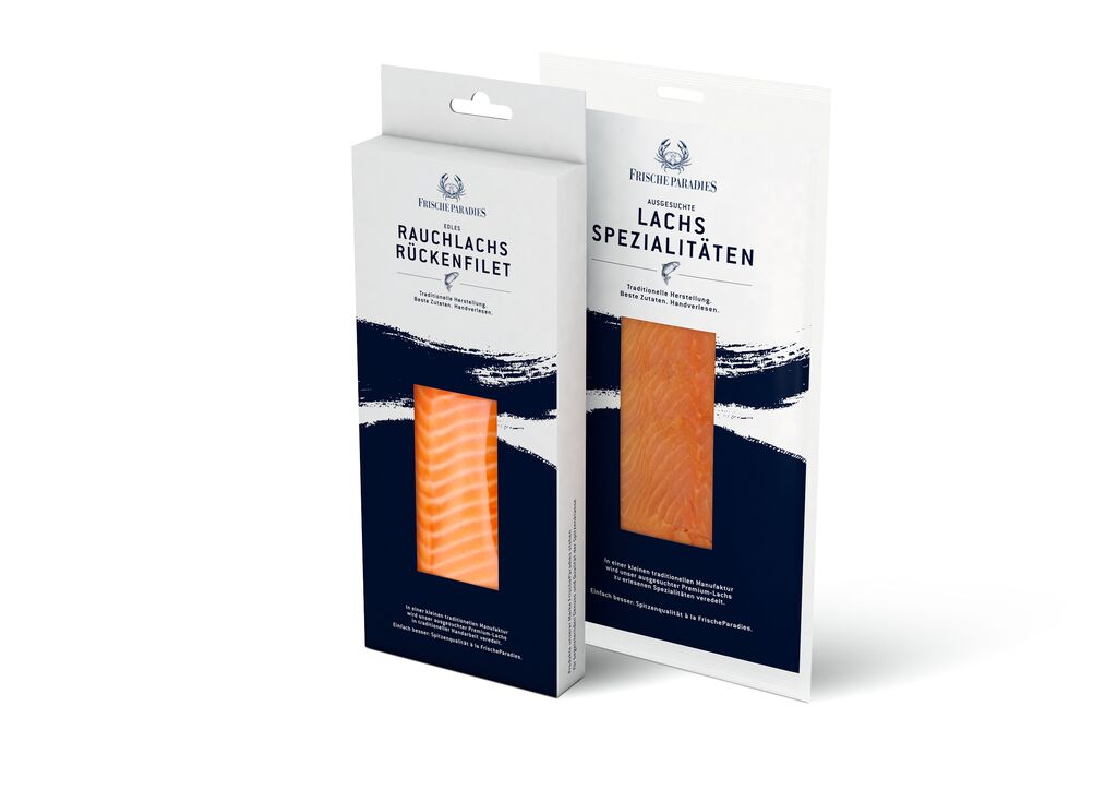
Beverage Packaging

RIVO Gin

Back Download

The overall idea of the packaging design of RIVO Gin was to evoke the artisan spirit of Italy in a brand design that sets itself apart from the international competition. Como was the birthplace of Italian Rationalism, an architectural current founded on the idea that structure and linearity should be the basis of all design. These principles are exhibited in this packaging design along with elements referring to magic. Geometric lines interact in order to create abstract elements recalling two key components of Lake Como’s geography: the waves on the lake and the surrounding mountains.

Red Dot

Others interested too