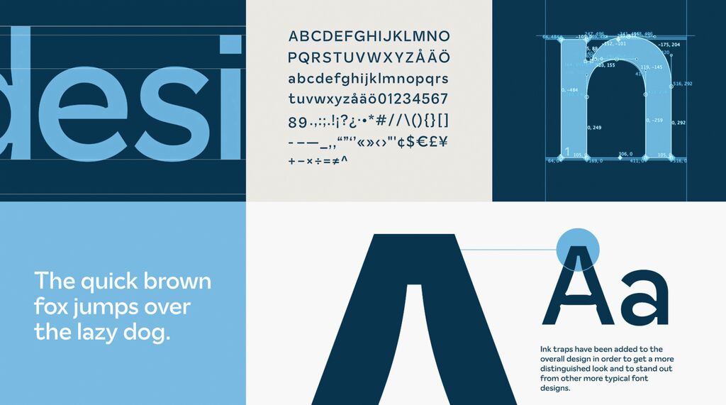
The typeface for Rychal-Su reflects the character of melted water from the Dagestan region of Russia. It embodies a simple yet expressive design of the letters, combining the softness of water with the hardness of stones and minerals. These contradictions create a unique image, as the outer contour is soft and smooth, while the inner contour is extremely rigid and geometric. The contrast thus created in the corners of the rounded shapes gives the text a subtle shimmer, reminiscent of a crystalline structure. The typeface includes a normal font, a bold sans-serif version and an additional serif font.
Credits
Client:
Rychal-Su, Kasumkent, Russia
Design:
Ermolaev Bureau, Moscow, Russia
Project Team:
Ermolaev Bureau: Vlad Ermolaev (Creative Direction)
Olga Umpeleva (Typography)