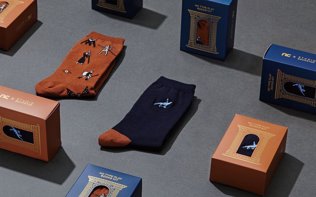
Typographic Artwork

Time Book

Back Download

The newly developed typeface by Quinsay Design is inspired by fonts used in early letterpress printing. Accordingly, it has been published on a series of transparent bookends called “Time Book”. The collection comprises three kinds of bookends, named “The Pink”, “The Font” and “The Ice”, and all share the same shape of a book but feature different colours and printed graphical information. Furthermore, they are made of hand-polished crystal glass blocks whose surfaces are screen-printed with special ink. The name “Time Book” is inspired by the different publishing dates of books, with these three bookends each featuring “MMXIX” on the book spine as the Roman numeral for “2019”. “The Pink” is the year 2019 calendar – with the pink colour representing “pig”, the Chinese zodiac sign of this year. Inspired by a novel written by Gabriel García Márquez, “The Ice” shows the beginning of the novel “One Hundred Years of Solitude”. And the sides of the yellow bookend “The Font” are illustrated with the 26 letters of the alphabet, as well as numbers and punctuation marks.

Statement by the Jury

This typographic work catches the eye with its impressive presentation of three heavy blocks made of transparent crystal glass. The idea of publishing a new typeface as haptic lettering on three bookends shaped like a book is congenially complemented by the professional quality of the font itself. Heights, kerning and spacing have been harmoniously balanced which makes the typeface ideally suited for modern, flexible use.

Red Dot: Grand Prix

Others interested too