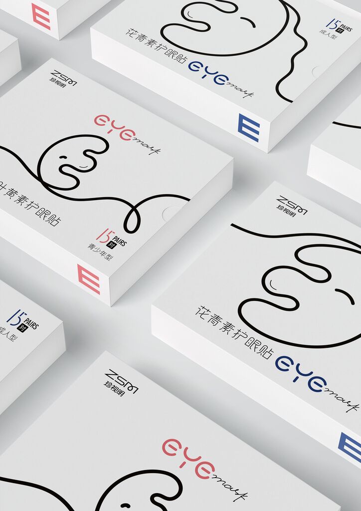
Client: Free Bio Technology Corp., Taipei City
Beverage Packaging
Velvet
In order to target Mongolian trendsetters, this label design features a product world that creates constantly new impressions. For this purpose, there are divergent circles placed on the vodka bottle as a metaphor for their impact on their surroundings. In addition, it resembles the shape of a vinyl record that refers to music and nightlife. On the other hand, this graphic element communicates the smooth taste of the vodka. The strong contrast of glowing orange and deep emerald green ensures that the product stands out, both on the supermarket shelf and at the bar.
Credits
-
Art Direction:Sergey Trushevsky
-
Client:APU Company, Ulan Bator, Mongolia
-
Design:Svoe Mnenie, Moscow, Russia
-
Graphic Design:Marina Dovbnya
-
Creative Direction:Andrey Kugaevskikh