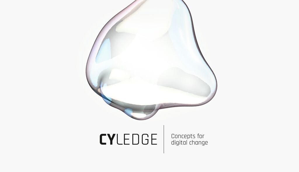
Icon Design

Vorwerk

Back Download

Vorwerk’s image transformation from a technical, sterile company to an emotionally appealing quality brand is based on its new corporate design. The specifically developed concept for the icons is an important component of the visual identity. In order to become a part of the customer’s life, Vorwerk must be ergonomic in terms of content and form. Brand-defining attributes from the core of the company, which shape the brand perception, were the template for the icon design, which provides an icon for each product and usage. Every icon conveys joy and pride, thus turning it into a brand ambassador.

Red Dot

By starting the video, you agree that data, e.g. your IP address, will be sent to Vimeo. vimeo.com/privacy

Others interested too