Interview with Tanguy Prevot, Erik Pertot
Honeywell, spol. s.r.o.
Red Dot: Medical products are often seen as purely utilitarian. How important is it to give them a distinct visual identity – and what role does design play in building trust?
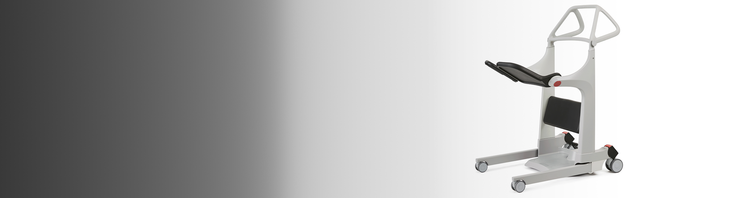
We focus on creating a design that feels both reliable and evokes a sense of familiarity. A strong visual identity is essential for this emotional connection. Our goal is to make people feel safe when they see and touch the product, as if the product truly belongs in their daily life rather than just in a clinical environment.
Designing for care means designing for vulnerability. How did you approach the challenge of creating a transfer aid that ensures both safety and dignity for the patient while also easing the strain on caregivers?
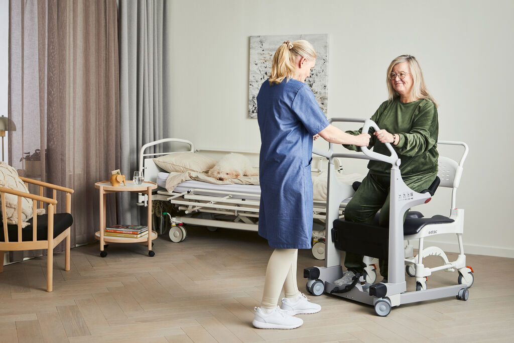
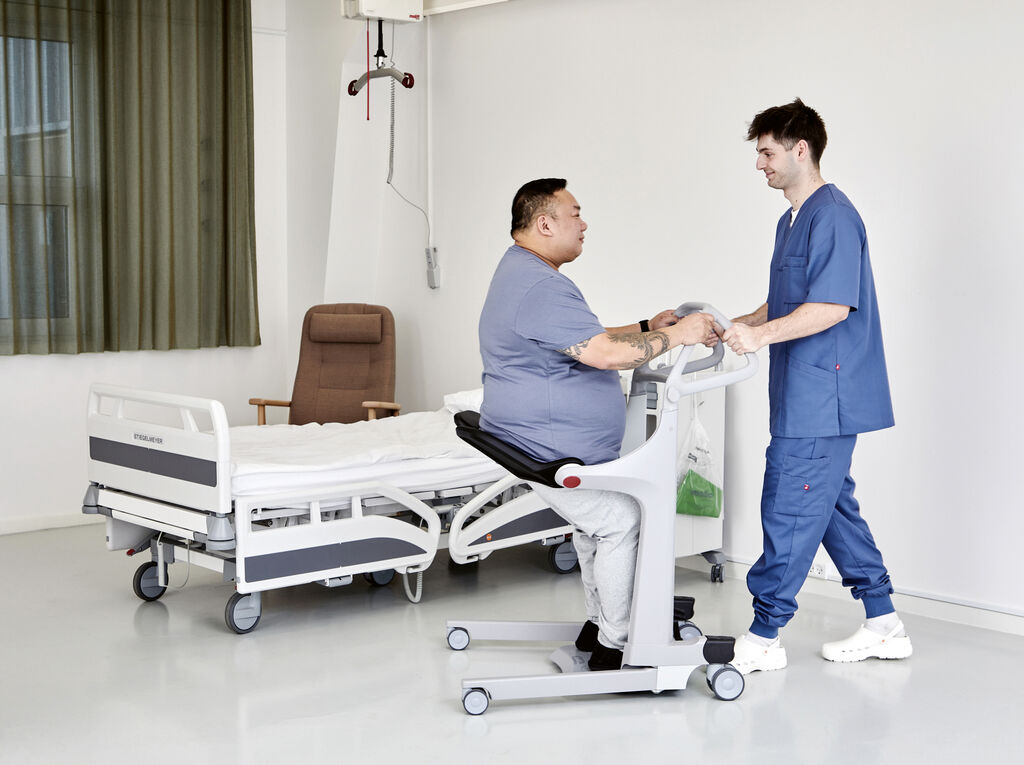
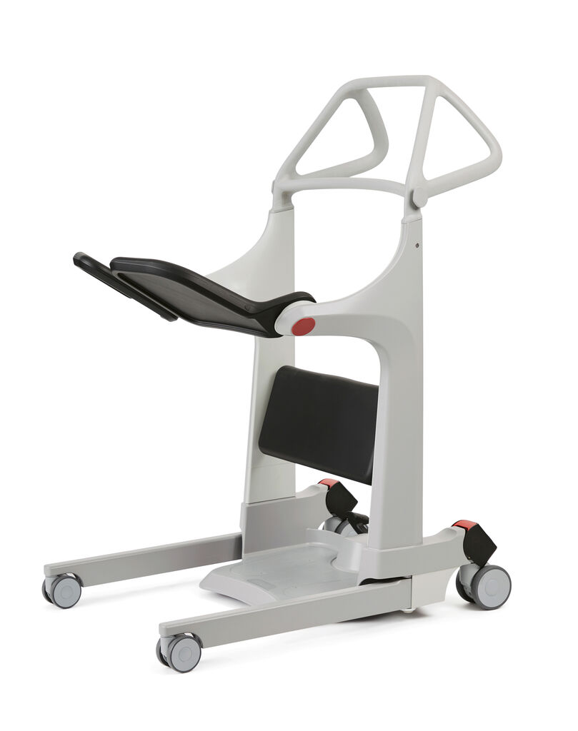
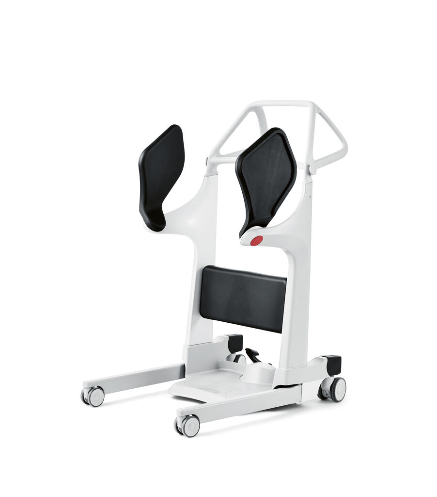
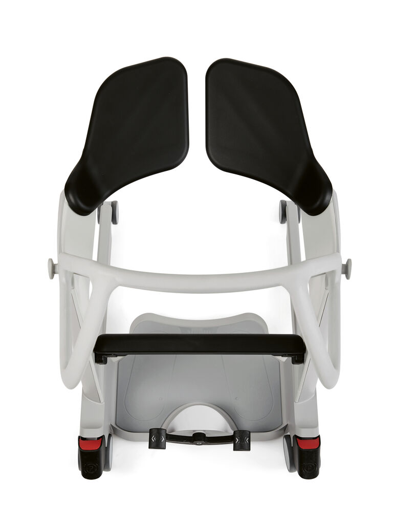
Designing products for care is not just about addressing a functional issue; we are encroaching on some of the most vulnerable moments of a person’s life. We wanted the product to feel kind, almost like a helping hand. At the same time, it needed to convey a sense of solidity and safety. One example of this is how the seat pads move, gently embracing the user in a way that feels reassuring and respectful. It’s these subtle details that allow people to retain a sense of dignity.
The Molift Transfer Pro combines numerous adjustable elements – yet the result feels cohesive and intuitive. How did you manage the complexity of the product without compromising on clarity and usability?
Throughout the project, we focused on maintaining a consistent and well-considered design language across all aspects. We believe that a coherent aesthetic often brings clarity and makes a product feel natural. With the help of prototypes and continuous testing, we were able to integrate a high degree of flexibility without sacrificing usability.