

Interview with Brand Genesis Lab | Tongji University
With six employees, aizawa office is at home in almost every design genre, creating sophisticated brand identities as well as expressive posters, books, spatialdesign and intelligent packaging solutions. What remains the same across all these fields is how they capture the true essence of each client and visualise it clearly and honestly. “Design is not mere decoration, but something that can bring about meaningful transformation. When our design sparks joy in someone, that is the energy that drives our daily work,” explains designer Yukihiko Aizawa. This inspiring spark is also reflected in the packaging for Pairing Beer, which transforms a beer bottle into a tactile experience.
Red Dot: What was the primary goal in creating the packaging of Pairing Beer?
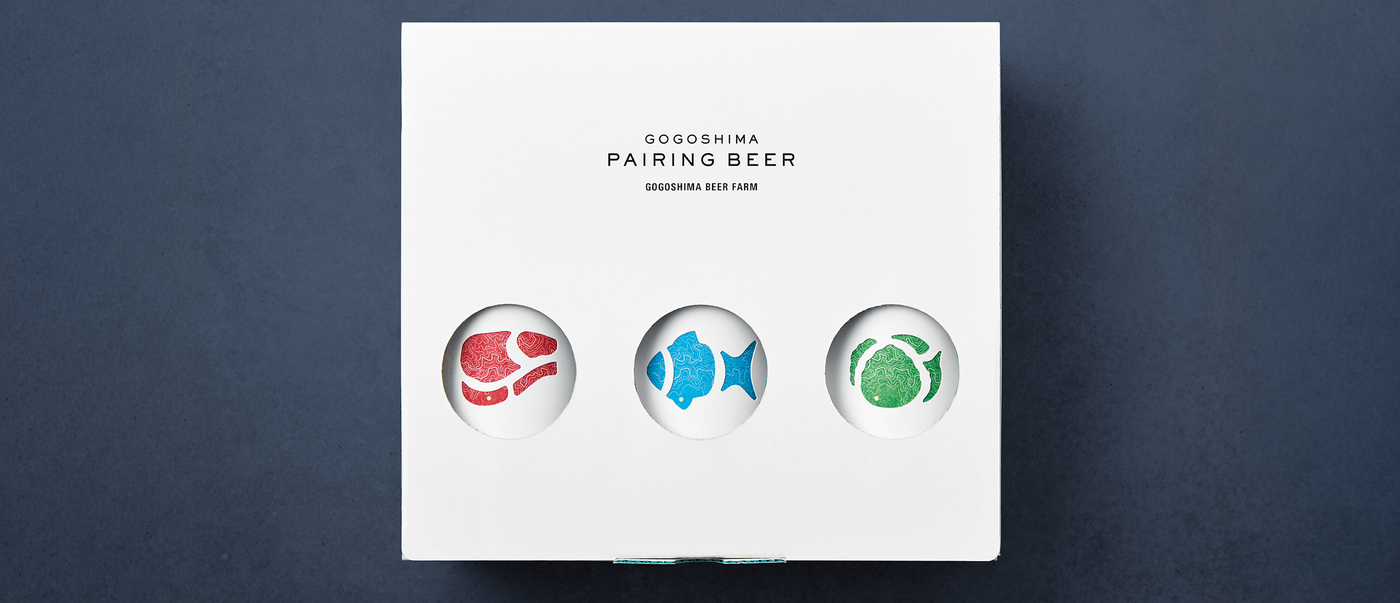
The pairing of beer with food is a new trend and therefore we tried to convey each combination intuitively and instantly. The design visualises the purpose and appeal of the product at first glance.
What role does the feel of the label play?
While the upper layer of the label uses clear visual elements to convey the appropriate pairing of food with types of beer, the lower layer uses washi paper to evoke the warmth of a small island in the Seto Inland Sea, as well as the craftsmanship and natural sensibility of the brewery. We believed that the fusion of commercial visuals and regional tactile qualities would create a design that truly suits this beer.
How challenging was production due to these layers?
Since beer needs to be refrigerated, we had to select a paper that would endure cold storage without peeling, one that is resistant to both water and moisture. Within these constraints, we had a hard time finding the best type of paper for the design. For the cardboard packaging, we also applied colour to the corrugated core, which was another major challenge. We are all the more grateful for the manufacturer’s understanding and willingness to embrace it.
Consumers can peel off the top layer to reveal the label underneath. Was this playful effect also part of the concept?
Indeed, the two-layer label adds a unique, playful touch. The sleeve is die-cut to represent the appropriate pairing with meat, fish and vegetable dishes, while the bottom layer features a map of Gogoshima, where this beer is brewed. This design choice reflects our quiet respect for the land and for the brewers behind this beer.
How important is emotional storytelling in packaging in general?
In today’s marketplace, it can be difficult to choose products based on price and quality alone. It seems that many purchasing decisions are driven primarily by emotions. Therefore, I believe it’s important to embed storytelling in order to foster an emotional connection to the packaging, appealing to both emotions and aesthetics. To me, this is what builds a memorable brand.

