
Interview with RXM Creative
TinyOcean has the potential to transform the aquaculture industry. There is a lot of science behind the concept, but Rise has succeeded in translating the founders’ mission into a visual identity that deeply resonates with its audience. The brand’s emotional depth and high information content appeal to investors, political decision-makers and all people who believe in a sustainable future.
Red Dot: You wanted to communicate the many positive impacts that TinyOcean can have. How is this reflected in the design?
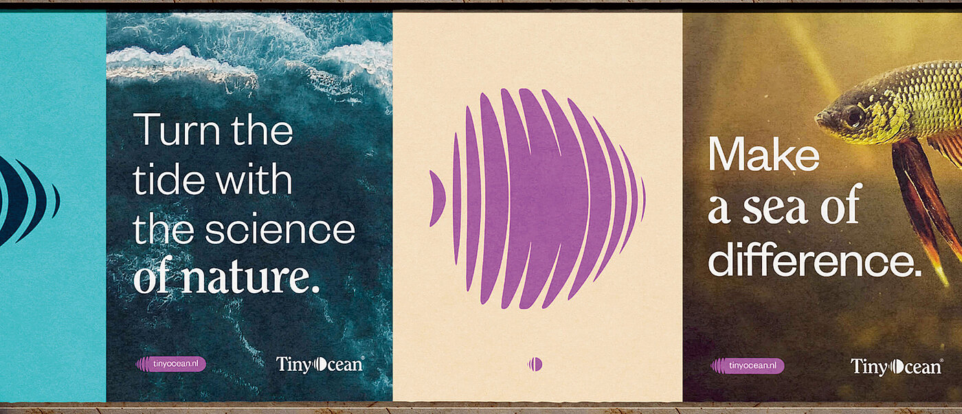
We took TinyOcean’s intrinsic motivation as the foundation of the brand image and, by doing so, we helped to bring an innovation to the market with the potential to fundamentally transform the aquaculture industry. When we were fine-tuning the tone of the brand copy, we took the client’s mission as our compass. We eliminated all the complexity without diluting the science, so as to ensure that that the brand comes across as emotional and approachable. And with the visuals, we avoided the cold, industrial look that this sector usually favours, taking our cue from nature’s rhythms: flowing forms and wave motifs. It has a rebellious edge, just like TinyOcean’s mission.
There’s a lot of complex science behind the project. How did you manage to communicate that?
We got together with the founders and literally unravelled everything: both the science and the story behind it. There’s a lot of technical jargon in the world of regenerative aquaculture, but emotions also run deep after years of trial and error, as well as battling against resistance from people opposed to change. That’s how we came up with the idea of a water ripple – a visual metaphor tracing growth from larva to fish and reflecting the natural rhythm of the ocean. The ripple became the essence of the brand, in terms of both design and meaning.
You also pick up on the concept of motion in the typeface …
We opted for a very clear-cut type and then added subtle motion by adjusting the kerning and using fluid animation for an ebb-and-flow effect. But everything is still easy to read, and it looks authentic.
What was the most fun part of this project?
The best part was when it clicked for the client – when they finally felt understood after years of rejection and now experienced a “that’s exactly what I’m trying to say” moment. Our design immediately changed the tone. TinyOcean is no longer just a group of people with an idea – it’s a credible brand that is suddenly able to explore entirely new avenues.

