
Interview with Brand Genesis Lab | Tongji University
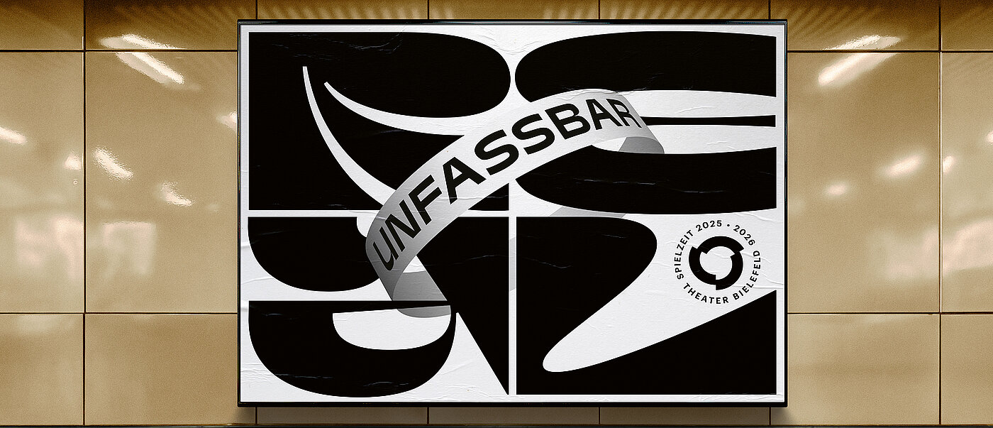
The interdisciplinary design studio beierarbeit has shaped the constantly evolving visual identity of Theater Bielefeld for many years. For the coming season, they developed a new display typeface that playfully embodies the theme “Unbelievably Real” by using an abstract visual language. As a key visual for the seasonal communication, the font acts as a concise anchor and is framed by the familiar dynamic ring, which is reminiscent of a banderole. With 180 letters, numbers and punctuation marks, it forms the basis for flexible analogue and digital applications.
Red Dot: The REAL font serves as a typographic key visual. Is the development of a typeface fundamentally different when it is intended to fulfil such a function?
Project design and font development ran in parallel, as the key visual was also explored with typographic alternatives. In the first step, the font only had to assert itself with the seasonal motto “Unbelievably Real” in all settings (mixed, capital, normal) in order to counteract associations with other points of contact with “Real/real”. Finally, based on the functional requirement of being able to serve all media and formats, the variable monospace display font REAL was created for this major campaign.
How essential was the playful variety of the font?
The motto defined the design scope and set the coordinates. The result was a distorted and prismatic design aimed at creating something different. The consistent work with squares led to unconventional forms that harmoniously balance the ratio of white to black space in all letters. In practice, the uniform character width allows for interesting shapes on the threshold between text and image.
What features give the font its striking effect?
The aim was to mould each individual glyph into a complete image. Sweeping, dynamic curves lend the glyphs a physical quality, whereas the contrasting areas between the positive and negative forms create three-dimensionality. The result is a sculptural effect. The character of the font and design is localised in the realm of art and culture.
Did the weights of the font only really become apparent during the realisation of the communication media?
Font development and communication design were parallel processes. This allowed us to optimally balance requirements and flexibility, while utilising the full potential of our expertise for the project. This interdisciplinary approach of merging communication, typeface and motion design is a key unique selling point of our agency.
Was a lot of persuasion necessary for a purely typographical solution?
In its communication, Theater Bielefeld relies on the power of the word in their combination of programme and social message anyway. Therefore, it didn’t require much persuasion.

