
Interview with dpjn / Diena Pirms Janu Nakts
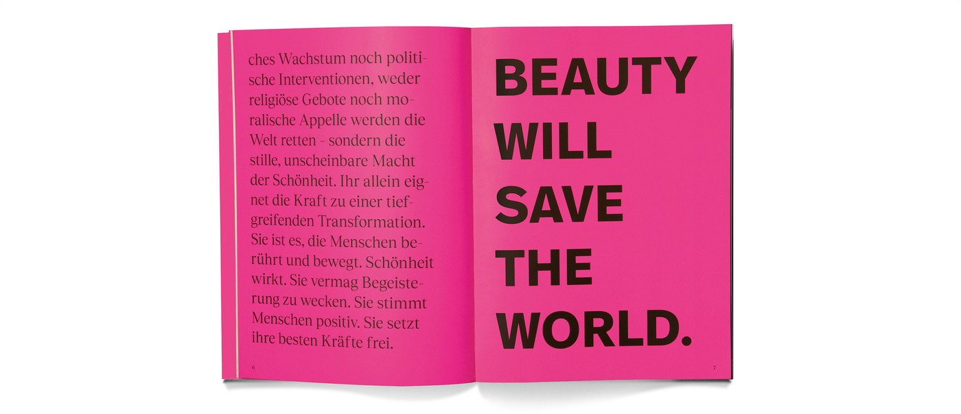
As a brand agency, Fuenfwerken Design AG develops visions of the future and positions both established and emerging brands. The team has also made a name for itself in the cultural sector. With “Beauty Will Save the World”, they created a book design that captivates through its formal expressiveness and outstanding craftsmanship. Guided by the conviction that “a good book is not just a medium for information, but an experiential space”, the team produced this book as a poetic and immersive experience.
Red Dot: “Beauty Will Save the World” – how challenging was it to conceive a factual counterpart for this title?
The title by Prof. Jan Teunen conveys a great perspective that is emotional and philosophical at the same time – it is both a statement and a promise. The design challenge was not to illustrate this, but to give it a visual structure that appeals to the mind. Beauty needs to be understood here as a spiritual principle, not as an ornament. That’s why we worked with clarity and reduction – as a counterweight to the pathos of the title, but also to create resonance. The factual gesture of the layout provides orientation without losing the sense of poetry.
The layout evokes an exciting rhythm. How did you approach this?
We have interpreted the book as a composition – with soft and loud tones, with tension and calm. The rhythm arises from the dynamics between white space, typography and the different visual worlds. Providing a clear structure, the three chapters also allow for creative variation: through font sizes, different grids and typographic accents. The expressive pages give space and visual power to important statements and thus become an organic part of a dramaturgical plot. Beauty lies not in uniformity, but in lively diversity.
For you, how important was it to translate this into materiality?
Very important. When we talk about beauty, we are also talking about sensual experience. Paper, binding, colouring, embossing and screen printing – all of these elements are not decorative additions, but actively contribute to the meaning. A book thematising beauty should also embody it – not as a luxury, but as a statement. The materiality emotionally charges the content and anchors it in the physical, in the here and now. It creates a sense of presence.
Can you tell us more about the elaborate production?
The production of the book was consciously guided by the craft. It was intended to be perceived as an all-encompassing, deep-blue object – a radical reduction to the essentials of classic bookmaking. Also, the surrounding colour border was intended not as an effect, but as a conceptual framework to enclose and energise the object. We wanted the material presence of the book to be as clear and bold as its title. Working closely with the printer and bindery, we aimed for an object that also embodied the beauty of book printing and the craft itself.

