
Interview with Fuenfwerken
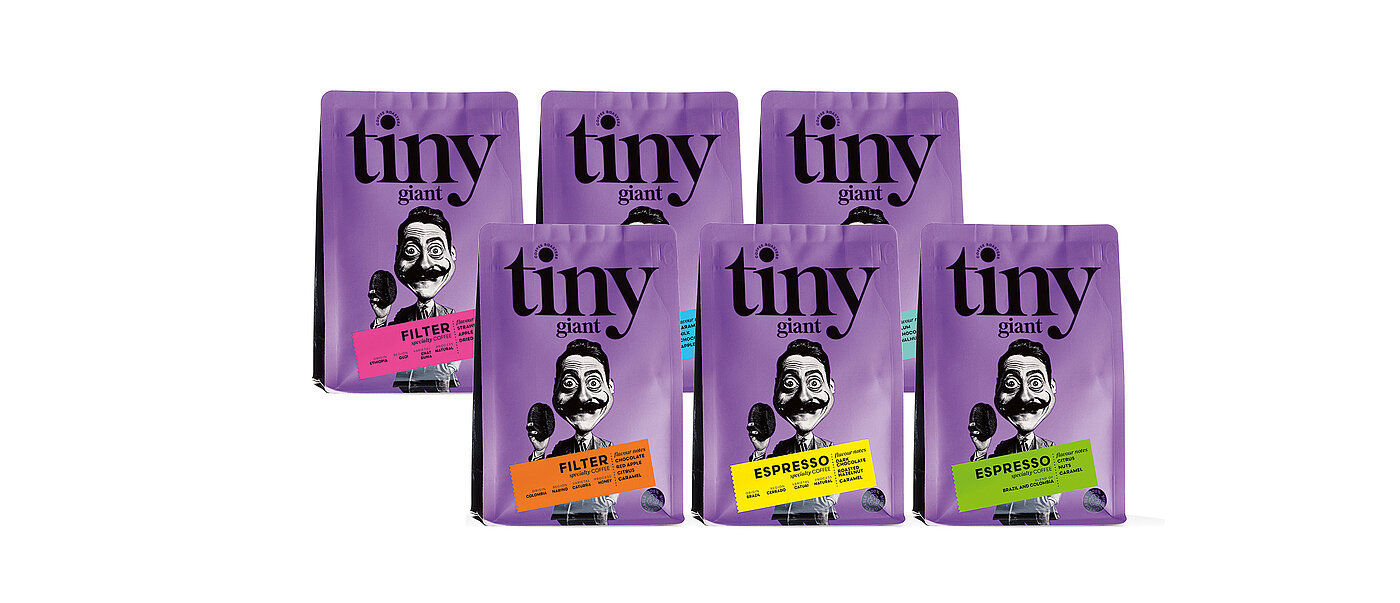
Diena Pirms Janu Nakts, DPJN for short, is a Latvian creative agency that specialises exclusively in packaging design and works primarily in the fast-moving consumer goods sector. DPJN designs its products to reach the people who need them directly and without detours, which is why bold designs and daring experiments are always on its agenda. The agency team developed a strong brand profile that is both artistic and instantly recognisable for the new Tiny Giant coffee brand.
Red Dot: What initial ideas did you come up with for Tiny Giant’s packaging?
Tiny Giant was a totally new coffee brand without any previous history, so the first thing we had to work on was creating a strong personality from scratch. We needed to make the brand stand out in the competitive market for speciality coffee. The packaging had to be both visually striking and emotionally appealing to ensure that the product isn’t overlooked on the shelf.
What led you to take inspiration from the Spanish artist Salvador Dalí?
Dalí’s surreal world provided the perfect source of inspiration. We took his eccentric personality and iconic moustache as our starting point, played around with the proportions of his face and paired him with an oversized coffee bean. This surreal exaggeration reflects the speciality coffee’s spirit of discovery. It’s surprising, daring and a little absurd.
Which target audience(s) did you have in mind?
We created Tiny Giant for design-savvy, urban coffee lovers – people who value creativity as much as quality and craftsmanship. But we were also targeting the young and courageous, so age wasn’t a factor in the equation. The use of a bright-purple base colour with distinctive character ensures that the product appeals to casual shoppers – it keeps the brand accessible while making a strong impression.
What role did cost-efficiency and sustainability play?
Cost-efficiency was an important consideration when we decided to use coloured stickers, because they reduce production costs and also make it easy to differentiate between coffee varieties. We incorporated sustainability by using recyclable materials and simplifying the printing process to minimise waste. The end-result proves that bold design can go hand in hand with smart and sustainable decisions.

