Ligalux

The latest iteration of the brand identity for the SWR Festival in Schwetzingen was created by the branding and design agency Ligalux. It aspires to more effectively communicate the traditional classical music festival, to encourage new target audiences to engage, and also to build bridges between tradition and innovation. Ligalux achieved this with a variable design grid that takes the basic forms of the historical palatial architecture on site and flexibly rearranges them into floral shapes and patterns – giving rise to kaleidoscopic effects that are both recognisable and poetic.
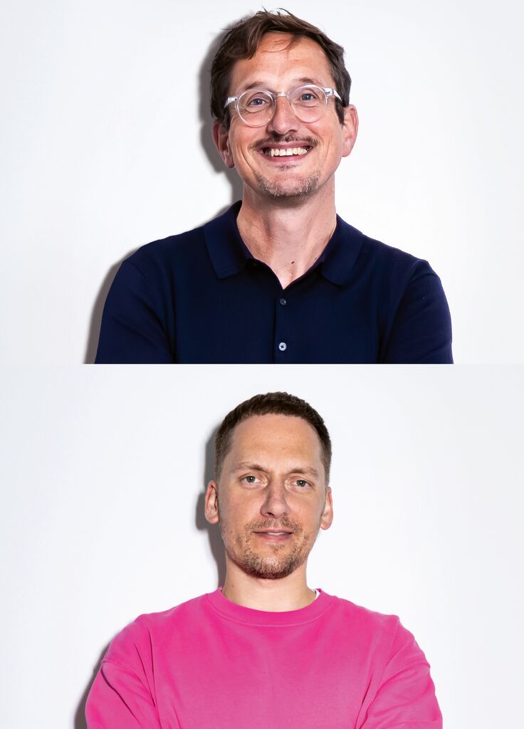
Interview with Jan Kruse and Dominik Pander
Red Dot: What was your biggest challenge in the development of the brand identity?
One of the biggest challenges was to find the balance between tradition and innovation. The brief was to retain the heritage of the SWR Festival in Schwetzingen, which is famed for its contemporary programme, while updating the visuals. We did this by exploiting the creative power of modern technologies and innovative tools. It was equally important for the identity to appeal to new target groups without losing the existing audience – and to focus on the festival’s historical setting. That’s why we decided to develop a simple design system that was nevertheless flexible, so as to facilitate consistent and effective communication across a wide range of touchpoints.
One specific aim was to extend the festival’s appeal to younger listeners. How did you bring that about?
Most members of the younger generation use their smartphones for everything, so we approached the redesign on a “social first” premise. Although the design elements were digitally conceived, they can easily be transferred to the analogue world. Motion graphics are a central element of high-visibility social media marketing. When we created the festival theme of “Seduction”, we focused on emotional imagery, powerful colours and a classic typeface to obtain a modern and contemporary look that would appeal to younger audiences.
You also used AI for the design of “Seduction”. How can AI impact the quality of visuals?
AI opens up all kinds of possibilities for image generation and processing. When we were developing the visuals for the festival theme, we experimented with various AI tools to create expressive motifs featuring flowers from the palace gardens; and then we used image-to-motion tools to create movement. It was fascinating to see the emotional depth, sensuality and attention to detail of the resulting visual worlds. We were able to maintain textures, expressiveness and image style across multiple motifs, generating flowers in a variety of perspectives and controlling every detail. This made it possible to develop a striking aesthetic that walks a fine line between imagination and reality.
Discover other winners
