Work & Co, part of Accenture Song
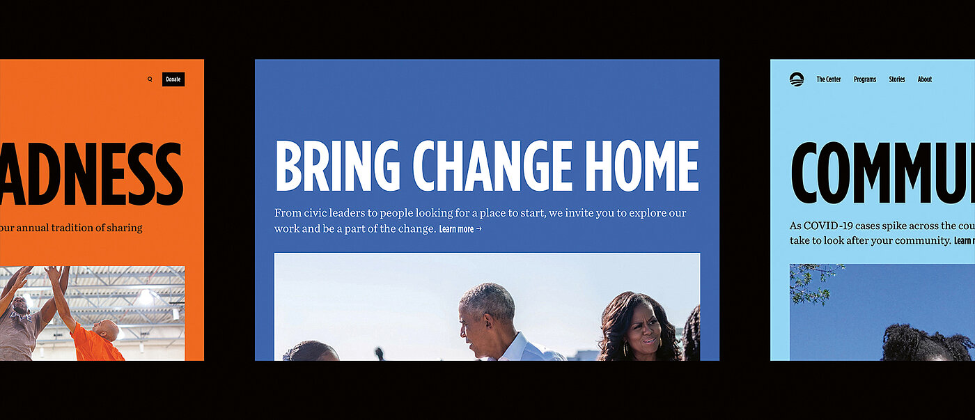
Since its founding in 2013, the design and technology agency Work & Co has created digital products for clients like Apple, IKEA, Aesop, Virgin America, Nike, Mellon Foundation and PGA TOUR. In 2024, the agency became part of the creative group Accenture Song. Its work focuses on user-centred design, whether for websites, apps or AI applications. In 2023, the Obama Foundation approached Work & Co with a complex challenge. Established by Michelle and Barack Obama, the foundation sees itself as a catalyst for social change, aiming to inspire people around the world through its initiatives. With numerous events, networking formats and educational programmes, the foundation reaches a broad audience – bringing its credo “Hope to Action” to life. With the Obama Presidential Center, the foundation is currently turning a vision into reality – a large campus that includes a museum, library, event rooms and sports facilities. “To support this, we developed a long-term roadmap for the foundation’s digital products and simultaneously redesigned its website. The goal was to reflect the new brand, while meeting the diverse future needs of visitors,” explains Parker Sapp, Product Management Leader at Work & Co. Through consistent user guidance, clear colour coding and a well-defined grid, the designteam succeeded in engendering an accessible structure that ensures intuitive orientation.
Interview with Parker Sapp
Red Dot: Given the broad range of different content, how did you approach the structure?
The foundation has been operating globally for over a decade. During that time, it has made a tremendous impact through stories about individuals and communities. Simultaneously, the website had the important and emerging role of conveying the grand vision and progress of the Presidential Center as it took shape. Looking ahead to when the center opens, a third dimension was added: content that will inform and support visitors and participants in on-campus programmes. Starting from this point, we first developed a framework that supports visitors from their first preview of an upcoming on-campus event, through their engagement with it, and to a recap that encourages longer-term action.
The website has a journalistic feel. Was this a declared design goal or did it simply result from the content?
It was very intentional. The “Stories” section naturally feels more dynamic given the amount of work and events that take place daily across the foundation. However, we wanted to ensure that this level of energy was evident everywhere, from the homepage to the institutional pages. So we leaned on editorial patterns such as variable grids, thematic sections and tags, and modules with related stories – to help visitors orient themselves and find their way to the most relevant content.
There is a memorable, intuitive colour code for the various activities. Was that an important building block for ensuring orientation?
We built on the foundation’s vibrant and distinctive colour palette, established by the branding firm Manual Creative, to create a flexible, consistent approach across the Presidential Center, the foundation and its many global programmes. For the website, we used this colour system to reinforce wayfinding. It gives each programme a voice and draws a connection between the stories of its impact, background and purpose, while also highlighting opportunities for users to get involved.
Were there any other guidelines that influenced the design?
Other important aspects were accessibility and inclusivity in design. We wanted to ensure that all of these combinations resulted in clear and legible content, regardless of where they are used or who is seeing them. The site’s design system is complex, but we hope it will be useful to the average visitor and help them find what they are looking for more quickly.
