
Interview with Beijing Jiaotong University and Central Academy of Fine Arts
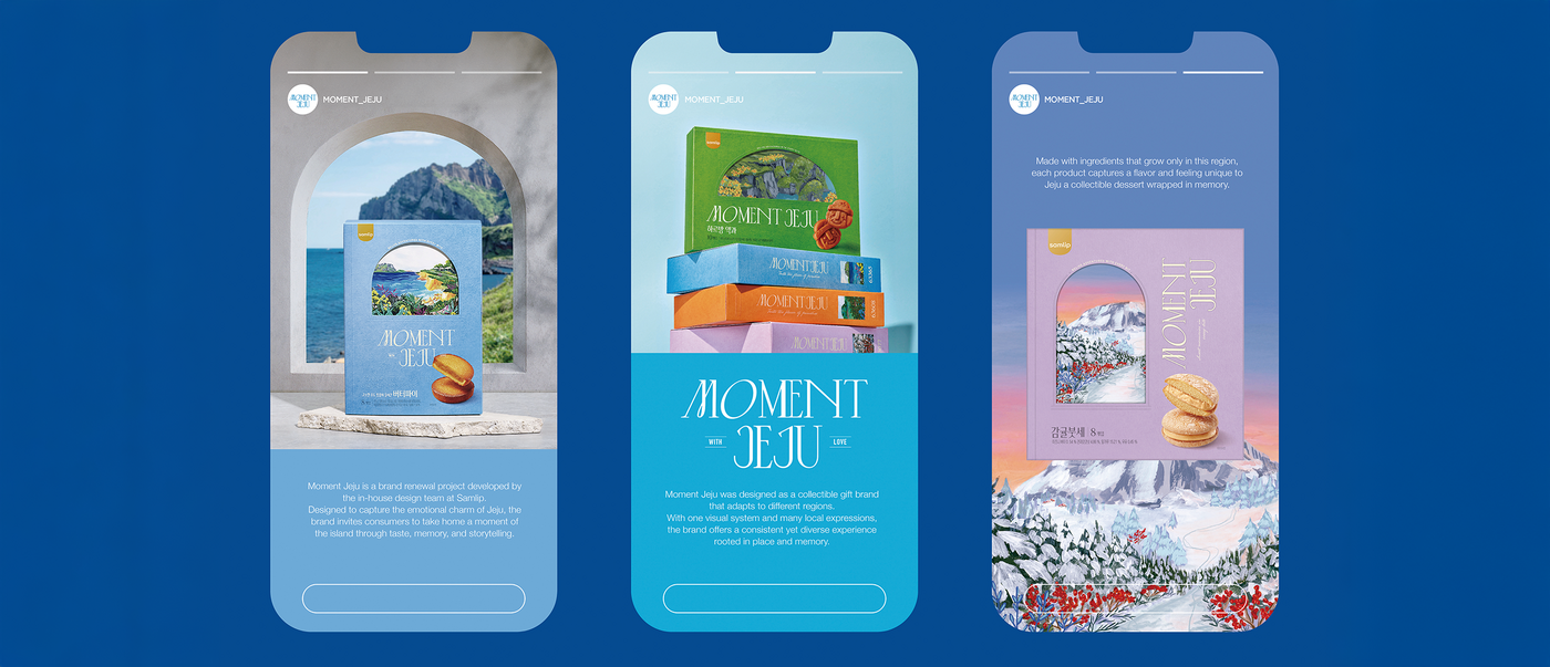
South Korea’s largest island, Jeju, attracts countless visitors with its natural beauty. “Moment Jeju” is a packaging design created by SPC Samlip that visually captures the special moments people experience on the island. Elaborately produced with stylish illustrations, the product is a keepsake, yet at the same time far more than just a souvenir.
Red Dot: What do you mean by the description experience-driven product?
We mean that the product isn’t intended for consumption only. Although Jeju has breathtaking scenery, many visitors do not fully appreciate it. We wanted to create something that is more than just a biscuit container, namely also a reminder of special moments on Jeju. This elaborately produced packaging with tactile elements supports that idea.
What were you aiming for with the illustrations?
We didn’t want anything generic. Eventually, we found an artist who perfectly captured the landscapes with her charming brushstroke style. She was tasked with depicting Jeju based on her personal experience of the island, and we asked her to focus more on emotional coherence than on an accurate depiction. Above all, we wanted to create illustrations that people would want to keep, perhaps even hang up on the wall, so that the image could outlast the product.
The typography is very distinctive, too …
“Moment Jeju” is designed to appeal to both Korean and international visitors. We used English as the lead language to ensure the brand name’s intercultural legibility, and then we supplemented it with Korean. The Latin serif font makes a timelessly elegant statement to an international audience, while the Korean font with its soft curves and generous spacings adds warmth and a local flavour. The weights and rhythms of the two typefaces were carefully harmonised to create a design with global appeal that retains its unmistakable Korean identity.
What role does the colour system play?
We selected the shades that occur naturally in Jeju’s landscapes and then organised them into a clear colour coding system. This helps customers to easily distinguish between the products, yet it also aligns with the unified Jeju identity. The colour coding system was additionally designed for scalability. In the upcoming “Moment” series, we intend to use the same approach for Seoul or Busan to ensure a consistent supraregional identity with local colour flavours.

