
Interview with Beijing Jiaotong University and Central Academy of Fine Arts
The ability to reconcile the seemingly contradictory is the hallmark of the Munich-based strategy and design agency KMS TEAM. Here, brands are made future-proof without compromising their core foundations. Tradition is transferred to the modern age, often revealing hidden values. For the scaffolding manufacturer Layher, this was achieved through typographic sensitivity, which formed the basis for a stringent visual identity across all channels.
Red Dot: The centrepiece of the Layher corporate design is the company’s new font. What factors were considered ahead of time?
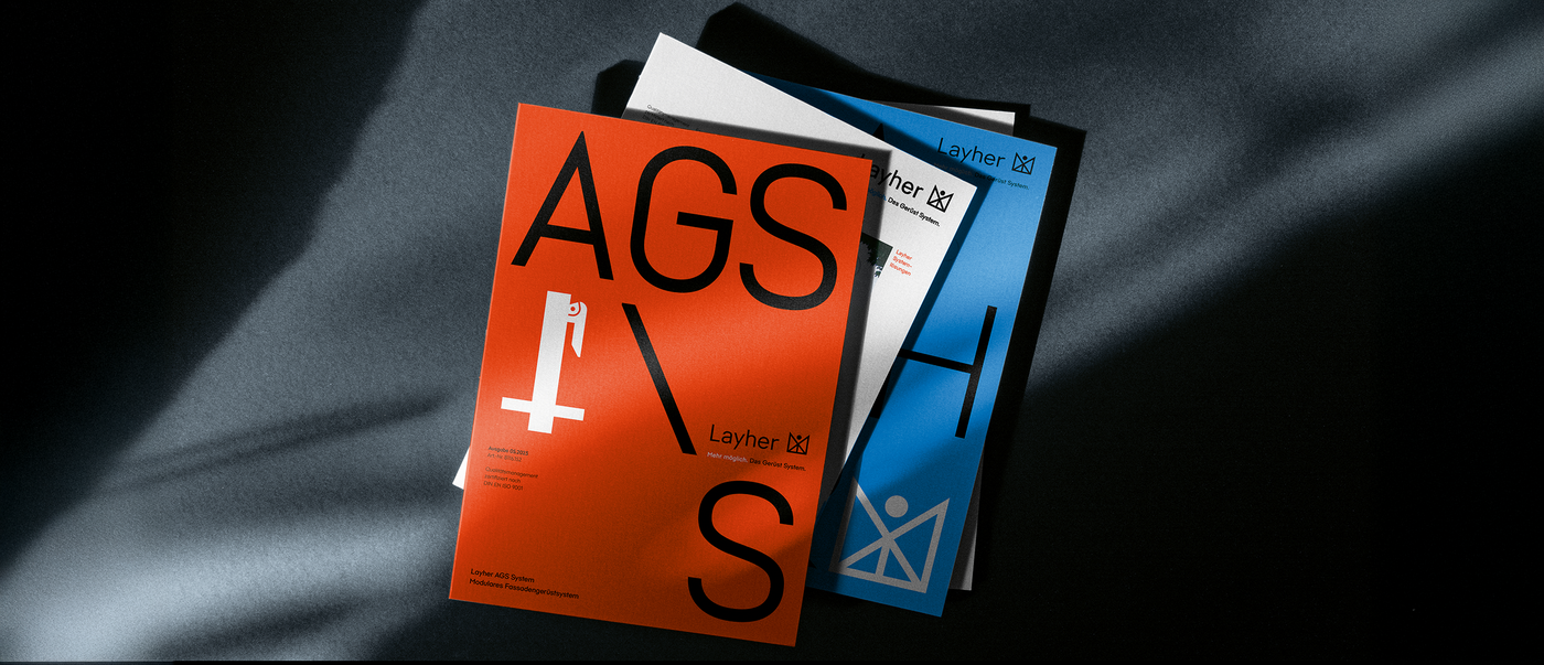
The design framework was tight from the outset, as the logo, claim and colour scheme were to be retained. The analysis of the existing appearance showed that additional graphic elements or areas would have quickly disturbed the products and their illustration. We therefore identified the typeface as a central design element to give Layher a distinctive, unmistakable appearance. The aim of the font development was to establish a formal relationship with the logo and to follow a concise headline approach by emphasising the claim “More is possible. The scaffolding system.” The typography symbolises the function of Layher products. Instead of scaffolding facades, it plays with formats – with maximum flexibility. A mono-spaced uppercase font proved to be ideal for creating clear, modular stackable headlines that reflect the technical precision and systematic nature of the brand.
How difficult was it to preserve the character of the brand and still give it a contemporary look?
There were clear no-gos right from the start. The identity-forming elements – above all the logo and the associated claim – were not allowed to be changed. Our approach was therefore a careful modernisation without calling into question the lived brand attitude. As a result, we simplified the logo, tidied up the colour palette and made the brand more striking and self-confident.
Were you able to quickly convince Layher of this modern solution?
On the customer side, marketing and management were directly involved so that decisions could be made easily. The goal was clear from the very beginning: the revised appearance was to make the brand fit for the future, to position it clearly amid increasingly fierce competition and to make it more attractive for the labour market. Our idea of solving the task by streamlining existing elements and developing a concise corporate typeface was immediately well received.
The company naturally has a physical presence, but it is also present digitally. Was there an equal focus on both during the development process?
We develop brands holistically, rather than looking at analogue and digital brand worlds separately. For Layher, digital touchpoints play just as pivotal of a role as the classic sales channels or the physical brand presence. This is why we pursued an integrated brand strategy from the start, which makes it possible to create a brand experience that is consistent and flexible across all media.

