Mutabor Design takes a highly strategic approach to creating and developing brands, knowing that good consulting and strategic development are the key to successful design projects. The team at Mutabor Design is convinced that creative ideas which bring joy to people and enrich their lives also contribute to a brand’s financial success – if the right processes are in place.
Mutabor Design interviewed by Red Dot
Red Dot: Why are you not addressing the younger generation on social media, through influencers or collaborations, as it is common today?
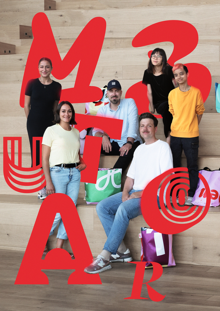
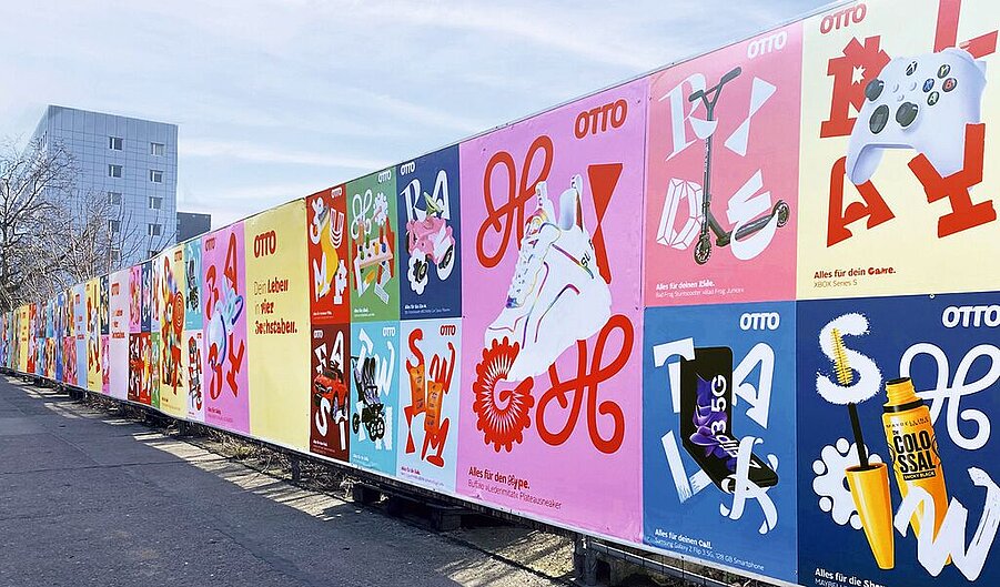
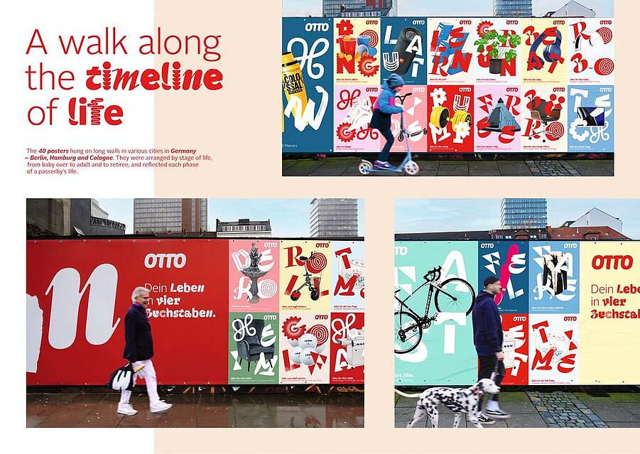
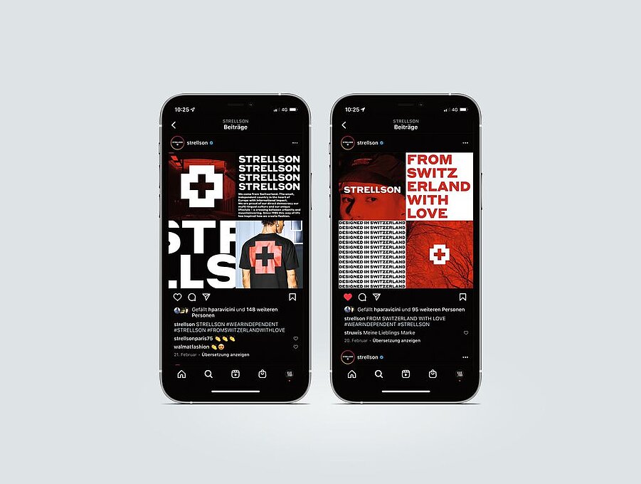
Mutabor Design: Gen Z people are very familiar with OTTO, and it would have been easy to take the usual approach. But we wanted to celebrate the rebranding and were looking for something a little more “eye-catching”. Given that out-of-home has become an increasingly important communication avenue for e-commerce, we decided for a combination of construction-fence banners and in-app ads, flanked by Instagram posts. We wanted to surprise people and create an exceptional degree of visibility.
Why did you focus on typography?
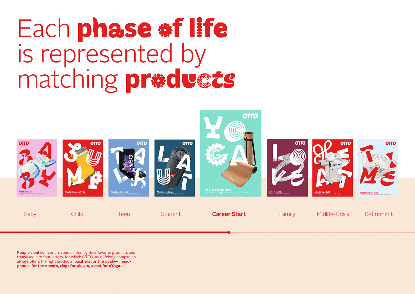
We developed a new display font that is freely combinable with the existing OTTO corporate font. It means using a mix-and-match approach to create a new typography every time. We wanted to make the OTTO Play font front and centre in this campaign. It looks spontaneous and fresh, as if it was made for Gen Z.
What have been the reactions to the campaign?
Given the small budget, the campaign was a big success. We were delighted with the courage that OTTO showed in launching an absolute “designer” campaign that defies the conventions of how we see things. This allowed us perfectly to underscore the statement that “OTTO no longer is what you thought it is”.


![[Translate to English:]](/fileadmin/_processed_/7/0/csm_DP_Interbrand_NY_91-DP05796-2021BC-2_c2a9c90a49.jpg "[Translate to English:]")

